Food Flyer Ideas & Templates for Restaurants and Cafes
 Ali Tanis15 min read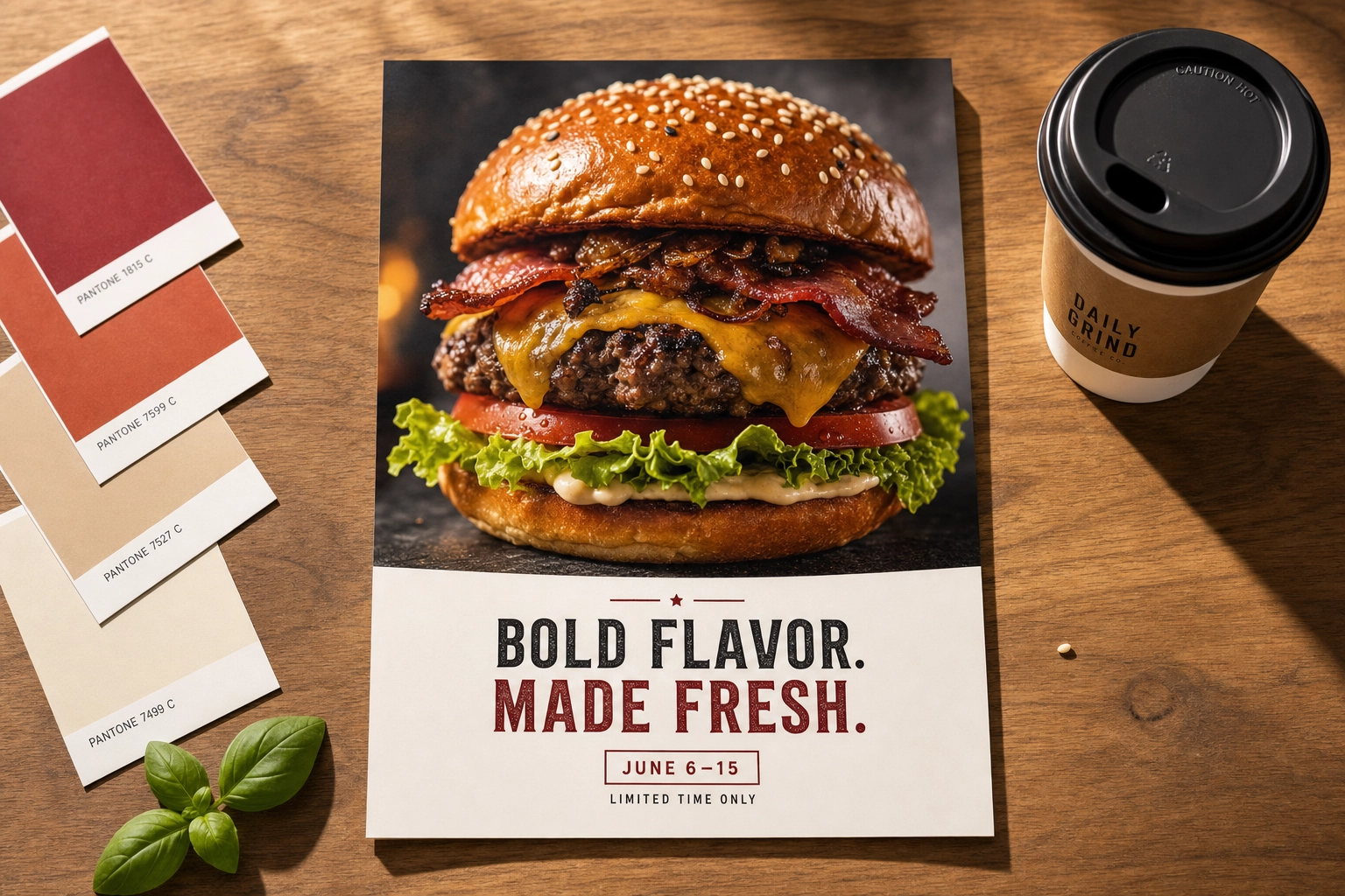
A great food flyer does one job: make a hungry person stop and think "I want that." Everything else — the fonts, the borders, the little starburst that says "NEW" — is secondary to a single, mouth-watering photo of the food. Get that photo right and a plain layout still sells. Get it wrong and the slickest template in the world won't save you.
This guide walks through six food flyer ideas you'll actually use — grand opening, weekly special, happy hour, seasonal menu, delivery promo, and catering — with the layout that works for each, how much text belongs on it, and why the photo is doing 80% of the persuading. Then we cover the craft (negative space, contrast, one hero shot over a busy collage) and the sizing you need for both print and social.
Quick Summary: The food photo is the flyer. Give one bright, appetizing hero shot 60–70% of the space, reserve clean negative space for a 3–6 word headline, and add only the offer, the date, and how to act. Design once, then export at 300 DPI for print (8.5×11") and 1080×1350 for social. FoodShot's Poster Mode helps you make that artwork — it does not print or ship physical flyers.
Why the Food Photo — Not the Design — Carries the Flyer
Look at any food flyer that stopped you mid-scroll. Odds are you remembered the dish, not the layout. That's the whole game. A flyer is a frame around a craving, and the craving lives in the photograph.
This is why swapping in a sharp, well-lit hero shot beats fiddling with template decorations. A dim, flatly-lit phone photo tells the reader "average food, average place." A bright, textured close-up — steam off the plate, a glossy sauce, a crisp edge — tells them the opposite before they read a single word. Template galleries like Canva, Adobe Express, and PosterMyWall hand you thousands of free food flyer templates, but none of those templates fix a weak photo. A restaurant with a stunning dish and a plain layout will out-market a restaurant with a gorgeous template and a dull plate every time. That's the gap this whole guide is about.
If your camera roll is full of decent-but-flat dish shots, that's the fixable part. FoodShot turns a phone snap into a menu-ready hero image, which is exactly the raw material a flyer needs. The same styled photo you'd use for restaurant food photography or cafe menu photos is the photo that carries the flyer.
6 Food Flyer Ideas by Occasion (and the Layout Each One Needs)
Different messages need different layouts. A grand opening should feel like an event; a happy hour should feel like a wink. Match the structure to the moment, keep the text lean, and let the food photo do the heavy lifting every time.
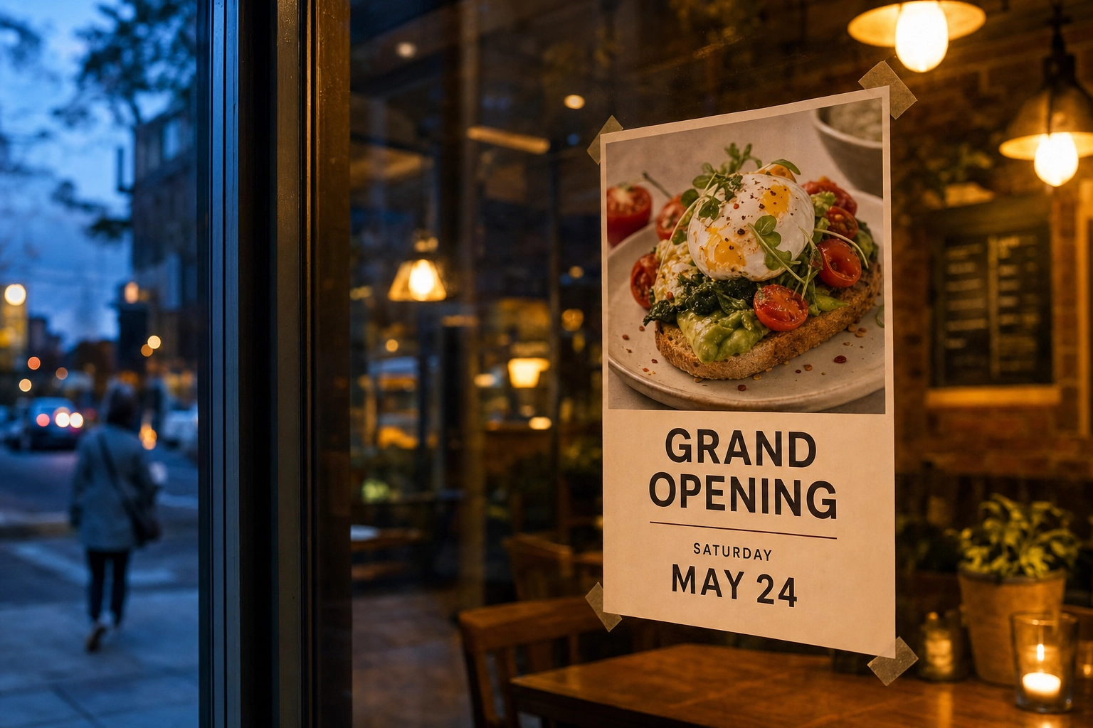 A bright grand opening food flyer taped inside a cafe window at dusk, glowing against the warm interior light with a plated dish photo dominating the layout
1. Grand Opening Flyer
Goal: announce you exist and pull first-week traffic.
Layout that works: one signature dish filling the top ~60% of the flyer, with a bold "GRAND OPENING" headline and a clean detail block — name, date, address — anchored at the bottom. Give the date real weight; it's the one thing a reader needs to remember.
How much text: the restaurant name, "GRAND OPENING," the opening day and date, and a single incentive ("first 50 guests get a free dessert"). That's it. A grand opening flyer buried in paragraphs reads like a lease agreement, and on opening day you want excitement, not fine print.
Why the photo carries it: you have no reviews and no reputation yet, so the dish is your entire pitch. Make it your most photogenic, crave-worthy plate — this is the one shot standing in for everything you're about to be.
2. Weekend or Daily Special Flyer
Goal: move one specific dish this week.
Layout that works: a single hero plate, a price tag treatment, and a small day-of-the-week badge (think "SATURDAYS ONLY" or "TACO TUESDAY"). Keep it as a reusable template — next week, or the next special day, you swap the photo and the dish name and you're done.
How much text: dish name, price, and the days it's available. Specials live and die on clarity, so put the real number on the flyer — "$12 wood-fired pizza" beats "special pricing" every time.
Why the photo carries it: a special is an impulse play. The reader isn't planning a night out; they're deciding in three seconds whether that plate is worth a detour. Only the photo can win that.
3. Happy Hour Flyer
Goal: fill the dead hours between lunch and dinner.
Layout that works: pair a drink with one shareable food item, and make the time window the second-loudest element after the food. Darker, moodier lighting suits happy hour and tends to read beautifully on a phone screen at night.
How much text: "HAPPY HOUR," the exact window (e.g., "Mon–Fri, 4–6 PM"), and two or three deals. Bars and lounges love to list ten items — resist it. Three great deals beat ten forgettable ones.
Why the photo carries it: happy hour sells a feeling, not a discount. A backlit glass and a plate of something golden and shareable does more than any percentage-off badge.
4. Seasonal & Holiday Menu Flyer
Goal: push a limited-time seasonal or holiday menu before it expires.
Layout that works: lean into seasonal styling — warm props and amber tones for autumn, cool and crisp for summer — with the season named clearly and the dates it runs. A limited menu of two or three dishes shown together works here, as long as one dish is the obvious star.
How much text: the season or holiday, the dates, and a short list of the featured dishes. Scarcity is the pitch, so the end date earns its own line.
Why the photo carries it: seasonal food is about mood as much as flavor. Styling the shot to feel like the season — the same instinct behind aesthetic food backgrounds — is what makes a pumpkin latte feel like October instead of just a drink.
5. Delivery Promo Flyer
Goal: drive online and app orders.
Layout that works: a hero dish that travels well, a clearly boxed promo code, and a simple "how to order" line. Keep it platform-agnostic so the same flyer works across every delivery app you're on — mention the platforms by name in plain text, but don't rebuild their logos or lean on their branding.
How much text: the offer ("20% off your first delivery order"), the code, and the one step to redeem it. A promo flyer is a coupon with an appetite attached.
Why the photo carries it: delivery food fights an uphill battle on presentation, so the photo has to promise that it arrives looking good. A pristine, well-lit hero shot is the reassurance the reader needs to tap "order."
6. Catering Announcement Flyer
Goal: book events and B2B orders.
Layout that works: a wide shot of a spread or platter rather than a single plate — abundance is the selling point. Keep the tone professional, with clear event types (corporate, weddings, parties) and an obvious way to book or get a quote. This is the same audience your catering visuals speak to, and the same trust-first approach applies to food truck marketing at events.
How much text: "CATERING," the event types you serve, and a booking contact. Skip the discounts; catering buyers care about reliability and volume, not 10% off.
Why the photo carries it: a catering client is imagining their event. A generous, styled spread lets them picture their guests around that table — which is exactly the decision you want them making.
The Layout Craft: Negative Space, Contrast, and One Hero Shot
Every occasion above rests on the same handful of craft rules. Learn these once and every food flyer you make gets sharper.
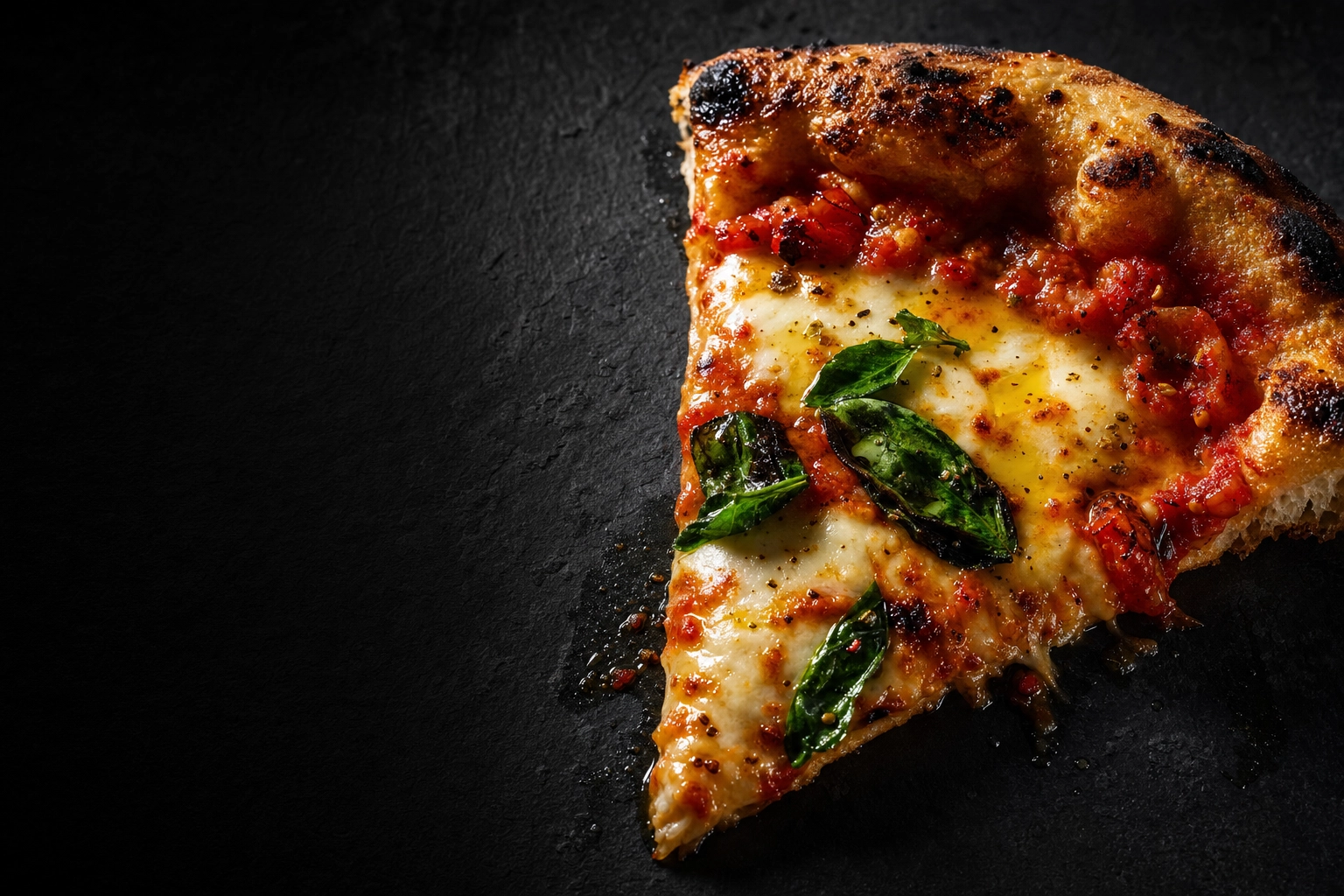 A single glossy dish shot on dark slate with dramatic side lighting and generous dark negative space, demonstrating where a food flyer headline would sit
Give the food room, then guard the negative space. Let the hero photo own 60–70% of the canvas, but deliberately reserve a clean zone — a solid color block, or a naturally quiet, out-of-focus area of the photo itself — for your headline. Text dropped over a busy patch of food is text nobody can read. Plan the empty space on purpose; don't hope for it.
Win the contrast battle. Headlines have to survive against a photo, so aim for a clear tonal gap: light text over the dark, shadowed part of a dish, or dark text over a bright, airy area. When a photo is too varied to place text cleanly, add a subtle gradient scrim — a soft dark-to-transparent fade along one edge — so the words stay legible without hiding the food.
One bright hero beats a busy collage. The single most common mistake on a food flyer is cramming six small photos into a grid. A collage shrinks every dish below "craving size" and splits the reader's attention six ways. One confident, appetizing shot, shown large, outperforms a mosaic almost every time. If you must show variety, show one hero and let a menu link or QR code carry the rest.
Limit fonts and pull color from the plate. Two typefaces maximum — one for the headline, one for details — and a two-to-three color palette drawn straight from the food (the char on a steak, the green of basil, the cream of a latte). Colors sampled from the dish make the whole flyer feel designed rather than decorated.
Print vs Social: Sizing Your Food Flyer for Where It Lives
A food flyer usually needs to live in two worlds — a physical handout and a social post — and they have different rules. Design once at high resolution, then export to each.
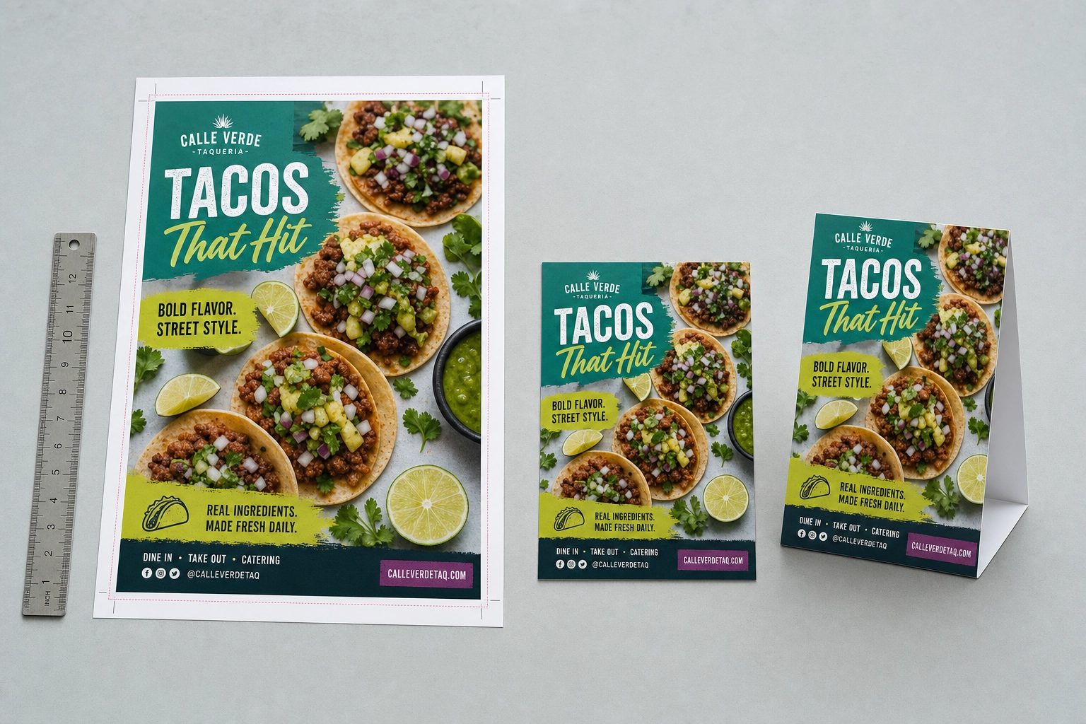 The same taco food flyer design reproduced at several print sizes with crop and bleed marks on a bright studio table, showing print versus social sizing
For print:
- 8.5 × 11" (US Letter) is the standard flyer size, and the safest for bulk printing.
- 5.5 × 8.5" (half-page) and 4 × 6" (handbill) suit table tents and street handouts.
- Internationally, A5 (5.8 × 8.3") and A4 (8.3 × 11.7") are the equivalents.
- Export at 300 DPI and add a 0.125" bleed if the photo runs to the edge. Screens look fine at 72 DPI; print does not.
For social:
- 1080 × 1350 (4:5 portrait) is the workhorse for Instagram and Facebook feeds — vertical wins more screen space.
- 1080 × 1080 (1:1 square) is the safe, everywhere-fits option.
- 1080 × 1920 (9:16) is for Stories and Reels.
Don't stretch a print layout into a vertical social frame and call it done — the composition breaks and your headline drifts off the food. Rebuild the same elements for each ratio. A good set of food flyer templates makes this quick: build the print and social templates once, then reuse them — same photo, same headline, re-flowed for the frame. This is how a busy restaurant keeps a whole year of flyers looking like one brand.
How Much Text Is Too Much
If you remember one rule, make it this: a food flyer is a billboard, not a brochure. The reader decides in about five seconds, often at thumbnail size, so every extra word is a reason to look away.
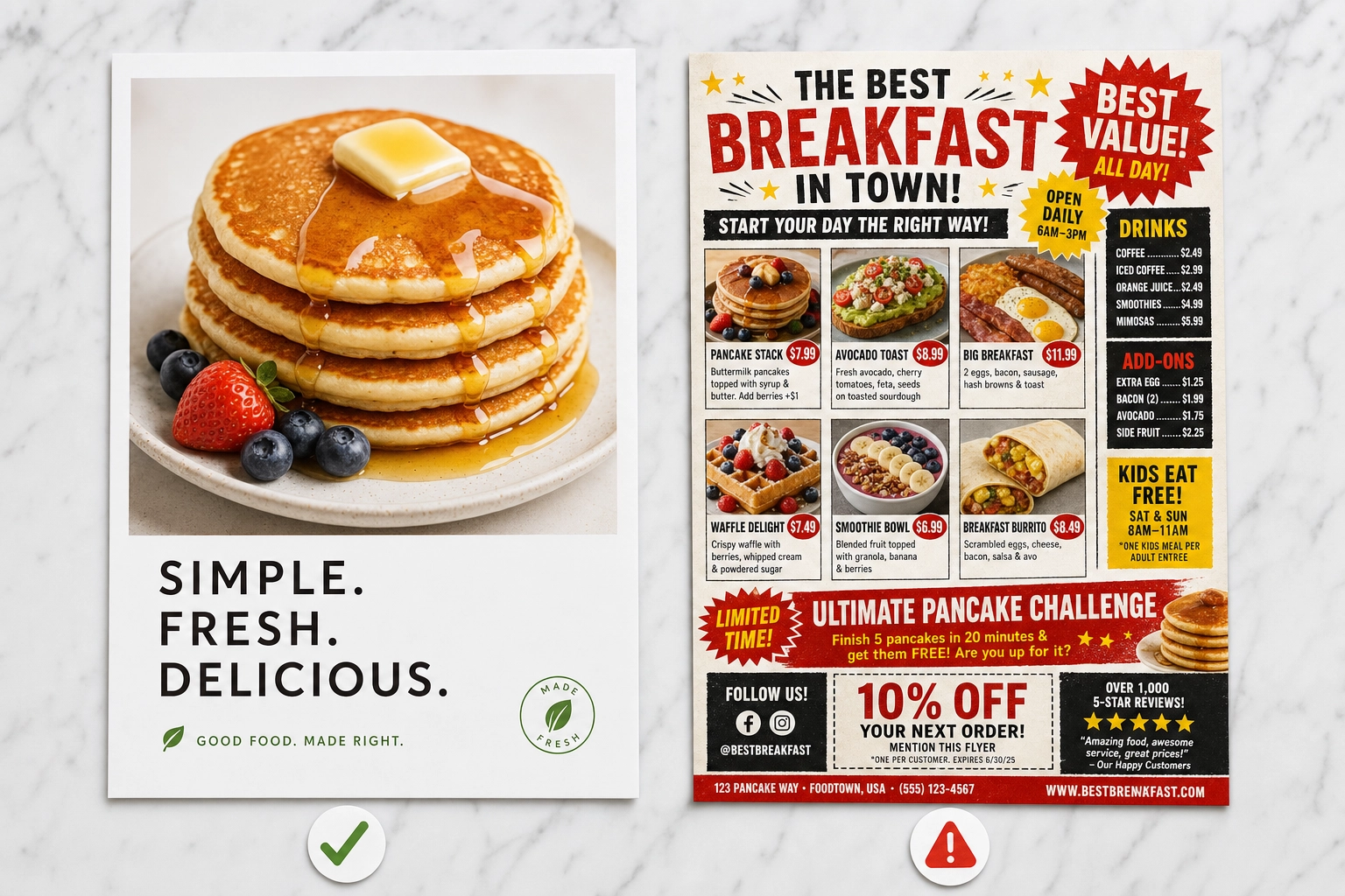 Two food flyers side by side on a marble surface, one clean and minimal with a single bold dish photo, the other cluttered with tiny text and a busy collage
Keep the headline to 3–6 words. Give the flyer exactly one offer, one call to action, and one block of details (date, time, price, or contact — whichever the occasion needs). Cut the descriptive paragraph entirely; the photo already says "this is delicious," so the words only need to answer what, when, and how to act.
A fast test: shrink the flyer to the size of a phone thumbnail. If you can still read the headline and understand the offer, it works. If you're squinting, you have too much text — or the food photo isn't dominant enough.
From Phone Photo to Finished Flyer with FoodShot Poster Mode
Everything above assumes you have one thing: a hero photo good enough to carry the flyer. That's where FoodShot comes in.
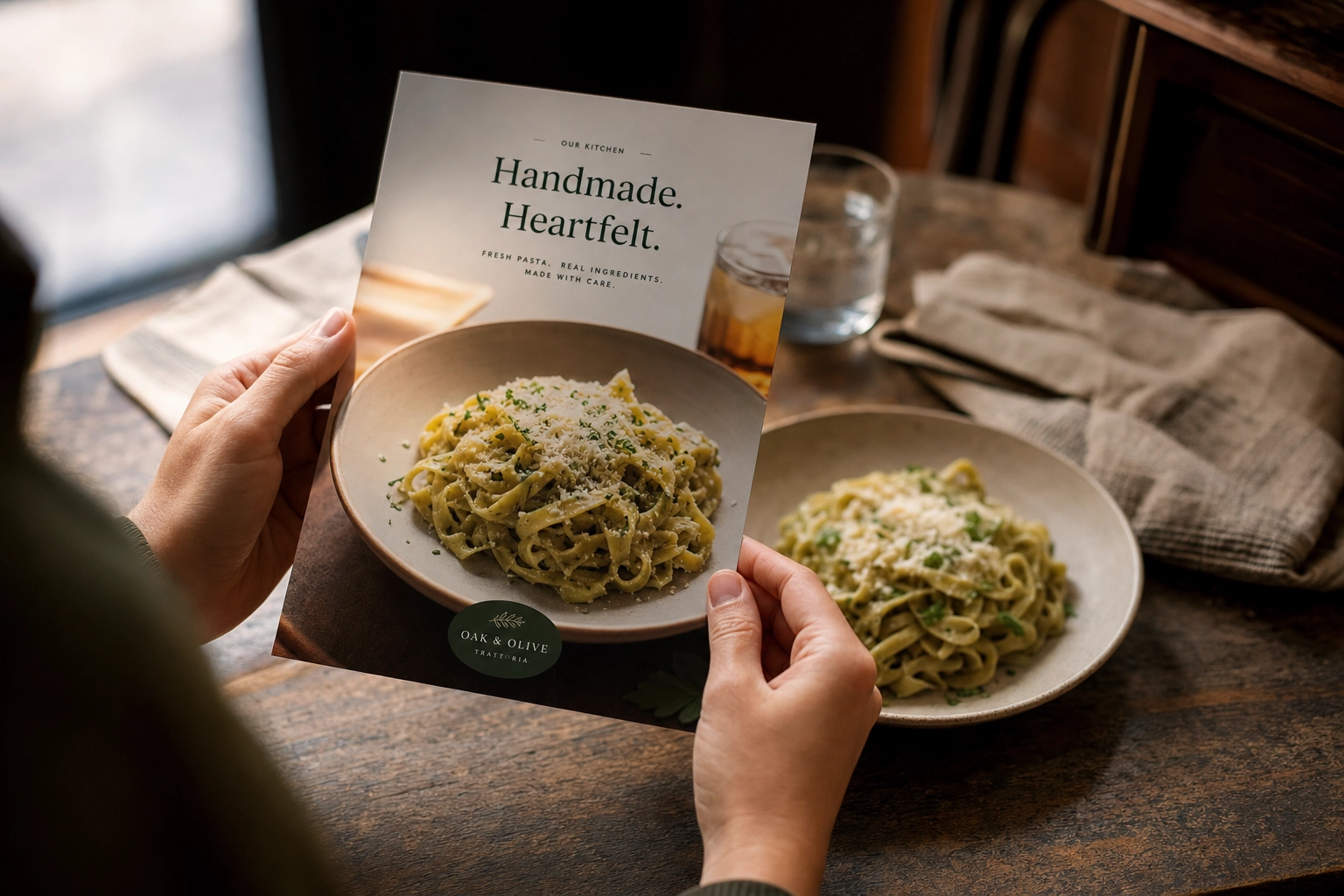 A restaurant owner's hands holding a freshly printed, polished food flyer above the same real plated dish on a bistro table, showing the photo-to-flyer result
Step 1 — Get a menu-ready hero shot. Upload a phone photo of the dish and apply a style from the 200+ style library across Delivery, Menu, and Fine Dining looks. In about 90 seconds you get a bright, studio-quality image — the exact kind of hero shot a flyer needs. You can explore the style library to match the mood to the occasion.
Step 2 — Drop it into Poster Mode. Poster Mode gives you marketing-ready templates built around a dominant food photo — the negative-space-and-headline structure this guide keeps coming back to. These templates already respect the craft rules, so a restaurant owner with zero design training still ends up with a balanced flyer. Prefer your own design? You can upload your own poster template and let FoodShot place the AI-styled food inside it, so a grand opening layout or a weekly-special frame stays consistent every time you swap the dish.
Step 3 — Export for where it's going. Output is print-ready at 4K resolution, so you can size the same artwork for an 8.5×11" handout or a 1080×1350 social post.
One important limit, stated plainly: FoodShot makes the artwork — it does not print flyers or ship any physical materials. You'll take the finished file to your own printer, or post it yourself. FoodShot is also food-and-beverage only; it's not a general design tool for non-food graphics. On the free plan, exports are watermarked and for personal use, so you'll want a paid plan for commercial rights — see FoodShot pricing for the tiers, and bakery promotions for how this looks for a specific business.
Frequently Asked Questions
What size should a food flyer be?
For print, 8.5 × 11" (US Letter) is the standard, with 5.5 × 8.5" and 4 × 6" as common smaller options, all exported at 300 DPI. For social, use 1080 × 1350 for feed posts, 1080 × 1080 for square, and 1080 × 1920 for Stories. Design once at high resolution, then export a version for each place the flyer will appear.
How much text should a food flyer have?
As little as possible. Aim for a 3–6 word headline, one offer, one call to action, and a single block of details (date, time, price, or contact). The food photo does the persuading; the text only needs to explain what the offer is and how to act on it. If it reads like a paragraph, cut it down.
Do I need a professional food photo for a flyer?
You need a photo that looks professional — which is not the same as hiring a photographer. A bright, sharp, appetizing hero shot is non-negotiable because it carries the flyer. Free food flyer templates are easy to find; a genuinely appetizing photo is the hard part. Tools like FoodShot can turn a phone snap into a menu-ready image in about 90 seconds, so even that is fixable, whether you run a restaurant, a cafe, or a food truck.
Does FoodShot print flyers?
No. FoodShot creates the flyer artwork — the styled food photo and the poster design — but it does not print flyers or produce any physical materials. You export the finished file and print or post it yourself through whatever printer or platform you use.
Can I reuse one food flyer template for weekly specials?
Yes, and you should. Build one clean template with a spot for the hero photo, the dish name, and the price, then swap those elements each week. Reusing a food flyer template keeps your specials visually consistent and cuts your weekly design time to a few minutes.
Are food flyers still effective in 2026?
Yes. Flyers remain one of the most immediate, tangible ways to promote a food business, and the same artwork now doubles as social content. The difference in 2026 is that the food photo has to be excellent — audiences scroll past anything that looks flat or generic, so the hero shot matters more than ever.