Restaurant Branding: Complete Visual Identity Guide (2026)
Your restaurant's food might be exceptional. But if your restaurant branding tells a different story — or worse, tells no story at all — you're leaving money on the table every single day.
Restaurant branding is the key process of building a cohesive identity that shapes how customers experience your business across every touchpoint. And in 2026, getting it right has never mattered more.
Quick Summary: Restaurant branding is the complete experience you create across every touchpoint, from your logo design and menu to your Instagram grid and Uber Eats listing. Brands that maintain consistency see up to 23% higher revenue. This guide walks you through building a cohesive visual identity that turns first-time visitors into loyal regulars — with actionable steps, real case studies from Shake Shack and Sweetgreen, and a complete branding checklist you can start using today.
What Restaurant Branding Actually Means (Beyond a Logo)
Restaurant branding isn't your logo. It isn't your color palette. It isn't even your interior design.
It's all of those things — plus everything else customers experience before, during, and after their meal. The smell when they walk in. The way your staff greets people. The font on your takeout bag. The quality of your food photos on DoorDash.
Here's the business case: according to a Lucidpress study of 400+ organizations, consistent brand presentation increases revenue by an average of 23%. Companies with high brand consistency scores grow at 2.4x the rate of inconsistent brands. That's not a marginal improvement — it's the difference between a restaurant that survives and one that thrives.
And in 2026, the stakes for restaurant branding are even higher. Research shows 72% of diners use social media to research restaurants before visiting, and 68% specifically check a restaurant's social media profiles before deciding where to eat. Your brand isn't just what people see when they walk through your door — it's what convinced them to come in the first place.
Think about it this way: your restaurant brand is a promise. The logo promises a certain experience. The menu design confirms it. The food photography reinforces it. The interior delivers it. And the Instagram post about it keeps the cycle going.
When every touchpoint tells the same story, customers trust you. When elements don't match, something feels off — even if people can't articulate why.
Define Your Restaurant Brand Foundation: Mission, Values, and Personality
Before you pick a single color or sketch a logo, you need to answer three questions that will shape every branding decision you make. This is the most important work in the entire brand-building process — skip it, and every design decision that follows becomes guesswork.
1. Why does your restaurant exist (beyond making money)?
This is your mission. Sweetgreen's is "connecting more people to real food." A neighborhood Italian spot might be "bringing Nonna's recipes to a community that deserves better than chain pasta." Whatever it is, make sure it's specific enough to guide decisions. Your mission is the starting point for everything that follows.
2. What do you stand for?
These are your core values — the non-negotiables that shape every choice your business makes. Common restaurant brand values include:
- Quality — sourcing the best ingredients, no shortcuts
- Sustainability — local sourcing, waste reduction, carbon consciousness
- Community — neighborhood gathering place, local partnerships
- Creativity — seasonal innovation, chef-driven experimentation
- Accessibility — great food at fair prices, welcoming to everyone
Pick 3-4 that genuinely describe your restaurant. Not aspirational buzzwords — actual truths about how you operate and work.
3. If your restaurant were a person, how would they act?
Brand personality makes your restaurant human and helps people connect emotionally. Try this exercise: pick 3-5 adjectives that describe how your restaurant feels. Not what you serve — how you make people feel.
A craft cocktail bar might be: sophisticated, witty, intimate, adventurous. A family breakfast diner might be: warm, unpretentious, reliable, generous. A fast-casual poke bowl spot might be: energetic, fresh, casual, playful.
These adjectives should guide every branding decision that follows. If your restaurant personality is "warm and unpretentious," a sleek minimalist logo design with sharp geometric lines would feel wrong — even if it looks beautiful in isolation.
Your brand identity statement formula:
We serve [specific audience] by providing [specific offering] because [why it matters].
Example: "We serve busy professionals in downtown Austin by providing chef-quality lunch bowls in under 5 minutes because eating well shouldn't require a 90-minute reservation."
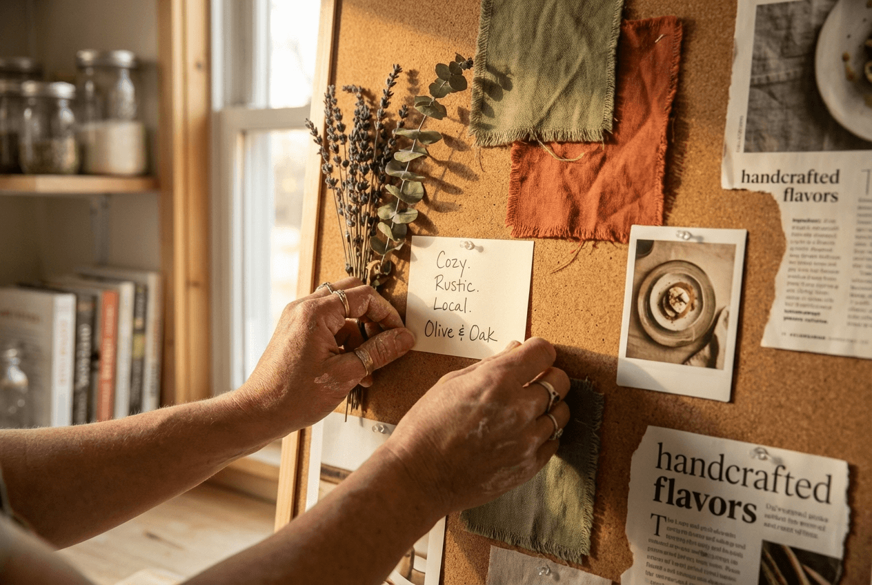 Restaurant owner building brand mood board with color swatches fabric samples and food inspiration
Restaurant Branding Visuals: Logo Design, Colors, and Typography
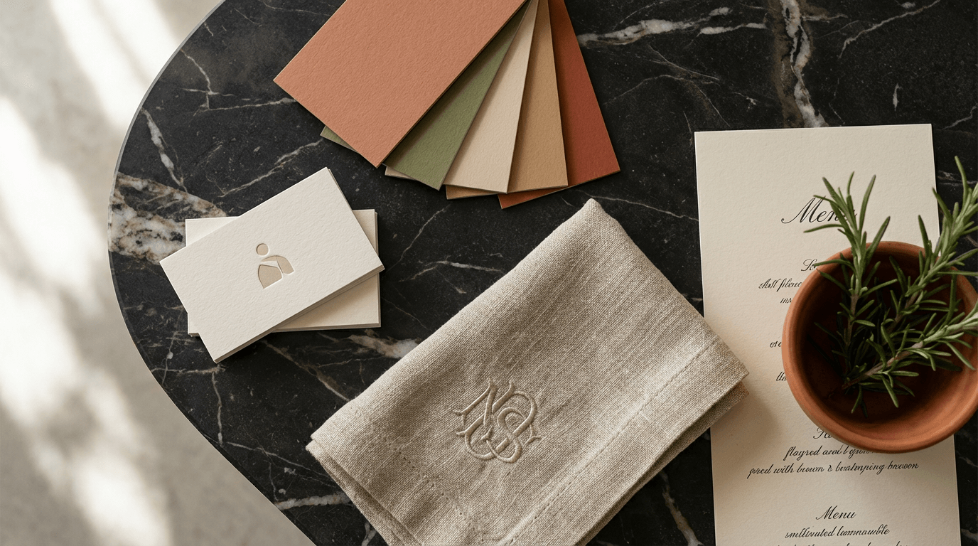
This is where your brand identity becomes visible. Your visual identity system needs to work everywhere — signage, menus, delivery platform listings, social media avatars, packaging, staff uniforms, and business cards.
Logo Design for Restaurants
Great restaurant logos share three key qualities:
- Simple enough to work at any size — from a billboard to a 44×44 pixel delivery app icon
- Memorable after one viewing — distinctive shape, unique character
- Appropriate to your brand personality — a fine dining restaurant and a taco truck shouldn't look interchangeable
The most common logo design mistake? Over-designing. A logo with too many details becomes a blur on a smartphone screen. And in 2026, smartphone screens are where most people first encounter your restaurant brand.
Budget reality: a freelance logo design runs $200–$5,000 in 2026. A full brand identity package from a boutique agency costs $5,000–$20,000. Premium agencies charge $20,000–$50,000+. The right investment depends on your scale — a single-location cafe has different needs than a concept planning multi-unit expansion.
Color Psychology for Restaurant Branding
Colors trigger specific emotional responses, and successful restaurants have used this for decades:
- Warm tones (red, orange, yellow) — stimulate appetite, create energy. Think fast-casual and family dining.
- Greens — communicate freshness, health, sustainability. Natural fit for farm-to-table and salad-forward concepts.
- Dark tones (black, navy, deep burgundy) — signal luxury, sophistication, exclusivity. Fine dining territory.
- Pastels and earth tones — suggest calm, artisanal, handcrafted. Popular with cafes and bakeries.
Research shows a consistent color palette boosts brand recognition by more than 80%. Pick a primary color, a secondary color, and 1-2 accent colors — then use them across everything. This is one of the most important elements of any restaurant branding project.
Typography as a Brand Element
Your font choice communicates more than you think:
- Serif fonts (Times New Roman, Garamond) — tradition, elegance, established credibility
- Sans-serif fonts (Helvetica, Futura) — modern, clean, approachable
- Handwritten/script fonts — artisanal, personal, creative
- Slab serifs (Rockwell, Archer) — bold, confident, contemporary casual
Choose 2-3 fonts maximum: one for headings, one for body text, and optionally one accent font. More than that creates visual chaos and weakens your brand identity.
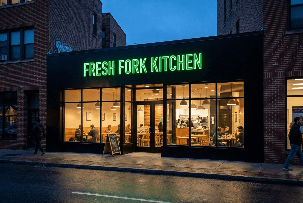 Modern restaurant storefront at dusk showing cohesive visual branding with illuminated signage and consistent design
Case Study: How Shake Shack Built a $1.6 Billion Restaurant Brand
Shake Shack's brand identity is a masterclass in restaurant branding — and it started completely by accident.
In 2001, restaurateur Danny Meyer set up a hot dog cart in New York's Madison Square Park to support the park's restoration. By 2004, it became a permanent kiosk. Paula Scher, a partner at Pentagram (one of the world's most respected design firms), was already redesigning the park's identity pro bono. She took on the Shake Shack branding project as part of that work.
Here's what made the brand design brilliant:
Architecture drove the design. Architect James Wines designed the original kiosk with corrugated stainless steel horizontal beams. Scher placed the typography between those metal bars — creating a visual identity that was inseparable from the physical structure. As she told Fast Company: "It was so accidental, because it was conceived for one specific location at that point in time."
The colors were deliberately contrarian. While virtually every fast food chain used red and yellow, Shake Shack chose black and a distinctive green (#1F5130). This wasn't arbitrary — it signaled that Shake Shack wasn't typical fast food. It was a key brand identity decision that helped create instant recognition.
The typeface matched the personality. Scher chose Neutraface — a font that communicates "approachable modernness." Not too formal, not too casual. Exactly the positioning Shake Shack occupies between fast food and fine dining.
It scaled without losing identity. Originally designed for a single location, the brand system proved flexible enough to work globally — from stand-alone restaurants to airport locations to stadium concessions. That's the mark of a successful, well-designed visual identity system.
The takeaway for your restaurant branding? Design for your specific context first. A brand that's authentically rooted in your story is more powerful than one assembled from generic templates.
Menu Design and Food Photography: Your Restaurant Brand on a Plate
Your menu is arguably your most important branding asset. Every customer interacts with it, and it directly drives revenue.
But here's what most restaurant owners miss: the visual quality of your menu — especially your food photography — may be the single highest-ROI branding investment you can make.
The numbers back this up. Studies show menus with professional food photography increase sales by 20–45%. And 60% of diners say plating aesthetics influence their perception of flavor before they even taste the food. Adding a signature item to your menu also boosts brand recall by 33%.
Why Food Photography Is a Restaurant Branding Decision
Food photos don't just show what you serve — they communicate who you are as a brand. Consider the difference:
- A dimly lit, slightly blurry smartphone photo of a burger suggests a place that doesn't sweat the details
- A bright, styled photo with visible texture and color pop suggests a place that takes pride in presentation
- A moody, dramatically lit photo with negative space suggests upscale, chef-driven dining
Each photo style positions your restaurant differently in a customer's mind — sometimes before they've read a single word on your menu items.
This matters even more on delivery platforms. On Uber Eats or DoorDash, your food photos are your storefront. There's no ambiance, no friendly host, no smell of fresh bread. Just a thumbnail image and a name. Restaurants with food delivery photography mistakes — poor lighting, cluttered backgrounds, inconsistent styling — lose orders to competitors with better visuals, even if the food isn't as good.
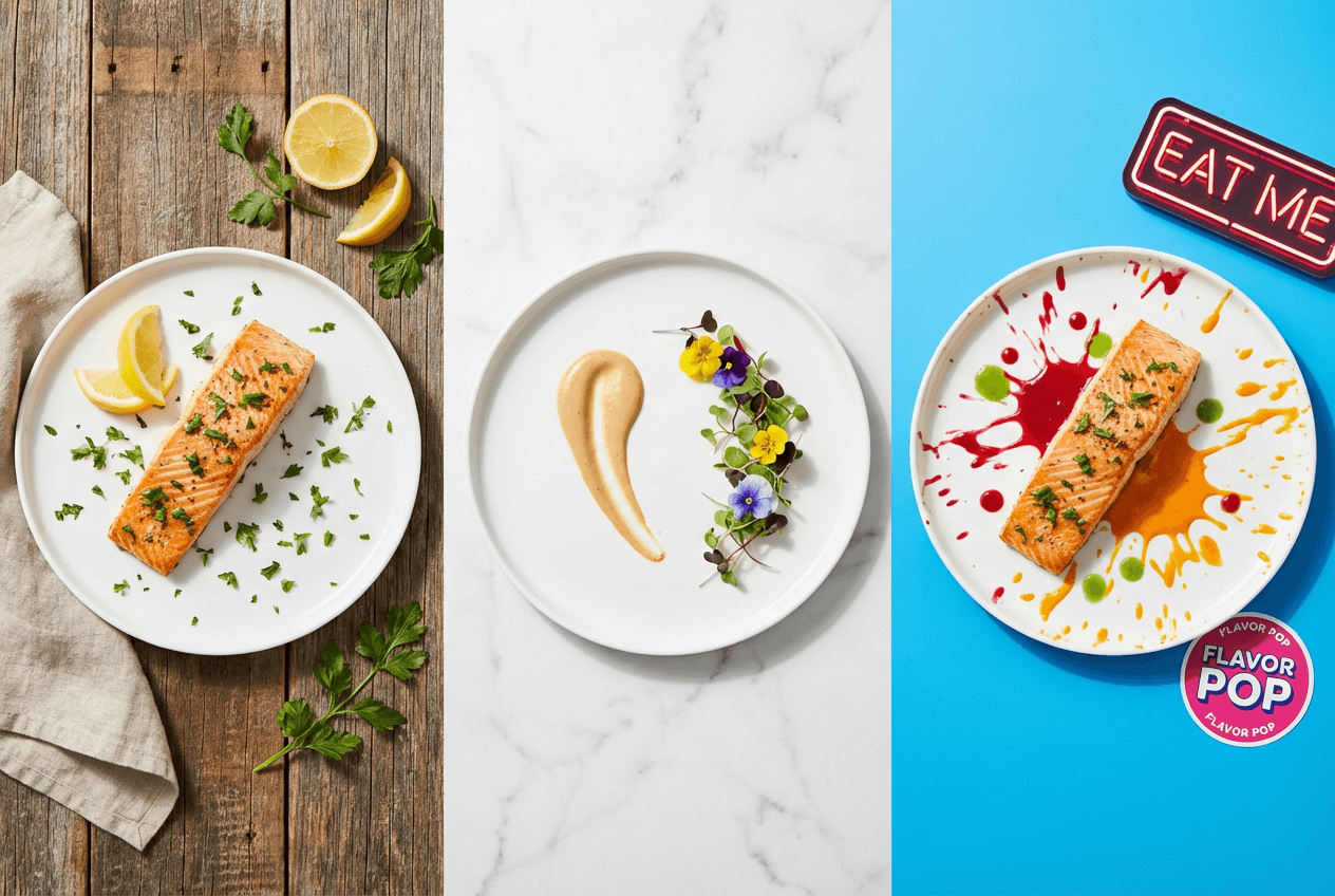 Three food photography styles showing how different visual treatments communicate distinct restaurant brand positioning
Making Food Photography Affordable and Brand-Consistent
Traditional food photography costs can be significant — professional sessions often run $500–$1,500+ for a single shoot. For restaurants that update menu items seasonally, that adds up fast.
This is where AI tools have changed the game for restaurant branding. With FoodShot AI's food photo editor, you snap a photo of your dish with any smartphone, choose a style preset that matches your brand positioning (Fine Dining, Instagram, Delivery-optimized, and 30+ others), and get a professionally styled result in about 90 seconds.
The key for branding: consistency. Instead of mixing photos from different photographers taken in different lighting conditions over different years, you can run your entire menu through the same style preset. Every photo shares the same lighting, mood, and visual treatment — which is exactly what brand consistency looks like in practice.
You can also swap backgrounds to match your brand aesthetic, adjust camera angles, and even clone the styling from reference photos you admire. For restaurants that want fine dining food photography quality without the studio cost, or cafe photography that looks polished and inviting, it's a practical solution that delivers results. Learn from our iPhone food photography tips to start getting better source photos for the process.
Interior Design and Ambiance: The Physical Restaurant Brand Experience
When a guest walks into your restaurant, every sensory detail either reinforces or contradicts your brand. Lighting, furniture, music, table settings, wall textures, even scent — it's all part of building a successful restaurant brand.
The goal isn't to create a "nice" space. It's to create a space that feels like your brand identity.
A restaurant that values sustainability should have materials, lighting, and decor that communicate environmental consciousness — reclaimed wood, natural light, living plants. A restaurant built around bold creativity might use unexpected furniture, rotating art installations, and dramatic lighting. The design elements should tell the same story your logo and menu tell.
The details matter more than people realize. If your logo and menu feel "rustic farmhouse" but your interior is sterile white tile with fluorescent lighting, something breaks in the customer's mind. They might not be able to name it, but they'll sense the disconnect — and that undermines the brand identity you've worked to build.
Design for the Camera
In 2026, every guest is a potential photographer and brand ambassador. User-generated content (customer photos shared on Instagram, TikTok, and Google reviews) drives 4x higher conversion than branded content. That means your interior isn't just for the people sitting in it — it's for the thousands of people who'll see it through phone screens.
Create at least one "Instagram moment" in your space — a feature wall, a unique lighting installation, a distinctive table setup. This isn't vanity. It's free brand marketing that generates itself every time customers tag your location.
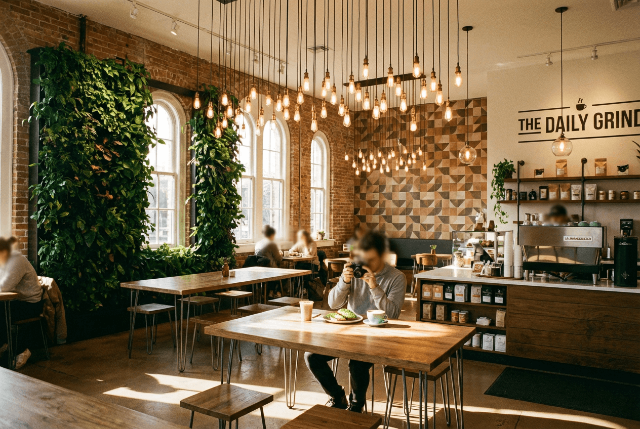 Thoughtfully designed cafe interior showing cohesive brand identity with living plant wall Edison lights and Instagram-worthy ambiance
Online Presence: Website and Social Media for Restaurant Branding
Here's a stat that should reshape your priorities: 72% of diners use social media to research restaurants, and 61% say TikTok food content specifically influences where they eat.
Your online presence isn't a nice-to-have. It's often the first brand experience a potential customer has with your restaurant business.
Your Restaurant Website
Your website should look and feel like walking into your restaurant. That means:
- Colors and fonts that match your physical brand identity
- Food photography that reflects your current menu (not two-year-old photos)
- Copy and tone that match your brand personality
- Mobile-first design — most people will find you on their phone
At minimum, your website needs: hours, location, menu (with photos), reservation or online ordering capability, and contact info. Everything else is secondary. Make sure the design elements on your website create a consistent experience with your other brand touchpoints.
Social Media as Restaurant Brand Expression
Each social media platform offers a different branding opportunity for your restaurant:
Instagram is your visual portfolio. Your grid should have a consistent aesthetic — similar lighting, colors, and composition across posts. This doesn't mean every photo looks identical; it means they look like they belong together. Learn more in our guide to best restaurant social media campaigns.
TikTok is your personality stage. Behind-the-scenes kitchen footage, chef spotlights, plating close-ups — this is where brand personality shines through motion and authenticity. With 61% of diners influenced by TikTok food content, this is a key channel for restaurant marketing ideas.
Pinterest is your discovery engine. 80% of weekly Pinterest users discover new brands on the platform. Pin your best food photography, interior shots, and seasonal specials.
Google Business Profile is your credibility anchor. Fresh photos, updated hours, and responded-to reviews signal a brand that cares about its customers. Research shows 73% of diners will choose a competitor if a restaurant doesn't respond to online messages.
The key across all platforms: visual and verbal consistency. Use the same profile photo (your logo), consistent brand colors in graphics and templates, and maintain a unified tone of voice. When someone encounters your brand on Instagram, then checks your website, then finds you on Uber Eats — the experience should feel connected. For more strategies, read our social media marketing for restaurants guide.
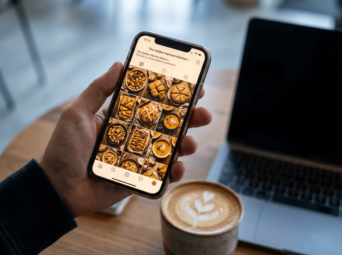 Restaurant owner reviewing consistent social media food photography grid on smartphone for brand cohesion
Delivery Platform Branding: The Overlooked Restaurant Touchpoint
This might be the biggest branding blind spot in the restaurant business right now.
Millions of customers discover restaurants through Uber Eats, DoorDash, and Grubhub — and your listing on those platforms is, for many people, the only impression of your brand they'll ever see. No interior ambiance. No smiling host. Just:
- A hero image
- Menu item photos
- Your restaurant name and description
- Customer reviews
Most restaurants treat delivery profiles as an administrative afterthought. The hero image is something the owner snapped on their phone two years ago. Menu items have inconsistent photos — or no photos at all. The description is generic.
This is a massive competitive advantage for restaurants that get branding right on these platforms.
How to Brand Your Delivery Presence
- Use a professional hero image that communicates your brand positioning (not just "a photo of food")
- Photograph every menu item with consistent lighting, styling, and backgrounds
- Write descriptions that match your brand voice — not generic ingredient lists
- Maintain consistency across all platforms — the same photos, same descriptions, same brand story
For a complete walkthrough, see our guide to menu photos for Uber Eats and DoorDash.
The challenge is maintaining brand consistency when you have dozens of menu items across multiple delivery platforms. This is where AI food photography tools become practical — run all your dish photos through the same style treatment, and every listing looks cohesive. Update one item? Process the new photo with the same preset, and it fits seamlessly into your existing visual library.
For restaurants on food delivery apps, consistent branding isn't just about looking professional — it directly impacts order volume and builds your restaurant brand with every customer interaction.
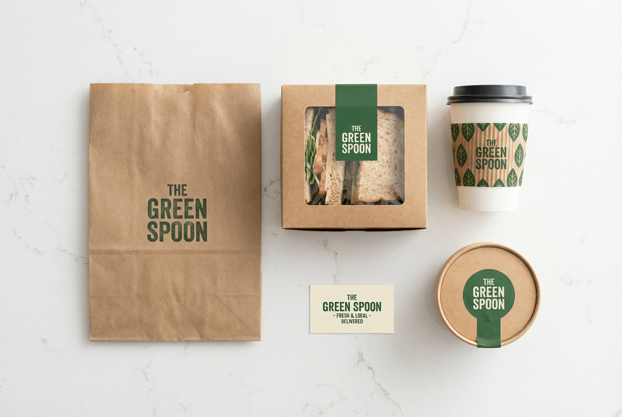 Branded restaurant delivery packaging including bags boxes and cups showing consistent visual identity for takeout orders
Brand Voice and Messaging for Restaurants
Visual identity gets most of the attention in restaurant branding, but your verbal identity matters just as much. Brand voice is how your restaurant "sounds" — in menu descriptions, social media captions, website copy, email newsletters, signage, and even how your staff talks to customers.
Define Your Tone Spectrum
Think of tone as a set of sliding scales:
- Formal ←→ Casual
- Serious ←→ Playful
- Traditional ←→ Innovative
- Exclusive ←→ Inclusive
A craft cocktail bar might sit at: casual, playful, innovative, slightly exclusive. A heritage steakhouse might sit at: formal, serious, traditional, inclusive.
Once you've placed yourself on these scales, create a practical "we say / we don't say" guide for your team:
| We Say | We Don't Say |
|---|---|
| "Crafted with locally sourced ingredients" | "Made with fresh stuff" |
| "Join us for happy hour" | "Come get cheap drinks" |
| "Our chef's seasonal creation" | "New special" |
This guide should be shared with everyone who writes or speaks for your brand — from the person managing Instagram to the person writing menu descriptions to the host greeting customers at the door.
Consistency Between Verbal and Visual Brand Identity
Your voice and visuals need to match. A restaurant with a rustic, handwritten logo shouldn't use corporate jargon in its social media captions. A sleek, minimalist brand shouldn't use exclamation points and emojis in every post.
When verbal and visual identity align, the brand feels real. When they don't, customers sense inauthenticity — even if they can't pinpoint why. This alignment is what separates successful restaurant brands from forgettable ones.
Case Study: Sweetgreen — Mission-Driven Restaurant Branding at Scale
If Shake Shack shows how design creates brand recognition, Sweetgreen shows how mission creates brand loyalty.
Founded by three Georgetown University seniors who opened a 500-square-foot salad restaurant, Sweetgreen grew to 220+ locations by building a restaurant brand around a clear mission: "connecting more people to real food."
When the company partnered with COLLINS (a San Francisco and New York-based strategy and design consultancy) for a comprehensive rebrand, they didn't start with colors or fonts. They started with four pillars:
- Food sourcing — transparency about where ingredients come from
- Sustainability — journey toward carbon neutrality
- People — team member experience (happy staff = happy customers)
- Cultural connections — partnerships with chefs, athletes (Naomi Osaka), and communities
The visual system COLLINS created reflected these values. As designer Alex Wallace explained: "The Sweetgreen identity builds on what was already strong — key elements like a core palette of greens and the logo. It will still feel familiar to anyone who already loves the brand."
The specifics: bright, produce-inspired colors; vintage-style illustrations reminiscent of hand-painted cookbooks; two custom typefaces (SweetSans and Grenette); and organic typography that suggests handcrafted care. This wasn't decoration — every visual choice was tied back to the mission of real food and real ingredients.
The rebrand was successfully implemented across every touchpoint: store design, signage, marketing, advertising, social media, digital products, app design, packaging, and team uniforms. When Sweetgreen went public in November 2021, shares surged approximately 75% on the first day of trading.
The lesson for your restaurant: A brand built on genuine values — and expressed consistently across every touchpoint — creates emotional connection that transcends the food itself. People don't just eat at Sweetgreen. They identify with Sweetgreen. That's the power of mission-driven restaurant branding.
Your Restaurant Branding Checklist
Use this as a working document to start building or refining your brand. Check off items as you complete them, and revisit quarterly to make sure your brand stays consistent across all touchpoints.
🏗️ Brand Foundation
- Mission statement (one clear sentence)
- Core values (3-4 non-negotiable principles)
- Brand personality (3-5 adjectives)
- Target audience profile (who specifically you serve)
- Brand statement (audience + offering + why)
- Competitive positioning (how you're different from nearby restaurants in your market)
🎨 Visual Identity Elements
- Logo design (primary version + simplified icon version for small displays)
- Color palette (primary, secondary, and 1-2 accent colors with hex codes)
- Typography (heading font + body font, no more than 3 total)
- Brand guidelines document (how and where to use each element)
- Social media templates (consistent frames/layouts for posts and stories)
📸 Food Photography
- Menu item photos (every item, consistent style and branding)
- Lifestyle and ambiance photos (interior, exterior, action shots)
- Social media content library (20+ ready-to-post images)
- Delivery platform photos (optimized for Uber Eats, DoorDash requirements)
- Seasonal and special menu photo updates (quarterly minimum)
🏠 Physical Space
- Interior design aligned with brand values and personality
- Signage (exterior + interior wayfinding)
- Staff uniforms that reflect brand identity
- Takeout packaging (bags, boxes, napkins with consistent branding elements)
- Table settings and food presentation standards
- At least one photo-worthy feature for customer-generated content
💻 Digital and Online Presence
- Website with brand-consistent design and current food photos
- Instagram profile (consistent grid aesthetic)
- TikTok presence (behind-the-scenes, personality content)
- Google Business Profile (current photos, responded reviews)
- Delivery platform profiles with professional, consistent photos
- Email template (matching brand visuals and voice)
🗣️ Voice and Messaging
- Tone guidelines document (where you sit on formal/casual, serious/playful scales)
- "We say / we don't say" reference sheet for your team
- Menu description style guide
- Social media voice guide (with platform-specific adjustments)
- Staff training on brand language and values
🔍 Ongoing Brand Review
- Quarterly brand audit across all touchpoints
- Annual food photography refresh (at minimum)
- Competitor brand monitoring in your market
- Customer perception surveys (does your restaurant brand land the way you intend?)
Frequently Asked Questions
How much does restaurant branding cost?
It depends on scope and who you hire. A freelance logo design runs $200–$5,000 in 2026. A complete brand identity package (logo, colors, typography, guidelines, templates) from a boutique agency costs $5,000–$20,000. Premium agencies with strategy work charge $20,000–$50,000+. You don't need to spend a fortune — a clear brand foundation with consistent execution matters more than expensive design.
For food photography specifically, traditional vs AI food photography comparisons show that AI tools like FoodShot can deliver professional results starting at $15/month, versus $500–$1,500+ per traditional photo shoot. For detailed pricing, see our complete food photography cost guide.
What are the most important elements of restaurant branding?
Start with brand foundation (mission, values, personality) — everything else flows from there. After that, the highest-impact visual elements are: (1) food photography (especially for delivery and social media), (2) logo design and color palette, (3) website design, and (4) social media presence. Interior design matters enormously for dine-in restaurants, but photos are what drive people through the door in 2026.
How often should I update my restaurant brand?
Major rebrands should happen every 5-10 years (or when your brand identity no longer reflects who you are). But refreshes should happen continuously: update food photography at least quarterly, refresh social media content weekly, audit delivery platform listings monthly. The goal is to keep your restaurant brand current without losing the recognition you've worked to build.
Can small restaurants compete with big chains on branding?
Absolutely — and in many cases, small restaurants have a branding advantage. Chains are constrained by corporate guidelines and committee decisions. Independent restaurants can be authentically themselves, move fast, and build genuine community connections that no chain can replicate. Consistent execution of a clear, authentic brand beats a big budget every time. Start by learning iPhone food photography tips and traditional vs AI food photography approaches to create professional visuals on any budget.
How does food photography affect restaurant branding?
Massively. Professional food photography increases menu sales by 20–45%, and 60% of diners say plating aesthetics influence their flavor perception. On delivery platforms, food photos are literally your storefront — they're the primary factor in whether customers order from you or scroll past. Investing in consistent, brand-aligned food photography through tools like FoodShot's AI food photo editor or professional shoots is one of the highest-ROI branding moves a restaurant can make.