How to Design a Restaurant Menu (2026 Guide)
 Ali Tanis19 min read
Your menu isn't just a list of what you sell — it's the most-read document in your restaurant. Every guest holds it, studies it, and makes a decision from it. Design it well and it quietly nudges customers toward the dishes you most want to sell. Design it carelessly and it leaves money on every single table.
Learning how to design a restaurant menu means treating it as a sales tool, not a formality. This guide takes you from blank page to finished layout: how to structure it, engineer it for profit, price it, choose type and color, and — the part most guides gloss over — how your photography choices make or break the whole thing. The principles apply whether you're building a printed bistro menu, a website, a QR code menu, or a delivery-app listing — and whether you run a café, a food truck, a catering business, a ghost kitchen, or a white-tablecloth room.
Quick Summary: Designing a restaurant menu well means combining four skills: smart layout (guide the eye with hierarchy and whitespace), menu engineering (feature your high-profit, high-popularity "Stars"), pricing psychology (drop the dollar signs and write sensory descriptions), and photography (consistent, appetizing shots on the right items — not every item). Get all four right and your menu becomes your hardest-working salesperson.
How to Design a Restaurant Menu: Start With Strategy, Not Fonts
The most common menu design mistake is opening a design tool before you've made a single strategic decision. A menu is the physical expression of your restaurant's concept, so start there.
Answer these before you touch a template:
- What's your concept and service style? A fast-casual taqueria, a neighborhood trattoria, and a tasting-menu fine-dining room need completely different menus. Casual concepts can carry bold fonts, bright color, and photos. Upscale rooms lean on whitespace, restraint, and words.
- Who is your ideal guest, and what do they care about? Families scanning for value read a menu differently than food-obsessed customers hunting provenance and technique.
- What's your price point? This drives everything from paper stock to whether you show photos at all.
You also need to decide which menus you're actually building. In 2026, most restaurants run several at once: a printed in-house menu, a website menu, a QR code menu, and one or more delivery-app listings. They share a brand, but they don't share rules — a delivery app is a purely visual, scroll-and-tap experience, while a printed fine-dining menu is a quiet, typographic one. If digital screens are part of your setup, our guide to digital menu boards covers those specifics.
Get the strategy right, and every later decision — layout, pricing, photos — gets easier.
Step 1: Curate the Menu Before You Design It
A menu is a list before it's a layout. Nail the list first.
Trim ruthlessly. More options feel generous but actually hurt you. Choice overload makes customers anxious and slow, bloats your inventory, and drags down kitchen execution. Smaller, focused menus are easier to run, easier to order from, and usually more profitable. A widely used rule of thumb is around seven items per category — enough to feel like a real choice, few enough to decide quickly.
Group into logical sections. There are two common approaches:
- By course (Starters → Mains → Desserts) suits upscale, sit-down restaurants with smaller menus.
- By type (Salads, Sandwiches, Bowls, Sides) suits casual spots and larger menus where guests scan for a category.
Decide how much to say. A "12-inch cheese pizza" and a "wood-fired pie with San Marzano tomato, fior di latte, and torn basil" describe the same dish at very different price points. Match the level of detail to your audience — foodies reward description, hungry families reward clarity — but keep the content on each line simple enough to scan in a few seconds.
Hunting for restaurant menu design ideas? Start by collecting menus you admire from places in your own category, then study what they leave off the page, not just what they include. The best menus feel effortless because someone made hard cuts before they ever started creating a menu.
Step 2: Engineer Your Menu for Profit
Here's where restaurant menu design stops being decoration and starts being strategy. Menu engineering is the discipline of building a menu around the numbers — and it's the backbone everything else supports.
Developed by Michigan State University professors Michael Kasavana and Donald Smith in 1982, menu engineering plots every item on two axes:
- Profitability — the contribution margin (menu price minus food cost).
- Popularity — the menu mix (how often it sells).
That gives you four categories:
- Stars — high profit, high popularity. Your signature winners. Protect them, feature them prominently, and never discount them. These are the dishes that earn the best real estate and the rare photo.
- Plowhorses — low profit, high popularity. Crowd-pleasers that don't make you enough. Tweak the portion, re-cost the recipe, nudge the price up, or pair them with a high-margin side or drink.
- Puzzles — high profit, low popularity. Profitable dishes nobody orders. This is a design problem: reposition them, rename them, write a better description, or feature them so they finally get seen.
- Dogs — low profit, low popularity. They clutter the menu and slow the kitchen. Rework them or cut them.
The payoff: once you know your Stars and Puzzles, you know exactly which items deserve the eye-magnets, the best placement, and the photography budget. Everything downstream serves this map.
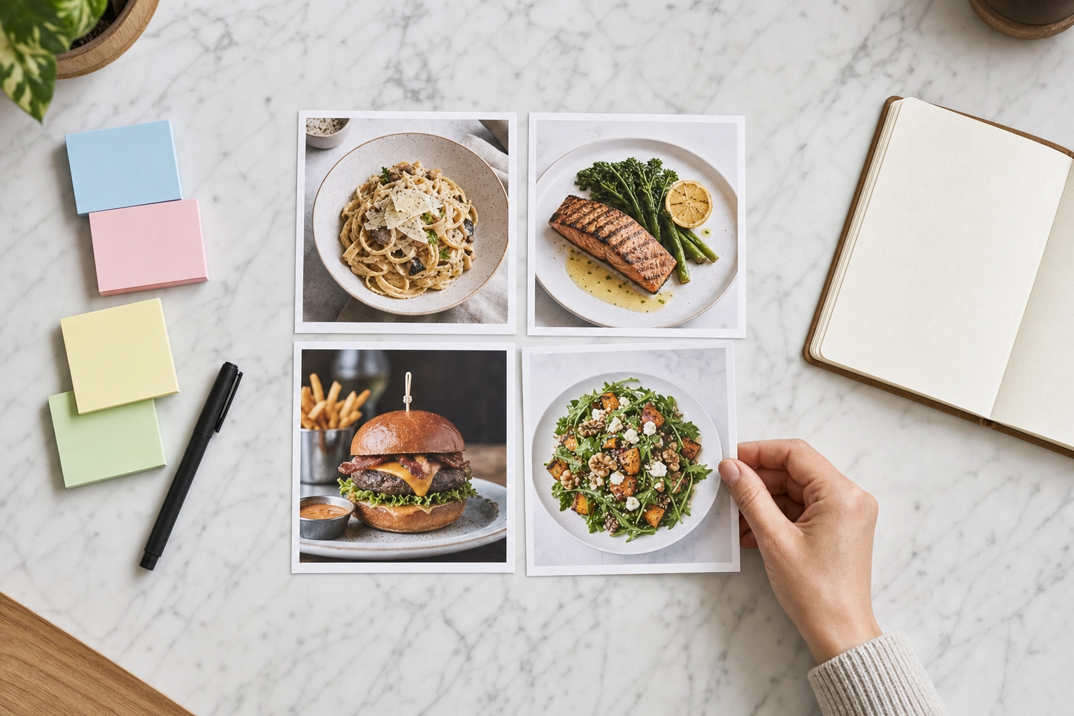 Four printed dish photos arranged in a grid on marble to sort menu items by profit and popularity
Step 3: Lay Out the Page (and the Truth About the "Golden Triangle")
Open almost any menu design article and you'll read about the "golden triangle" or "sweet spot" — the idea that eyes land in the center, dart to the top-right, then the top-left, so you should hide your best items there. It's one of the most repeated ideas in restaurant menu design. It's also mostly a myth.
That claim traces back to a 1987 Gallup study, but when San Francisco State researcher Sybil Yang actually tracked diners' eyes in a 2012 study, she found something different: people read menus like a book — top to bottom, in order. There was no magic hot zone where attention pooled. She did find a "sour spot" that got the least attention. In her words, the golden triangle was "like a bad rumor that just kept perpetuating."
So what actually works?
- Use the serial-position effect. People pay the most attention to the first and last items in a list. Put your Stars and Puzzles at the top and bottom of each section, not buried in the middle.
- Create real eye-magnets. Draw attention with a box or border, subtle shading, a color accent, an icon, or generous whitespace around an item — the content you most want customers to notice. A single, well-placed photo is the strongest magnet of all, which is exactly why you use it sparingly (more on that below).
- Give the page room to breathe. Whitespace isn't wasted space; it increases attention on what remains. Crowded menus get skimmed and abandoned.
- Don't line prices up in a column. A right-aligned price column with leader dots invites customers to scan by price and order the cheapest thing. Instead, "nest" each price right after its description in the same size and weight, so the dish sells first and the price is an afterthought.
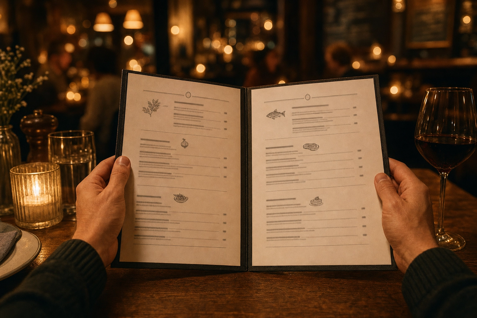 Diner holding an open bistro menu with clear sections and whitespace in a warm candlelit restaurant
Step 4: Write and Price Like a Behavioral Economist
Words and numbers do as much selling as the layout does.
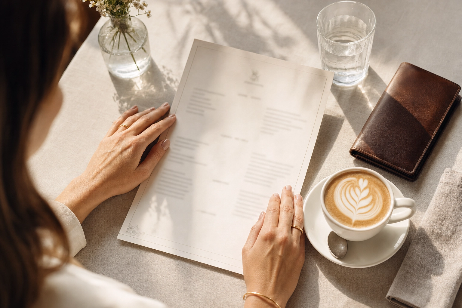
Write descriptions that trigger the senses. A landmark six-week field study by Brian Wansink and colleagues found that descriptive menu labels — think "succulent Italian seafood fillet" or "Grandma's zucchini cookies" — increased sales by 27% versus plain names, and left diners happier with the food. Using sensory words (crispy, slow-braised, velvety), provenance ("Gulf shrimp," "Vermont cheddar"), and the occasional nostalgic or house name does real work. Skip empty superlatives like "world's best" — customers have learned to ignore them.
 Overhead of a sunlit café table with hands resting on a one-page menu, coffee, and a leather bill holder
Drop the dollar signs. In a well-known Cornell University study, guests handed a menu with prices written as plain numerals ("24") spent about $5.55 more — roughly 8% — than guests whose menus used "$24.00" or "twenty-four dollars." The theory: currency cues trigger the "pain of paying." Formatting prices as clean numerals keeps the focus on the food.
Use price psychology deliberately:
- Charm vs. whole numbers. Prices ending in .95 or .99 signal value and deals; whole numbers (18, not 17.95) signal quality and confidence. Choose based on your positioning.
- Anchor high. One premium item — a $95 tomahawk, a rare-vintage pour — makes everything around it look reasonable and lifts what customers are willing to spend.
- Decoy pricing. Place a slightly-worse-value option next to the dish you want to sell, and the target suddenly looks like the smart buy.
Use icons, not extra sections. Small symbols for vegetarian, vegan, gluten-free, or spicy keep the menu compact and let one grilled salad serve every table, instead of splintering the menu into diet-specific lists.
Step 5: Choose Typography, Color, and Materials
Now the visual layer — and here, restraint reads as quality.
Typography:
- Legibility first. If a guest has to squint, you've failed. Use comfortable sizes and enough line spacing (leading).
- Limit yourself to one or two fonts — typically one display or brand font for headers and section titles, and one clean, readable font for descriptions. More than two starts to look chaotic.
- Build a hierarchy: section headers, then dish names, then descriptions, then prices, each visually distinct so the eye can navigate at a glance.
- Avoid long stretches of ALL CAPS in descriptions; they're slower to read.
Color. Color psychology is suggestive, not magic, but it's real enough to use with intent:
- Reds, oranges, and yellows are warm, attention-grabbing, and associated with appetite.
- Greens read as fresh, seasonal, and healthy.
- Black and deep tones signal sophistication and upscale dining.
- Blue tends to suppress appetite — use it sparingly unless you're a seafood brand.
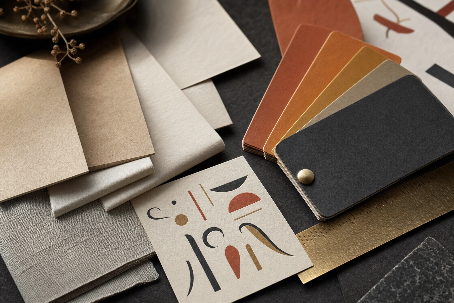
The best menu designs pick one or two colors and commit. Match everything to your brand and medium: fonts, colors, and paper stock should echo your logo, your interior, and your price point. And design for where the menu lives — heavy contrast and generous sizing for print; screen-friendly contrast, tap targets, and dark-mode legibility for digital and QR menus.
 Close-up of menu design materials — paper stock samples, warm color swatch chips, and a brass ruler
Step 6: Photography — The Detail That Makes or Breaks a Menu
This is the part most menu design guides wave at and move on. It's also where restaurants win or lose the most orders — so we'll go deep. A photo is the single strongest eye-magnet on any menu and the most persuasive content on the page, and it's the easiest thing to get wrong. Three questions decide whether photos help you or hurt you: when, how many, and how consistent.
When to Use Photos Depends Entirely on the Format
- Delivery apps: photograph everything. Uber Eats, DoorDash, and Grubhub are purely visual — no photo means no sale, because the image does the selling before the food ever arrives. Listings with strong photos consistently out-convert text-only ones (uplifts are commonly cited in the 25–35% range for a featured item), and the apps' algorithms favor complete, well-photographed menus. If delivery is a channel for you, our guide to getting more orders on Uber Eats and our delivery app photography page cover the specs.
- Casual, family, tourist-heavy, and international spots: photos help. When customers don't recognize a dish or don't share the language, a photo removes hesitation and speeds up ordering.
- Fine dining and upscale: use few photos, or none. Here, photos can work against you. A photo-heavy menu reads as fast-food and value, which quietly lowers perceived quality. Upscale rooms sell with words, typography, and whitespace instead. (See how we think about fine dining menu photography when images are used at all.)
How Many Photos: Less Is Usually More
Photographing every item is one of the most common menu mistakes. On a printed sit-down menu, feature only a handful of dishes — as a rule, no more than about 20–30% of the menu, and often just your top few. So choose carefully. Which ones? Your Stars and Puzzles from Step 2: the high-margin winners and the profitable dishes you want to push — whether that's your signature burgers, your wood-fired pizza, or your plated desserts. A single photo on a page pulls the eye straight to whatever it shows, so spend that power on items that make you money.
Consistency Is Everything
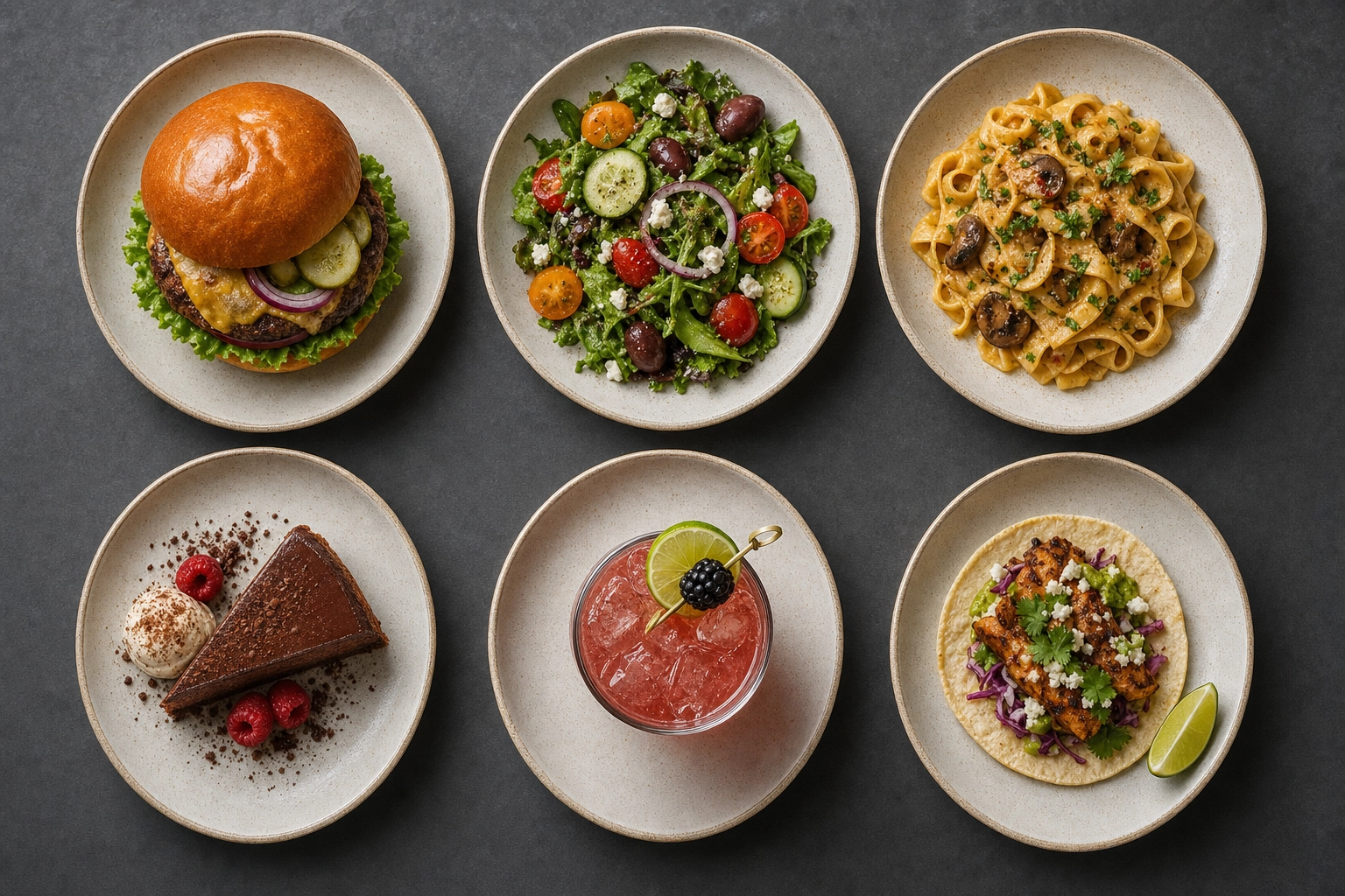
This is where most restaurants fall apart. When one dish is shot in warm daylight on marble and the next is shot under yellow kitchen light on a bare table, the whole menu looks amateur — and it chips away at trust in your brand. Every photo should share the same lighting, angle, background, and styling so the set reads as one cohesive collection. Consistency is what separates a menu that looks professionally art-directed from one that looks thrown together.
The Photos Have to Be Good — and Honest
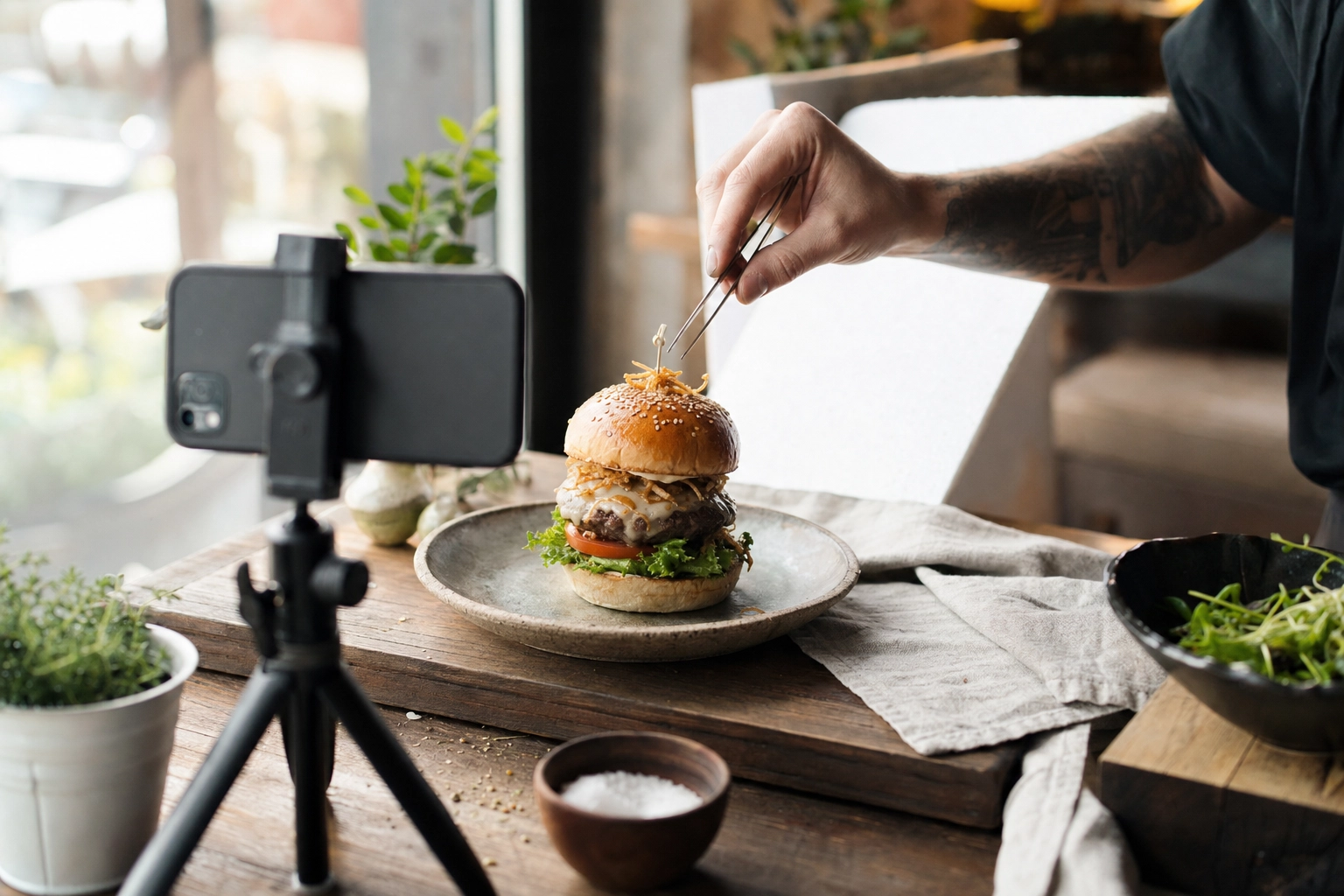
Menu photography needs to be appetizing, sharp, well-lit, and high-resolution (4K if it's going to print). It also has to match the real dish: delivery platforms will reject images that misrepresent what shows up in the bag, and customers punish "menu versus reality" gaps with bad reviews. The goal isn't fantasy food — it's your real dish, looking as good as it actually tastes.
Historically, hitting that bar meant hiring a photographer for a day, spending real money, and waiting weeks — then repeating it every time a dish changed. That's why so many menus mix one polished pro shoot with a pile of mismatched phone snaps. It doesn't have to be that way anymore, which brings us to the fix at the end of this guide.
 Smartphone on a tripod photographing a plated gourmet burger in a bright window-lit food shoot setup
Turning Your Design Into a Finished Menu
With the thinking done, production is the easy part. You have two routes for creating a menu: start from a template in an online menu maker and customize it yourself, or hand your layout, brand assets, and photos to a professional designer. For most independent restaurants and small food businesses, a good menu maker gets you 90% of the way there — browse the templates, pick one that fits your concept, then swap in your logo, set your brand colors and fonts, drop in your descriptions and prices, and place your handful of hero photos. Modern templates make this genuinely simple, and the best designs come from restraint, not from using every feature on the toolbar.
Then download and export a version for each place your menu lives:
- Print: a high-resolution, print-ready PDF (CMYK, with bleed) for professional printing on your chosen paper stock.
- Website: a fast-loading, mobile-friendly page or an embedded PDF that's easy to read on a phone.
- QR and digital: a screen-optimized version you can update online in seconds — no reprint required.
- Delivery apps: individual dish images sized to each delivery app's specs, uploaded straight into your menu manager. The same photos can carry across to your social media, too.
Keep one master file so every version you create stays in sync the moment a price or a dish changes.
Step 7: Test, Measure, and Keep It Alive
A menu is never "done." The best operators treat it as a living document.
- Re-run your menu engineering every quarter. Sales and food costs move; your Stars and Dogs will change with them.
- Update seasonally, both to use better ingredients and to give regulars and new customers a reason to come back.
- A/B test on digital and delivery, where you can measure the effect of a new name, price, or photo on actual orders.
- Refresh photos whenever a dish changes. On printed menus that's a reprint; on digital and QR menus it's instant — which makes staying current genuinely easy.
Common Restaurant Menu Design Mistakes to Avoid
Steer clear of these and you're already ahead of most operators. Consider it the short list of menu design tips nobody hands you until it's too late:
- Too many items and no hierarchy — customers can't decide, so they default to the familiar and cheap.
- Tiny fonts and walls of text that force people to squint.
- Right-aligned price columns that turn your menu into a price-shopping exercise.
- Dollar signs and cluttered price formatting that amplify the "pain of paying."
- Inconsistent photography — mismatched lighting and backgrounds that make the whole menu look amateur.
- Photographing everything, especially in upscale rooms where it cheapens the experience.
- Ignoring mobile and delivery, where most first impressions now happen.
- Empty superlatives and vague descriptions that don't help anyone decide.
Make Every Dish Look Menu-Ready with FoodShot
You can get every other decision right — layout, engineering, pricing, type — and still lose orders to weak, mismatched photos. That's the gap FoodShot closes.
FoodShot turns a plain phone photo of a real dish into a studio-quality, brand-consistent, 2K menu-ready image in about 2 minutes using AI food photography, with a 2x upscale when a large print needs a bigger file. Because it enhances your actual food rather than inventing it, what you print or upload is what the guest gets. And with My Styles, you can create one signature look — the same lighting, background, and mood — so every shot across your printed menu, website, delivery apps, and social media matches. That's the consistency that makes a menu look professionally art-directed.
It's roughly 95% cheaper than a photographer, paid plans start at $9/month billed yearly, and you can re-shoot a seasonal item in the time it takes to plate it. Try the AI food photo editor, see how it works for restaurants, cafés, and food trucks, and go deeper on technique in our menu photography guide and photo menu guide.
Master how to design a restaurant menu across all four disciplines — layout, engineering, pricing, and photography — and you'll have a menu that doesn't just describe your food. It sells it.
 Six different dishes shot in one consistent style on slate, showing brand-consistent menu photography
Frequently Asked Questions
How much does it cost to design a restaurant menu?
It ranges from nearly free to several thousand dollars. Free online menu maker tools and templates cost little to nothing; a freelance designer typically runs a few hundred dollars; a full branding agency can charge thousands. The bigger cost lever is usually photography — a traditional food shoot can run $700–$1,500+ per session, though AI food photography tools now bring that down to a few dollars per image while keeping every shot consistent.
How many items should a restaurant menu have?
Fewer than most owners think. A common rule of thumb is around seven items per category. Smaller, focused menus reduce choice overload, speed up ordering, cut waste, and are easier for the kitchen to execute well. Start tight and add only proven winners.
Should a restaurant menu have photos?
It depends on the format and your positioning. On delivery apps, yes — photograph everything, because the image is the sale. On casual and tourist-facing menus, a few photos help. On fine-dining menus, use very few or none; photo-heavy menus read as value dining and can lower perceived quality. When you do use photos, keep them consistent and limit them to your highest-margin, most iconic dishes.
Where should I place my most profitable items on the menu?
At the top and bottom of each section, where the serial-position effect means people pay the most attention — not in a mythical "golden triangle." Reinforce those spots with an eye-magnet: a box, subtle shading, or a single photo. Eye-tracking research shows diners read menus top to bottom, so the first and last positions in a category do the heavy lifting.
What is the best font for a restaurant menu?
The most legible one that fits your brand. Limit yourself to one or two fonts — a display font for headers and a clean, readable font for descriptions — and build a clear hierarchy of sizes. Avoid long passages of all caps and anything customers have to squint to read. Casual concepts can go bolder; upscale menus lean classic and restrained.
How often should I redesign my restaurant menu?
Review performance quarterly with menu engineering and refresh seasonally. A full redesign every one to two years keeps your look current, but small, data-driven tweaks — swapping out a Dog, repositioning a Puzzle, updating a photo — matter more than occasional overhauls. Digital and QR menus make those updates instant.
Related Guides
- Menu photography guide — lighting, angles, and styling for menu-ready shots.
- Photo menu guide — when visual menus win and how to build one fast.
- Digital menu boards — designing screens for QSR and fast-casual concepts.
- Delivery app photography — specs and tips for Uber Eats, DoorDash, and Grubhub.
- AI food photography by venue: restaurants, cafés, food trucks, catering, bars & lounges, hotels & resorts, and pizzerias.