Menu Photography: How to Get Stunning Photos for Any Menu
Menu photography is not about taking one beautiful food photograph. It's about taking fifty that look like they belong together. That single shift in priority — from artistry per shot to consistency across a catalog — is what separates a menu that converts from a menu that confuses.
This guide is the tactical playbook for actually photographing each plate: what specs to shoot for based on where the picture will live, how to lock down a repeatable process, and the small mistakes that quietly ruin most restaurant menu photography. If you're earlier in the planning phase, our step-by-step menu photoshoot planning guide covers shot lists and budgeting. If you want the broader strategy, see our complete restaurant menu photography guide. This article is everything that happens between picking up the camera and exporting the final files.
Quick Summary: Menu photography requires consistent lighting, angle, background, and editing across every plate — plus output specs that match the menu format (300 DPI for print, 1920×1080 for TV boards, platform-specific aspect ratios for delivery apps). The reliable workflow is five repeatable steps per item: prep, set up, shoot, review, edit. AI tools like FoodShot now handle the consistency layer automatically, turning phone pictures into menu-ready images with identical styling across hundreds of items.
What Makes Menu Photography Different From Food Photography
General food photography is creative. Each shot tells a story about a single plate — moody lighting for a winter stew, bright airy light for a summer salad, dramatic side angles for a layered cake. Variety is the goal.
Menu photography is the opposite. Variety is the enemy. The viewer is comparing plates side by side on a printed page, an iPad, a delivery app grid, or a TV board across the dining room. If your salmon photograph looks moody and your salad photograph looks bright, the catalog reads as inconsistent — and inconsistency makes the food itself feel inconsistent.
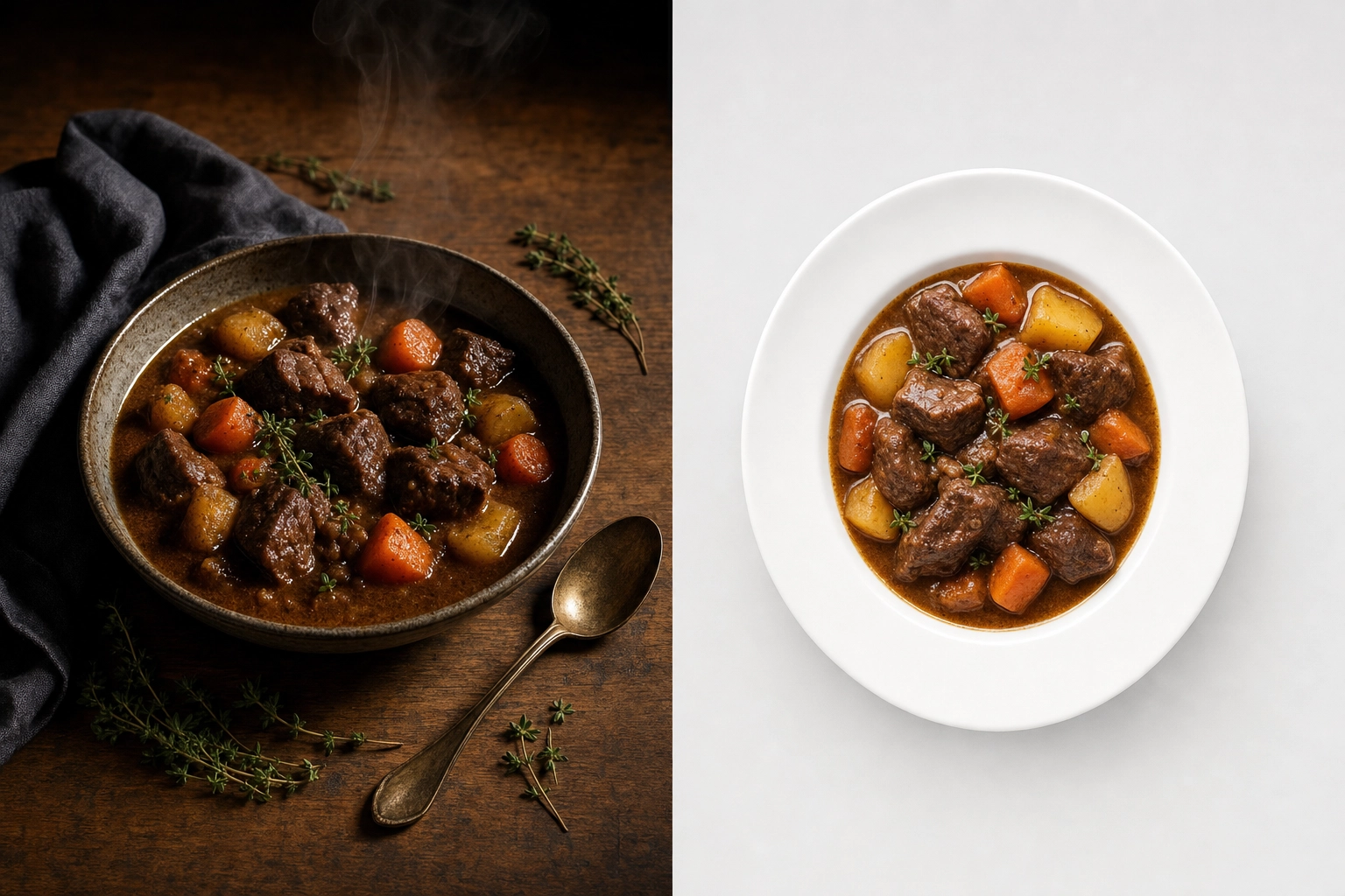 Side-by-side comparison showing artistic food photography versus clean menu photography of the same beef stew dish
Three rules separate menu photography from general food photography:
- Consistency beats artistry. A merely good photograph that matches the rest of the menu beats an excellent picture that stands out. Your menu is one product; each photo is a panel in the same package.
- Output drives composition. Before you frame a single shot, you need to know where the image will be displayed. Aspect ratios, file sizes, and resolution requirements vary dramatically between print menus, delivery apps, and digital signage.
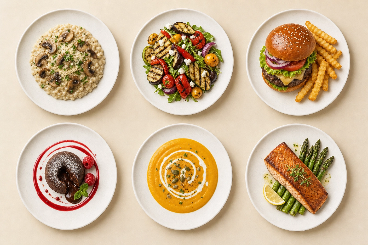
- The food has to be readable, not just beautiful. A diner glances at a menu picture for one to two seconds. The hero ingredient needs to be unambiguous. This is why restaurant menu photography typically uses neutral backgrounds, clean food styling without distracting props, and centered compositions with crop room.
Treat your menu like a uniform. Every photo wears the same lighting, the same background, the same plate. The dishes are what change. For more on the broader craft and how it differs from artistic food photography, see our restaurant food photography definitive guide.
Photo Requirements by Menu Type
Different menu formats need different file specs. Shooting once and exporting for everywhere only works if your source files are large enough and framed loosely enough to crop without losing the plate.
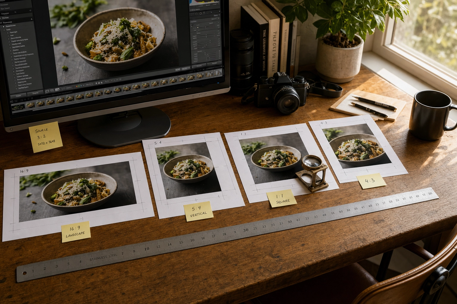
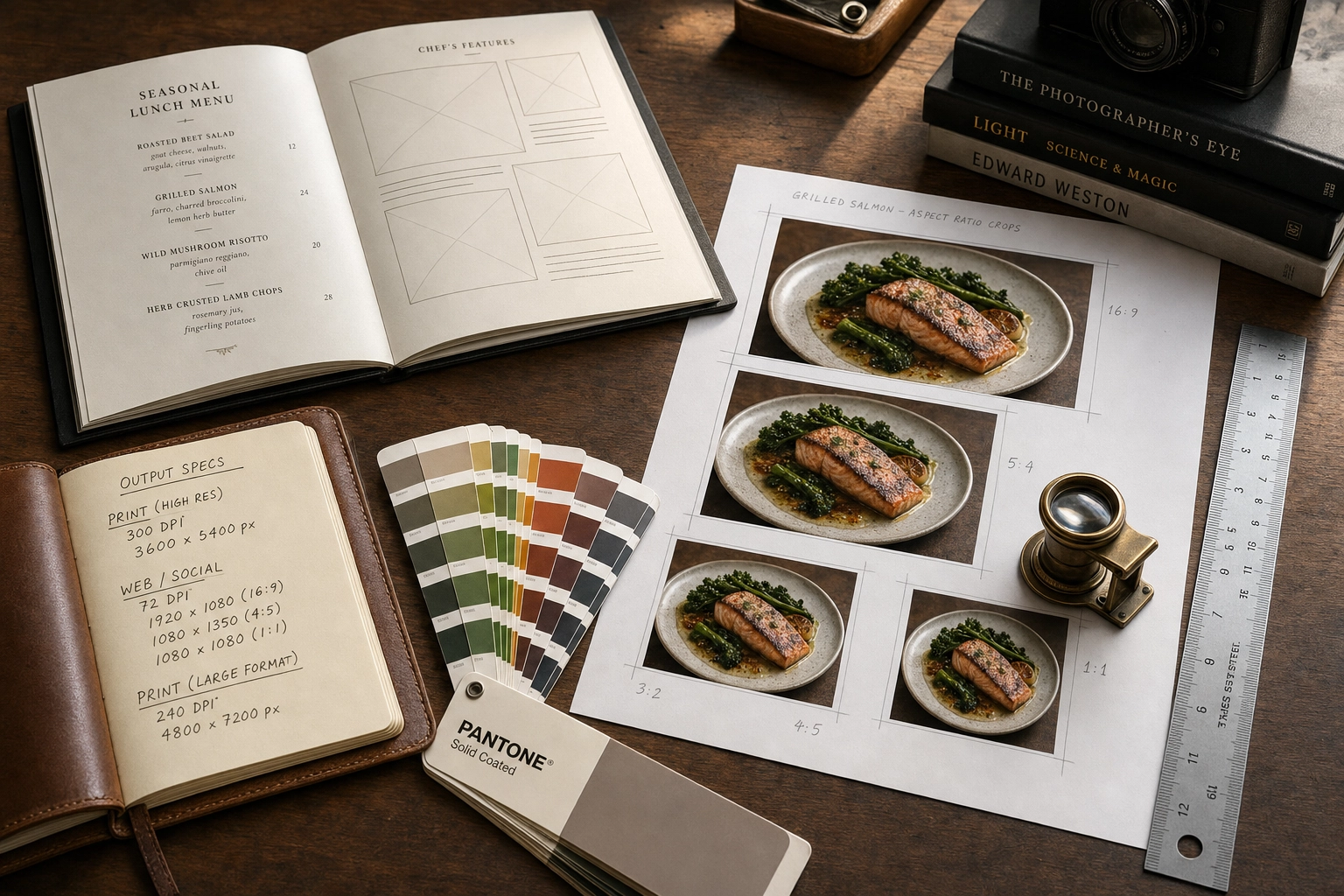 Photographer desk with printed menu, aspect ratio crop sheets, ruler, and notebook showing menu photography format specifications
Printed Menus: 300 DPI at Final Size
Printed restaurant menus, table tents, and inserts all need 300 DPI (dots per inch) at the final printed size. That's the industry standard for offset and digital printing — anything lower will look soft or pixelated up close.
The pixel math is simple: multiply the printed size in inches by 300.
- 4×6 inch menu insert: 1,200×1,800 pixels minimum
- 8×10 inch full menu page: 2,400×3,000 pixels minimum
- 11×14 inch oversized menu: 3,300×4,200 pixels minimum
A modern smartphone camera (12MP and up, which has been standard since 2018) shoots roughly 4,000×3,000 pixels per frame. That's enough resolution for a full-page printed menu image without upscaling. The mistake people make isn't resolution — it's cropping. Crop tightly in-camera and you remove the designer's flexibility to fit the picture into the layout. Always shoot with breathing room.
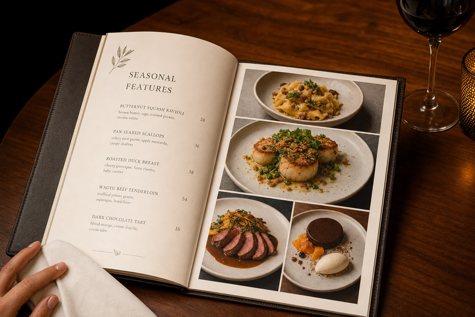 Open hardcover printed restaurant menu on walnut table showing plated dish photographs in fine dining setting
If your printed image will include overlaid text — captions, prices, ingredient callouts — bump the working resolution to 400 DPI. Text rendering needs the extra detail.
Digital Menus: Pixel Dimensions Beat DPI
The "72 DPI for digital" rule you've heard is a leftover from 1990s CRT monitors. Modern screens read pixel dimensions, not DPI metadata. A 2,000-pixel-wide image looks identical at 72 DPI or 300 DPI on a screen — the DPI tag only matters if someone prints it.
What actually matters for digital menus:
- Website thumbnails: 800–1,200 pixels on the longest edge
- QR-code mobile menus: 600–1,000 pixels wide (most diners view on phones)
- Tablet menus and POS displays: 1,200–1,920 pixels on the longest edge
- Color profile: sRGB (the universal standard for screens)
- File format: JPEG at 80–90% quality for web, or WebP if your menu platform supports it
Always export from a master file at least twice the size of your largest planned use. Scaling down is lossless; scaling up isn't.
Delivery Apps: Aspect Ratios Vary by Platform
Delivery apps reject more pictures than any other channel, and the reason is almost always wrong aspect ratio. Each platform crops differently, so a photograph formatted for one app will get auto-cropped — often badly — on another.
Current platform requirements as of 2026:
- Uber Eats: 5:4 to 6:4 aspect ratio, minimum 1,200×800 pixels, recommended cover image 2,880×2,304 pixels, max file size 10 MB. See the official Uber Eats merchant photo guidelines for current rules.
- DoorDash: 16:9 ratio for header carousels, 1:1 square for menu thumbnails, minimum 1,400×800 pixels, under 16 MB. The DoorDash Merchant Learning Center lists the full 14 rejection reasons.
- Grubhub: 1,024×768 pixels landscape for menu items.
- Deliveroo: Final display is 1:1 square — supply 3:2 source images with crop room.
 Multiple aspect ratio crops of the same food photo printed and labeled showing menu photo export workflow for delivery apps
The cross-platform workflow that saves time: shoot every plate at the highest resolution your camera supports, framed loosely, then export multiple crops from one master file. For deeper specs and rejection-fixing tips, see our delivery app menu photography use case.
TV Menu Boards: 1920×1080 Is the Standard
Quick-service restaurants, cafés, and food courts increasingly use TV displays for menu boards. The technical specs are dictated by the screens themselves:
- Standard digital menu board: 1,920×1,080 pixels (Full HD), landscape orientation
- Premium 4K boards: 3,840×2,160 pixels
- Small kiosks and tablets: 1,024×768 pixels minimum
- Color profile: sRGB
- Background contrast: Higher than print or web — TV menus are viewed from across the room
Compose for the screen. Center the plate with safe zones around the edges where menu text and prices will overlay. A picture that looks balanced as a standalone image often gets cluttered when a $12.99 price tag drops onto it.
The Five Consistency Pillars
Consistency is what separates a professional menu from a chaotic one. Lock these five things before you shoot a single plate, and the rest of the workflow becomes mechanical. These principles also apply if you're hiring out a full restaurant photography session — the same rules govern any commercial food photography shoot.
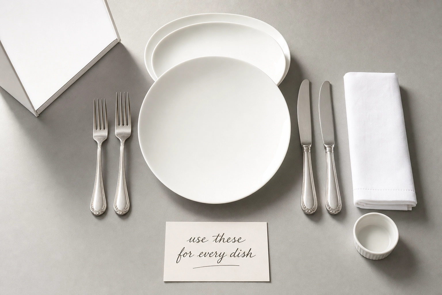 Overhead flat lay of menu photography consistency kit with white plates linen napkin matching silverware and reflector arranged on gray surface
Lock Your Lighting
Pick one light source and use only that source for every plate. Mixing window light with kitchen overheads is the fastest way to get color casts that won't fully fix in editing.
The reliable choice for restaurant menu photography is natural window light from one direction, ideally hitting the plate at roughly 45 degrees from the side. North-facing windows give the most consistent quality throughout the day. If you must shoot at multiple times of day, close the blinds halfway and use a single LED panel with a diffuser instead — predictability beats brightness.
Place a white foam board (under $5 at any craft store) opposite the light source to fill shadows. Use the same board, in the same position, for every dish.
Lock Your Angle
Each item category gets one primary angle. Don't switch mid-menu.
- 45-degree angle: Default for most plated items — entrées, sandwiches, breakfast plates. It's the angle a diner sees when the food arrives.
- 90-degree overhead (flat lay): Pizzas, salads, bowls, charcuterie boards, anything wider than it is tall.
- 0-degree eye level: Burgers, layer cakes, cocktails, milkshakes — anything where height is the story.
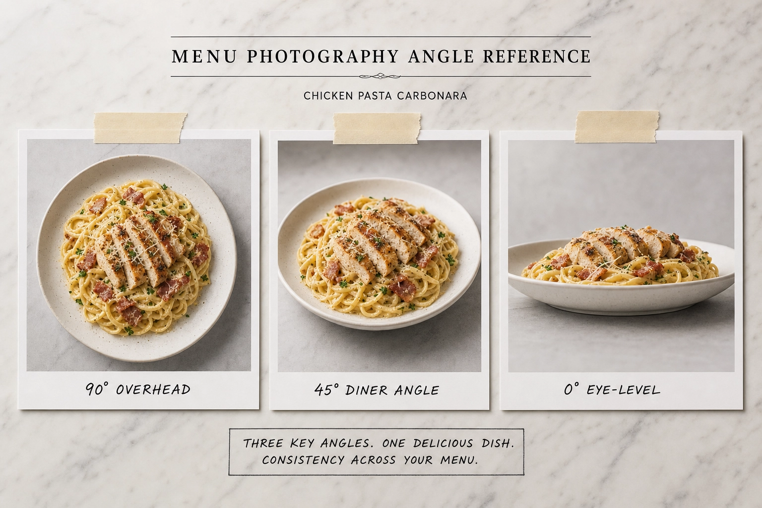 Three reference photos of the same pasta dish photographed from 90-degree overhead, 45-degree, and eye-level angles for menu photography
Mark your camera height with painter's tape on the tripod leg or a wall reference. After 30 plates, your eye gets tired and the camera quietly drifts up or down. The tape doesn't.
Lock Your Background
Two backgrounds is the maximum for a coherent menu. One is better.
White seamless paper or a light-gray surface works for nearly any cuisine — it disappears behind the food and lets dishes do the talking. Marble slabs work for fine dining menus. Butcher paper or a single wood plank works for casual concepts. Whatever you pick, keep it for the entire shoot and any future reshoots.
Avoid: high-contrast wood grain, busy patterned tiles, distressed reclaimed surfaces. They draw the eye away from the food. The background's job is to be invisible.
Lock Your Plates and Props
Use one plate style across the menu, or a maximum of two (small for sides, large for entrées). Same fork. Same napkin. Same glassware. The food changes; the props don't.
If an item is served with a sauce ramekin in real life, photograph it with the ramekin every time. If it gets a lemon wedge, every plate gets a lemon wedge. Authenticity to how the food is actually served beats stylized perfection. For deeper plating and food styling tactics, our guide on how to stage food for photography breaks it down dish by dish.
Keep a "props bin" next to your shooting station. Same items, same place, every time.
Lock Your Editing
Build one editing preset. Apply it to every photo. Then make small per-image adjustments only.
- White balance: Set to 5,500K (daylight) and don't deviate by more than ±200K
- Exposure: Match histograms across the batch — not individual brightness
- Contrast and saturation: One value, applied universally
- Color profile on export: sRGB for digital, Adobe RGB for high-end print. Adobe's official color management guide walks through profile selection if you're new to print prep.
The editing pillar is where most restaurant menus quietly fall apart. Each photograph gets its own little tweak, and by item 40, the white balance has drifted, the contrast is uneven, and the menu looks like 40 different photographers shot it. Resist the urge to perfect each picture individually.
The 5-Step Workflow for Photographing Every Dish
Once your consistency pillars are locked, every dish follows the same five steps. Each loop takes 8–12 minutes once you're warmed up. For a 50-item menu, budget two full shooting days.
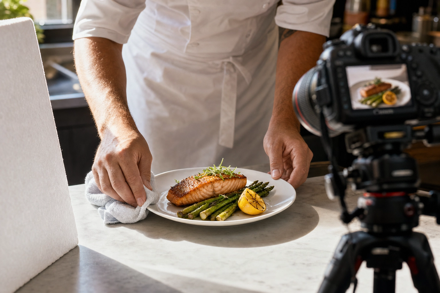 Chef hands wiping white plate edge with cloth before menu photography shot with tripod camera and reflector visible in background
Step 1: Prep the Dish (3–5 Minutes)
Plate the food exactly as a customer would receive it. Not "photo plating" — real plating. An item that's been over-styled looks fake on a menu, and customers feel cheated when their meal doesn't match.
Before the plate hits the table:
- Wipe the plate edge with a damp cloth, then a dry one — fingerprints catch reflections
- Polish any glassware with a microfiber cloth
- Add fresh garnish at the last possible moment (parsley wilts in 90 seconds under lights)
- Identify the hero side — the angle that shows the most ingredients, the best sear, the cleanest lines — and rotate the plate so it faces the camera
If the food has steam, sauce, or melting elements, save them for last. You have about two minutes before food photography starts looking tired.
Step 2: Set Up the Shot (One-Time, Then Repeat per Dish)
Set up once at the start of the day. Then each item slots into the same setup.
- Tripod height locked to the chosen angle for this category
- Lighting position and reflector placement marked on the floor with tape
- Background loaded and free of dust, lint, smudges
- Camera on manual: ISO 100–400, aperture f/5.6–f/8, shutter speed adjusted for exposure
- White balance set to a single fixed value (5,500K), not auto
Frame the composition with crop room. Never go tight to the plate edge — you'll need that buffer for delivery app crops, print bleeds, and design overlays.
Step 3: Shoot Multiple Frames (2–3 Minutes per Dish)
Take 5–10 frames per item. Variations beat single attempts every time, and a few seconds of extra shooting saves you from re-plating later.
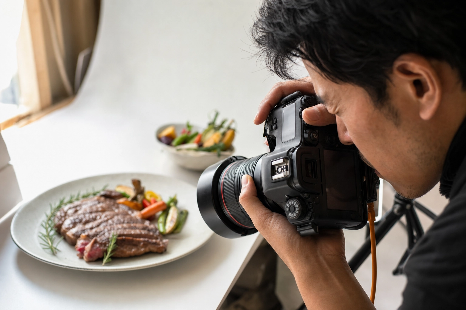 Photographer hands operating DSLR camera with viewfinder up to eye shooting plated steak dish during menu photography session
Capture in this order:
- The hero — locked composition, no movement, the keeper shot
- A slight angle shift — five degrees left or right for backup
- An action shot if appropriate — sauce drizzling, a hand reaching with a fork, steam catching the light
- A cropped variation — tighter on the plate for delivery app aspect ratios
- One last hero with a final fresh garnish
Shoot in RAW format if your camera supports it. RAW files preserve all sensor data, which means you can correct white balance, recover blown highlights, and lift shadows in editing without quality loss. JPEG bakes the camera's interpretation into the file, leaving you with much less recovery room. For more camera-side tips, see our food photography techniques guide.
Step 4: Review Before the Dish Walks Away
Don't trust the camera's tiny screen. Tether to a laptop or AirDrop a few frames to a tablet immediately after each plate. Check:
- Focus — sharp on the hero ingredient
- Exposure — no blown-out highlights on glossy surfaces
- Plate cleanliness — sauce drips, lint, fingerprints
- Reflections — overhead lights catching on cutlery or glassware
If something is off, reshoot now. Re-plating a tired item two hours later won't match the freshness of the original. Confirm at least one keeper before sending the food back to the kitchen.
Step 5: Edit With a Single Preset
End-of-day editing is a sequencing problem more than a creative one.
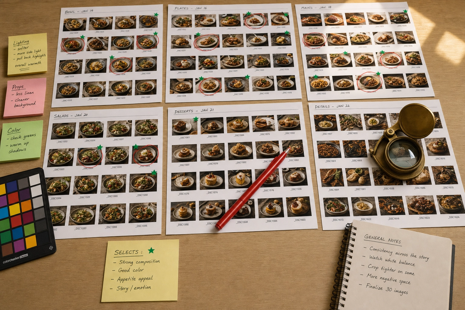 Photo editor desk with printed food photo contact sheets marked with red pen and green stickers for menu photography selection
- Cull first, edit second. Pick one keeper per item before opening the editor. Don't try to perfect rejects.
- Apply your preset to every picture as a baseline. White balance, exposure, contrast, saturation — all from the same starting point.
- Make minimal per-image adjustments. Slight exposure tweaks for very dark or very light items are fine. Resist hue shifts.
- Crop last. Once color is locked, export multiple crops for each output: print, web, square thumbnail, 16:9 widescreen, 5:4 delivery.
- Export with naming convention.
dish-name_format_size.jpgsaves hours when you're updating one platform later.
Common Mistakes That Ruin Menu Photos
Most menu photography failures trace back to a small set of repeatable mistakes. Each one compounds across a 50-item shoot.
 Cluttered restaurant menu photo with harsh lighting fingerprints and distracting props demonstrating common menu photography mistakes
Mixing Camera Angles Within One Category
Three burgers at eye level and one shot overhead reads as a different restaurant for the overhead burger. Pick one angle per category and don't deviate.
Auto White Balance
It changes shot-to-shot based on dominant colors in the frame. A salad picture with green-heavy auto balance and a steak picture with red-heavy auto balance won't match in post. Lock white balance to a fixed Kelvin value.
Using Flash on Food
On-camera flash flattens texture, kills depth, and creates harsh shadows behind the plate. Even bounced flash rarely matches the look of natural light. If natural light isn't available, use a continuous LED panel with a softbox or diffuser — never speedlights.
Cluttered Backgrounds
Salt shakers, sauce bottles, crumpled napkins, dirty cutlery in the corner of the frame. Move everything off the table except what's part of the plate. The background should be empty and neutral so the food is the only thing competing for the diner's attention.
Tight Framing With No Crop Room
Pictures that look perfect at full frame get destroyed when a delivery platform crops to 1:1 square. Always leave 15–20% breathing room around the plate. This single habit prevents most platform rejections.
Ignoring DPI for Printed Menus
A 72 DPI image printed at 300 DPI prints at one-quarter the intended size — or stretches and looks pixelated. Check DPI before you send files to a printer, and verify the pixel dimensions match the planned printed size.
Editing Each Photo With a Different Preset
Inconsistency at the editing layer is the #1 reason menus look amateur even when the original pictures are solid. One preset, applied universally, then minor tweaks. Variation in editing destroys the cohesion of the entire menu.
Reshooting Only New Dishes When the Menu Changes
Adding three new items to a menu and shooting them under different lighting six months later guarantees inconsistency. New plates get the same lighting setup, same background, same angle as the originals — even if it means rebuilding the station.
Photographing Tired Food
Lettuce wilts. Ice cream melts. Steam dissipates. Sauces pool. Shoot fast or shoot fresh batches. An item that's been sitting under lights for ten minutes photographs like an item that's been sitting under lights for ten minutes — and customers can tell.
Plating for the Camera, Not the Customer
Over-styled menu photos set unrealistic expectations. When the burger arrives looking smaller and less stacked than the picture, customers feel deceived. Match how the food actually plates in service.
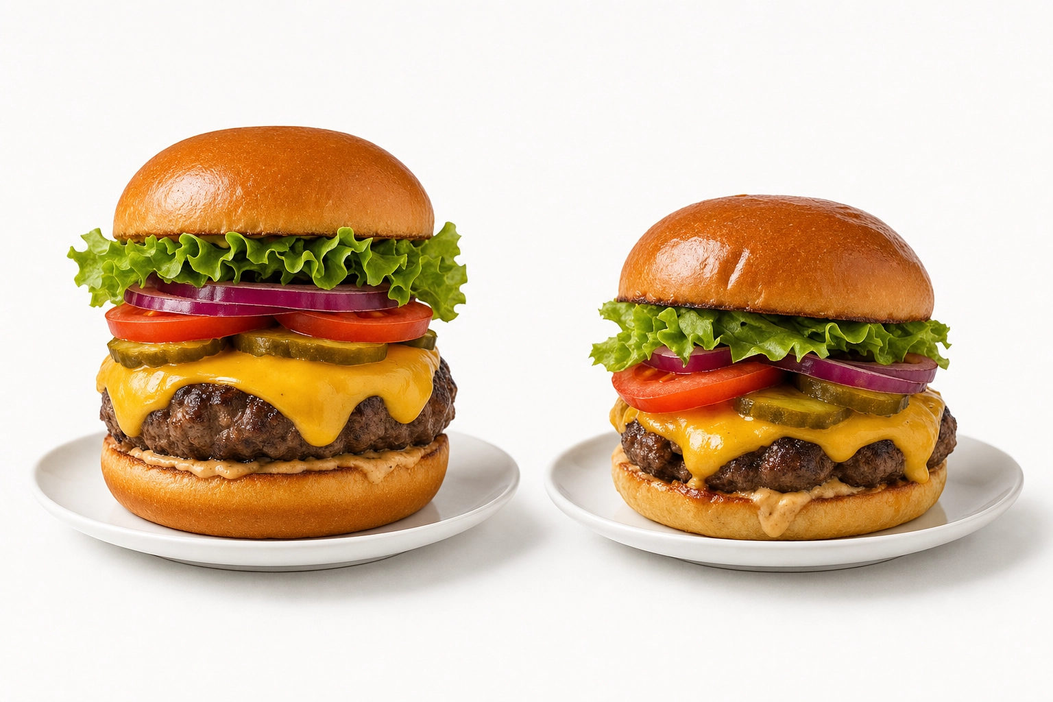 Side by side comparison of over-styled menu photograph burger versus realistic restaurant plating of the same dish
How AI Makes Menu Photography Accessible
The hardest part of restaurant photography isn't the shooting — it's the consistency layer. Five hundred raw pictures, dozens of slight variations in light or color, and an editing workflow that has to apply the exact same treatment fifty times. That's the part where most restaurants quietly fall short, even after a paid photoshoot.
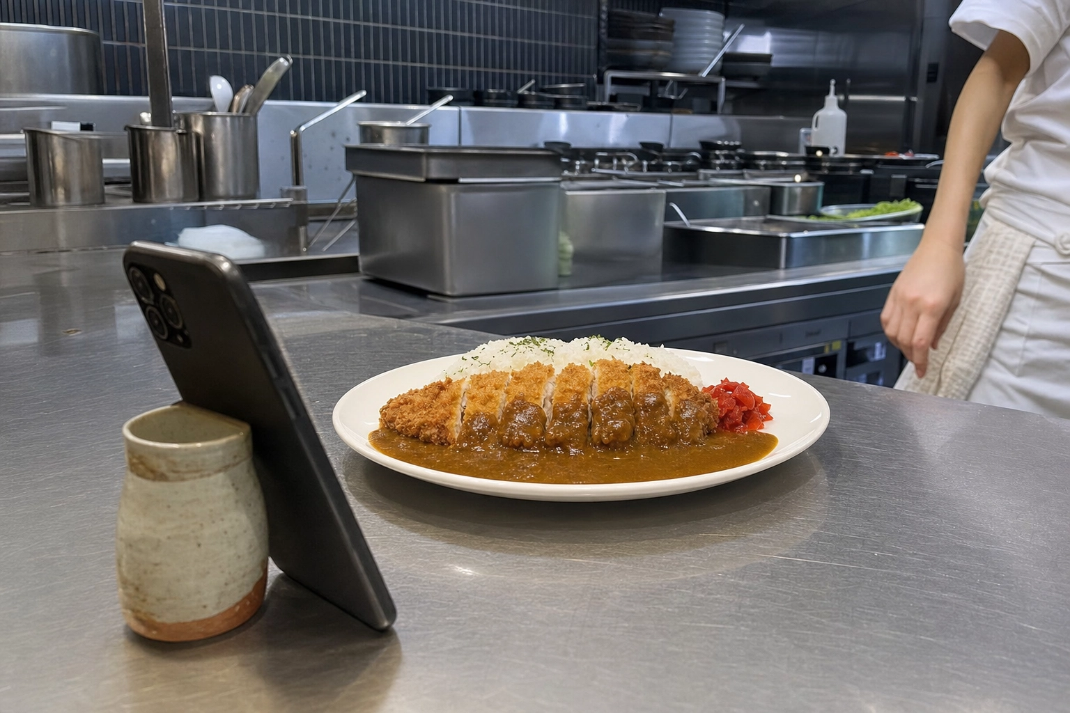 Smartphone propped on stainless steel kitchen counter photographing plated chicken katsu curry for AI menu photography workflow
AI changes the math. Instead of forcing every original picture to match, you let the AI normalize them at the editing layer.
The AI Menu Photography Workflow
Here's how the workflow shifts with FoodShot's AI food photo editor:
- Shoot reference pictures of every item on your phone — five minutes per plate, no tripod, no lighting kit, no studio. Just well-lit, in-focus, and clearly showing the ingredients. Our tips for taking good food photos cover the basics if you're new to camera-side technique.
- Choose one style preset — Delivery, Menu, Fine Dining, or upload your own brand reference. The preset locks the lighting direction, background, color treatment, and food styling approach.
- Run every item through the same preset. The AI applies the locked styling to all of them. A morning omelette and an evening pasta plate come out looking like they were shot in the same session.
- Export in the right aspect ratio for each output — 16:9 for DoorDash, 5:4 for Uber Eats, 1:1 for the website thumbnail, 1920×1080 for the TV board.
When AI Photography Makes the Most Sense
The cost math works out to roughly $0.27–$0.45 per professional menu image on the Business or Scale tier, compared to $40–$100+ per picture with a traditional photoshoot. More importantly: when you change your seasonal menu, you don't book another commercial photography session. You shoot phone pictures in the kitchen and run them through the same preset. The new items match the existing menu automatically.
Restaurants with frequently changing menus, multi-platform output requirements (print + web + delivery + TV), or fifty-plus items are where AI photography pulls clearly ahead of traditional shoots. For brand launches, hero campaigns, or once-a-year polish, a professional photographer is still worth the investment. For everything else — the daily, weekly, seasonal menu work — AI handles the consistency problem in a way that manual editing never quite manages at scale.
Frequently Asked Questions
What resolution do menu photos need to be?
It depends on where the picture will be displayed. Printed menus need 300 DPI at the final printed size — for an 8×10 inch image, that's 2,400×3,000 pixels. Digital menus and websites need pixel dimensions of 800–1,920 pixels on the longest edge (DPI doesn't matter for screens). Delivery apps require minimum 1,200×800 pixels with platform-specific aspect ratios. TV menu boards use 1,920×1,080 (Full HD) at minimum.
What aspect ratio should I use for menu photos?
Shoot at the highest resolution your camera supports with crop room around the plate, then export multiple aspect ratios from one master file. Uber Eats wants 5:4 to 6:4 ratios. DoorDash uses 16:9 for headers and 1:1 for thumbnails. Printed menus follow the design layout (often 4:3 or 3:2). TV menu boards are 16:9 landscape. Always frame with breathing room so the same source can be cropped to any ratio.
Can I use phone photos for a printed menu?
Yes, modern smartphones (12MP or higher) capture roughly 4,000×3,000 pixels — enough for a full-page printed menu at 300 DPI without upscaling. The limitations come from lighting and consistency, not resolution. A phone picture shot with controlled lighting, framed loosely, and edited with a unified preset will print beautifully.
How many photos do I need for a 50-item menu?
Plan for 50–80 final images: one hero shot per item, plus 1–2 alternate angles for top sellers and delivery app headers, plus 2–3 lifestyle shots for website banners and social media. To get those finals, expect to shoot 300–500 raw pictures (5–10 per item) and cull down. Budget two full shooting days plus one editing day, or use AI processing to compress the editing day to a few hours.
How do I keep menu photos consistent across dishes?
Lock five things before you shoot: lighting (one source, one direction), camera angle (one per dish category), background (one or two surfaces maximum), plates and props (one set used universally), and editing preset (one applied to every picture). Document each decision in a one-page style guide and tape it to the shooting station wall. AI tools like FoodShot enforce consistency at the editing layer automatically.
Should menu photos have a white background?
White or light-gray neutral backgrounds work for almost every cuisine because they disappear behind the food. They're the safest choice for delivery apps, printed menus, and TV boards. Fine dining and rustic concepts can use dark backgrounds (charcoal slate, dark wood) for a moodier brand voice — but pick one tone and use it for the entire menu. Mixing light and dark backgrounds across one menu is the fastest way to make it look chaotic.
What's the best angle for restaurant menu photography?
The 45-degree angle is the most versatile and works for most plated dishes — it's the angle a diner sees when the food arrives at the table. Use 90-degree overhead (flat lay) for pizzas, salads, bowls, and other dishes that are wider than they are tall. Use eye-level (0 degrees) for burgers, layer cakes, cocktails, and anything where height is the visual story. Pick one primary angle per dish category and stick with it across the menu.
How often should I reshoot my menu photos?
Reshoot whenever the menu changes substantively. Seasonal restaurants should refresh pictures 3–4 times per year. Restaurants with weekly specials should photograph each new item before it goes live on delivery apps. The single biggest mistake is keeping pictures of dishes you no longer serve — those listings actively hurt customer trust when the food doesn't arrive matching the photo. AI photo tools cut reshoot time from days to hours, which is what makes weekly menu updates practical.