Restaurant Menu Board Design: Ideas, Tips & Photo Guide
Your menu board is the highest-traffic piece of marketing in your restaurant. Every customer reads it, usually within 6 seconds of stepping inside. Smart restaurant menu board design guides them to your most profitable dishes, makes ordering faster, and quietly lifts your average ticket. A bad one sends them straight to the safe, cheap option — or out the door.
This guide walks through everything that actually matters in restaurant menu board design: the five board types and what they cost, the design principles that drive orders (not just look pretty), how food photos lift sales by 30% or more, the technical specs for digital signage, and how to solve the photography problem that trips up most operators.
Quick Summary: Effective restaurant menu board design comes down to five choices: the right board type for your concept (chalkboard, printed, magnetic, digital LCD, or LED), a clear visual hierarchy that directs eyes to high-margin items, photos of 5–9 hero dishes (which lift sales 30%+, per Grubhub data), and — if you go digital — true 4K source files that hold up on a 50-inch screen. AI tools like FoodShot now make that last part affordable for any operator.
5 Types of Restaurant Menu Boards (and When Each Wins)
Before you design anything, pick the right canvas. The board type sets the ceiling for what your menu board design can do — and what it costs to maintain.
Chalkboard menu boards ($15–200)
Chalkboards still work for one reason: they signal craft. A handwritten special on a wall-mounted slate tells customers a person made a choice today. That's why cafes, bakeries, breweries, and farm-to-table spots reach for them.
A few practical notes. Use liquid chalk markers instead of stick chalk — the lines stay crisp, don't smudge onto sleeves, and photograph cleanly for social media. Frame the surface area to roughly 24×36 to 36×48 inches for a counter setup. And be honest about the artistic skill involved: if nobody on the team can hand-letter, hire a local chalk artist for $100–400 and rotate the design every two to three months.
Chalkboards struggle for two reasons: they're hard to read past 12 feet, and they punish you when prices change frequently. If your menu shifts weekly, you'll grow to resent erasing the same items.
Printed menu boards ($50–800)
Printed signage wins when your menu is stable for 6–12+ months. They're produced on vinyl, acrylic, dibond (aluminum composite), or foamboard, and the substrate matters more than most owners realize. Vinyl is cheap and fine indoors. Acrylic looks premium for cafes and counter-service. Dibond handles outdoor weather. Foamboard is for short-term events only — it warps.
Cost: $50–300 for a single panel from a sign shop, $200–800 with custom design service. The hidden cost is reprinting. Every menu change is a fresh print job, which is why most operators add a magnetic strip or clip-frame for prices.
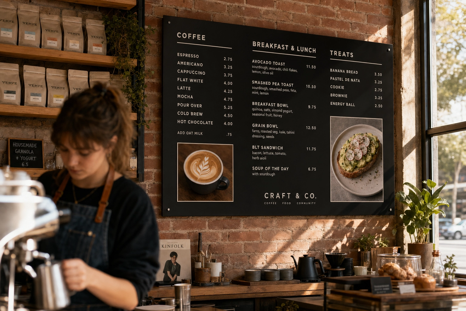 Printed acrylic menu board mounted above a craft cafe counter with clean typography and small food photos of coffee and avocado toast
Magnetic and letter boards ($80–300)
Letter boards have a vintage cinema look that pairs beautifully with bars, breweries, and trendy concepts. The cost is low, refresh time is fast (10 minutes to swap items), and the typography looks intentional even when you're not a designer.
The trade-offs: you're locked into one font and uniform letter spacing, which makes long descriptions cramped. Letter sets cost $20–40 to refill or expand. And they're text-only — if your concept relies on photography, this isn't your format.
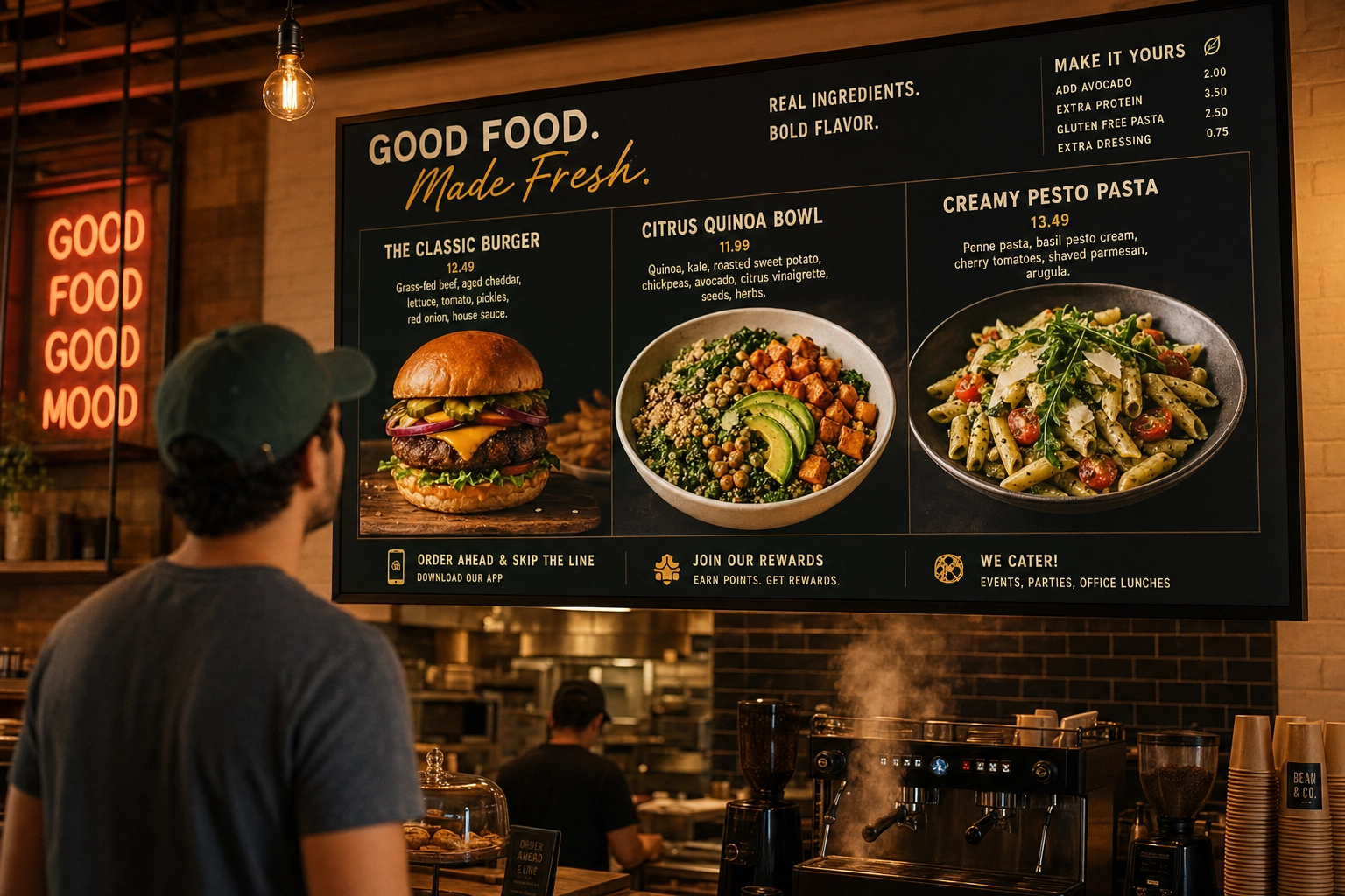
Digital LCD menu boards ($500–3,000+)
Digital signage is the default for any operator who changes prices, runs day-parts, or wants to show photos at scale. The flexibility is the value: a single screen can swap from breakfast to lunch automatically, push limited-time offers when lines build, and rotate hero photography that changes seasonally.
The technical floor is 1080p (1920×1080) for screens up to about 50 inches. Above that, you want 4K (3840×2160) — text and photos start showing pixelation on 4K-capable screens fed 1080p content. Commercial displays are rated for 16–24 hours of daily operation; consumer TVs are typically rated for 6–8. If your board runs all day, the commercial version is the cheaper long-term choice.
LED menu boards ($2,000–20,000+)
This is where the term gets confusing. The "LED" you want for outdoor menu boards is a true LED panel — small light-emitting diodes packed densely on a panel — not the LED-backlit LCD TVs sold for living rooms. The difference matters: true LED panels hit 1,500–2,500+ nits of brightness and stay readable in direct sunlight, where consumer TVs wash out.
LED signage makes sense for drive-thru menu boards, outdoor patios, and brightly lit storefront windows. Basic outdoor LED setups start around $2,000–5,000. Drive-thru units with weatherproof enclosures, integrated speakers, and POS integration regularly hit $20,000+ per lane for QSR chains.
For most counter-service indoor restaurants, a 4K commercial LCD does the job at a fraction of the cost.
Restaurant Menu Board Design Principles That Actually Sell
Choosing the right board type is half the work. The other half is making the design work — meaning it quietly steers customers toward your best dishes.
Visual hierarchy: lead the eye where you want orders
Your customer doesn't read top to bottom. Eye-tracking research shows menu boards get scanned in an F-pattern: across the top, then down the left side, then sweeping right for items that catch attention. The "golden triangle" — top-right, center, top-left — collects the most fixations.
Put your highest-margin and signature items in those zones. Use three tiers of visual weight: hero items get the largest type, a photo, and the most negative space around them. Standard items get mid-weight type with item names slightly bolded. Supporting items (sides, add-ons) get smaller, secondary treatment.
If everything looks equally important, nothing is.
Contrast and readability from a distance
The single most useful rule in menu board design: one inch of letter height per ten feet of viewing distance. That's the minimum.
Concretely:
- Counter-order menu read from 6–10 feet → 60–100pt body type
- Drive-thru pre-order menu at 12–20 feet → 120–240pt
- Drive-thru reading-line menu at 4–6 feet → 40–60pt
- Cafe specials chalkboard at 8–12 feet → 80–120pt
Use sans-serif fonts (Helvetica, Montserrat, Proxima Nova, Inter) for body type. They hold up at distance better than serifs, which lose detail when shrunk. Test legibility from the actual customer position — not from your laptop, not from behind the counter. Stand where customers stand and squint.
 Restaurant designer testing menu board text readability from a customer viewing distance across the dining room
Whitespace: less is genuinely more
Restaurants chronically overstuff their boards. The fix is counterintuitive: fewer items, more space, higher tickets.
Industry data on this is fairly consistent — roughly 13 items per board hits the sweet spot for quick-service contexts. Past that point, decision fatigue kicks in and customers default to familiar, cheap orders. Aim for 40–50% negative space. Group items into 3–5 clear categories with breathing room between them.
If your menu has 30 items, that doesn't mean cramming all 30 onto one screen. It means using rotating slides on digital boards, multi-panel layouts on printed ones, or printing a separate detail menu and reserving the board for hero items and prices.
Font choices: personality with legibility
Pick one body font and one accent font. That's it. Past two typefaces, the design starts feeling chaotic from across the room.
Match typography to brand voice. Handwritten or rounded sans = casual, friendly, approachable (cafes, taquerias). Geometric sans like Futura or Avenir = modern, minimalist (third-wave coffee, fast-casual). Slab serif = vintage, deli, butcher shop. Classic serif = upscale, fine dining.
Avoid ornate scripts entirely on menu boards. They look elegant on a printed dinner menu held 18 inches from the face. From across the room, they're unreadable.
Color psychology and brand alignment
Color shapes appetite more than most operators realize. Decades of research on this is fairly settled:
- Red stimulates appetite and creates urgency — used by McDonald's, KFC, In-N-Out, Wendy's
- Yellow triggers happiness and hunger; pairs with red for the classic QSR palette
- Green signals fresh, healthy, organic — works for salad-forward and farm-to-table concepts
- Brown reads as warm, comforting, artisanal — natural fit for BBQ, coffee, bakeries
- Black + white + neutrals convey sophistication and elegance — fine dining, cocktail bars
- Blue is widely considered an appetite suppressant — most restaurants avoid it as a primary color
Don't choose colors based on trends. Pull them from your existing brand identity so the board feels like part of your restaurant, not a separate sign hung on the wall. Our restaurant branding guide goes deeper on building consistent visual identity across every touchpoint.
Pricing presentation
Three small changes consistently lift average tickets:
- Drop the dollar sign. A Cornell University School of Hotel Administration study found diners spent roughly 8% more when prices appeared as plain numerals (e.g., "18") rather than with a dollar sign or the word "dollars." The reasoning: the symbol triggers the "pain of paying."
- Embed prices in the line. Right-aligned price columns let customers price-shop. Tucking the price next to the item name keeps focus on the dish.
- Anchor with a premium item. Place one high-priced item at the top of the section. It makes the rest feel reasonable by comparison.
How Food Photos on Menu Boards Drive 30%+ More Orders
The strongest single design lever you can pull is adding food photography. The data is consistent across multiple sources:
- Grubhub found professional photos in menu listings boost sales by approximately 30%.
- Snappr's enterprise research on delivery platforms showed high-quality photos lifted total orders by over 35%.
- An international restaurant study found items with images sell ~6.5% more than items without, on a per-item basis.
- Industry survey data: 91% of customers said digital menu displays significantly influenced their purchasing decisions, contributing to up to a 38% rise in restaurant sales.
- A widely cited Nielsen study on digital influence found that the majority of consumers report digital displays significantly influence what they buy at the point of decision.
The mechanism is straightforward. Humans process visual information roughly 60,000 times faster than text — research cited across industry studies puts visual decoding around 13 milliseconds. By the time a customer has read "house-made pappardelle with braised short rib," they've already seen, evaluated, and emotionally reacted to a photo of it. Photos shift wavering customers into confident orderers, which speeds up the line and reduces "what's the [item] like?" questions.
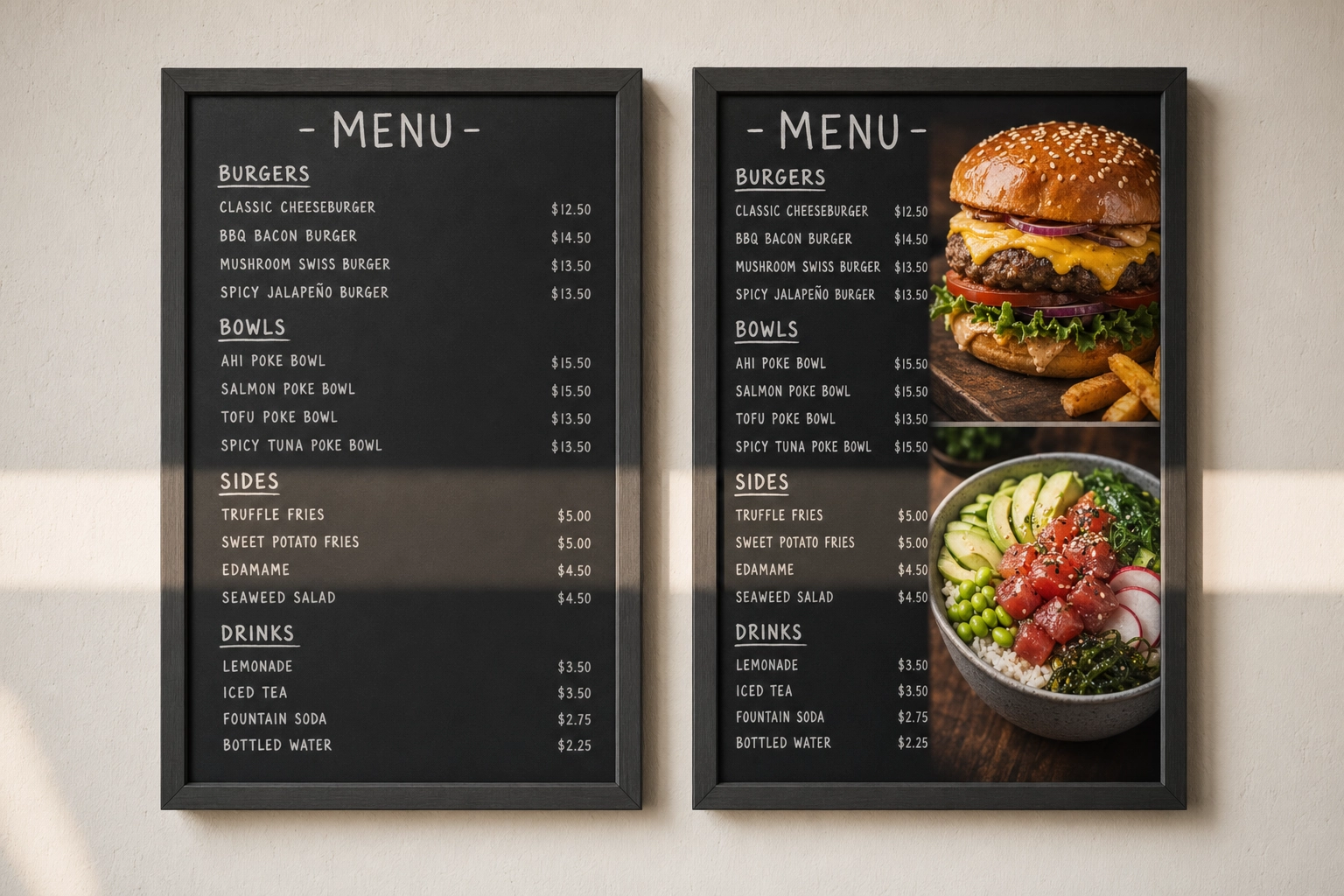 Side-by-side comparison of a text-only restaurant menu board next to one enhanced with vibrant hero food photos showing visual impact
Which dishes to photograph (and which to skip)
The Pareto rule works on menus too: roughly 20% of your dishes drive 80% of revenue. Photograph those.
Always feature:
- Signature dishes that define your concept
- High-margin items you want to push
- New launches and limited-time offers
- Combo or bundle deals (visualizing the bundle increases conversion)
- Seasonal specials
Skip photos for:
- Sides and add-ons (a small icon works better)
- Drinks where the name communicates everything (drip coffee, fountain soda)
- Items you'd rather not push
- Anything that looks unappetizing at distance (clear soups, gray-toned dishes, melted cheeses)
The trap most restaurants fall into is photographing every item. It dilutes effectiveness — when everything has a photo, no single photo stands out. Five to nine hero photos per board is the sweet spot.
Photo placement strategies that work
A few placement rules that consistently outperform:
- Pair photos directly with item names. Never run a photo grid at the top with the menu list below. Customers can't connect them quickly.
- One big hero beats six thumbnails. A single photo occupying 15–25% of the board area outsells the same area split into smaller shots. The eye stops on the big one.
- Hero shot in the golden triangle. Place your single most profitable item's photo in the top-right or top-center quadrant.
- Digital: full-screen hero slides between menu views. On rotating digital boards, intersperse 8–12 second full-screen photo slides between the standard layout. They function as ads inside your own menu.
For a deeper look at how this fits into a broader strategy, our guide on food photography for restaurant menus covers planning a menu photoshoot end-to-end.
The 42-Inch Problem: Why Most Menu Board Photos Look Bad
Here's the technical bar nobody warns operators about: photos that look great on Instagram or a delivery app routinely fall apart on a 42–55 inch screen.
A modern phone takes ~12 megapixel photos at 4032×3024 pixels. That sounds like plenty. But by the time those photos pass through automatic compression, get cropped to 16:9, and get displayed on a 4K screen at the front of the restaurant, three failure modes show up.
Pixelation. The screen is showing the photo at near-100% scale. Soft focus, motion blur, and JPEG compression artifacts that were invisible on a phone become obvious. Edges of food look mushy. Text on packaging gets jagged.
Color mismatch with venue lighting. A photo shot under cool fluorescent kitchen light looks wrong displayed in a warm-lit dining room. The board looks like it's running someone else's menu.
![]() Close-up of a pixelated low-quality food photo on a digital menu board screen showing how poor resolution looks unprofessional
Close-up of a pixelated low-quality food photo on a digital menu board screen showing how poor resolution looks unprofessional
Inconsistent style across dishes. Phone photos taken on different days, in different lighting, on different surfaces, by different staff — even if each one looks fine in isolation, displayed together they look chaotic. Your board reads as amateur.
The harshest truth: a blurry photo is worse than no photo. It actively damages perceived food quality. Most customers can't articulate why a board looks "cheap," but they feel it, and they spend less when they do.
This is why menu board photography historically meant booking a professional photographer — which leads to the cost problem.
Digital Menu Board Tips: Specs, Animation, and Scheduling
If you've chosen digital, getting the hardware and content right is more important than the design itself. A great design on undersized hardware still looks bad.
Resolution and aspect ratio requirements
The non-negotiables for digital menu boards:
- Minimum: 1080p (1920×1080). Anything less looks dated immediately.
- Recommended: 4K (3840×2160). Required if your screen is 50 inches or larger. The text is sharper, photos look cinematic, and the board ages better.
- Aspect ratio: 16:9 landscape is standard. Use 9:16 portrait (1080×1920) for tall single-screen drink or coffee menus.
- Design at native resolution. If your screen is 4K, design templates at 3840×2160. Never upscale a 1080p design.
- Brightness: Indoor away from windows: 350–500 nits. Indoor near direct window light: 700+ nits. Outdoor or drive-thru: 1,500–2,500+ nits.
Match your photo source files to the screen resolution. A 1920×1080 photo on a 4K screen will look soft. A true 4K photo on a 1080p screen looks great (the screen downscales).
Animation: subtle wins, flashy distracts
The temptation with digital is to use everything — flashy transitions, bouncing prices, scrolling text, video loops. Resist all of it.
Effective animation rules:
- Slow fades and gentle zooms only. No flashes, hard cuts, or fast slides.
- Slide dwell time: 8–15 seconds. Long enough to read every item, short enough to keep interest.
- Full menu cycle under 90 seconds. Customers waiting in line should see the entire menu at least once before they reach the counter.
- Reserve motion for hero items. A slow zoom on one signature dish per cycle works. Animating everything turns the screen into a slot machine.
Test from the actual queue position with a real customer. What feels subtle on a designer's laptop can feel chaotic on a 55-inch screen six feet away.
Content scheduling: serve the right menu at the right time
Day-part scheduling is the most underused feature in digital signage. Set it once, save staff hours every week.
A typical schedule:
- 6:00–10:30 — Breakfast menu, coffee specials prominent
- 10:30–11:30 — Transition slide ("Lunch starting at 11")
- 11:00–14:00 — Lunch menu with combo bundles featured
- 14:00–17:00 — Afternoon menu, desserts and snacks pushed
- 17:00–21:00 — Dinner menu, wine pairings, desserts
- 21:00+ — Late-night menu (if applicable)
Layer in promotional rotations: push combos and desserts when lines are longest, run limited-time-offer urgency on slow days, schedule holiday menus weeks in advance and forget about them. Most cloud signage platforms handle scheduling natively.
Cost Comparison: Chalkboard vs. Printed vs. Digital
Here's the realistic total cost across three setups, including the parts most articles skip (refresh costs, software subscriptions, content production).
| Setup | Year-1 cost | Recurring | Best for |
|---|---|---|---|
| Basic chalkboard | $50–200 | ~$0 | Cafes, single-location indies |
| Printed/hybrid | $200–800 | $100–600/yr (reprints) | Stable menus, food trucks |
| Entry digital | $500–1,000 | $120–360/yr (software) | Operators changing prices/specials |
| Mid-tier digital | $1,500–3,000 | $180–500/yr | Multi-screen counter service |
| Premium digital | $3,000–10,000+ | $400–1,500/yr | QSR, multi-location, drive-thru |
Basic chalkboard setup ($50–200)
A 24×36 framed wall-mount runs $30–100. Add a set of liquid chalk markers ($15–25), basic stencils for clean lines ($10–20), and you're done. If hand-lettering isn't a strength on your team, a local chalk artist will design a board for $100–400 and refresh it quarterly.
Refresh cost: effectively zero. Wipe, rewrite. The flexibility is the entire pitch.
Mid-range printed or hybrid ($200–800)
A custom-designed printed panel from a sign shop, with a magnetic price strip or clip frame for items that change, runs $200–500. A letter board paired with framed photo prints runs $150–400. Plan for $50–150 per reprint, two to four times per year.
This is the sweet spot for food trucks and casual concepts where the menu is stable but you want a polish that handwriting can't deliver. Our food truck menu design guide covers hybrid setups for mobile operators specifically.
Digital menu board setup ($500–3,000+)
Three tiers operators actually buy:
Entry ($500–1,000). A 43-inch consumer 4K TV ($300–500), an Amazon Firestick or Chromecast ($30–50), and the free tier of a cloud signage platform. Add a wall mount ($30–80). You can do it yourself in an afternoon.
Mid-tier ($1,500–3,000). A 55-inch commercial-grade display ($1,200–2,000), a dedicated media player (~$370), professional installation ($200–400), and a paid signage CMS subscription ($15–30/month per screen). Built to run 16+ hours a day for years.
Premium ($3,000–10,000+). 65-inch 4K commercial displays, multi-screen video walls, enterprise CMS with POS integration, custom design and installation. This is what national QSR chains spend per location.
The recurring cost most owners forget: software. Cloud digital signage platforms charge $10–30 per screen per month. For a single screen, that's $120–360 per year. For a four-screen counter setup, $480–1,440 per year. Factor it in.
How to Get Menu Board-Ready Photos in Minutes (Without a Photographer)
Now the part most guides skip: where do the photos actually come from?
The traditional path is a professional menu photoshoot. Industry data puts that at $700–1,400 for a basic shoot, plus another $200–500 for a food stylist and props, plus travel costs if the photographer needs to come on-site. Turnaround is typically 2–4 weeks. For 20 menu items, you're looking at $1,500+ and a full month before photos are usable.
The math breaks for most independent restaurants. You can't justify $1,500 to refresh a seasonal menu four times a year. So most operators end up with one photoshoot every 2–3 years, plus a patchwork of phone photos in between, plus stock images on the digital board — which is exactly the inconsistency problem from earlier.
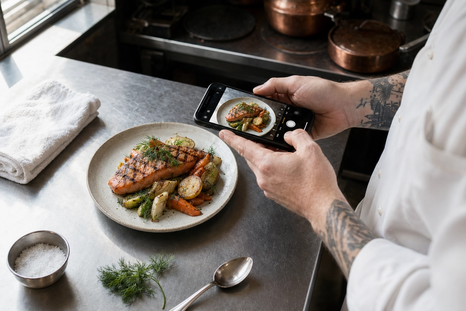 Chef photographing a plated grilled salmon dish with smartphone on kitchen prep counter for AI menu board photo enhancement
The AI path solves this by changing the inputs. You shoot a phone photo on the prep line, in your own kitchen, in the lighting you have. The AI handles everything that traditionally required a studio: clean background, even lighting, color accuracy, professional plating context, and — critically for menu boards — true 4K output sized for large-format screens.
FoodShot AI was built specifically for this workflow. A few features that matter for menu board design and photography:
- 200+ menu-specific styles including Menu, Delivery, and Fine Dining presets — pick once, apply to everything
- True 4K (3840×2160) output that holds up on 50–65 inch screens without pixelation
- My Styles — upload one reference photo (your hero dish or brand color palette) and apply that exact look to 30+ subsequent dishes for board consistency
- Builder Mode for matching backgrounds and plating to your venue's aesthetic
- 90-second turnaround per dish, billed at $9–15/month on the Starter plan
Compared to a $1,500 photoshoot, you'd produce 30+ menu-board-ready photos in an afternoon for less than the cost of one item photographed traditionally.
A simple workflow for refreshing your menu photos
Here's the actual process most operators follow:
- Plate the dish exactly as it leaves the kitchen for a customer. Don't art-direct it — authentic plating photographs better than fussy plating.
- Shoot from 45 degrees (or overhead for flat dishes like pizzas, salads, bowls), in natural light from a window. Avoid overhead fluorescents — they cast green-yellow on food.
- Upload to FoodShot and choose a style preset (Menu, Delivery, or Fine Dining work for most board contexts). Or upload a reference image from a previous dish to match the look exactly.
- Generate 4 variations, pick the strongest. Tweak with prompt edits if a specific element isn't right ("brighter background," "remove the napkin").
- Download the 4K file and drop it into your digital signage CMS. Schedule a slide rotation. Done.
Total time per dish: 5–10 minutes. Total cost per dish on the Starter plan: roughly $0.30–0.60 in credits. Compared to traditional photography, the math isn't close.
For operators wanting deeper coverage of menu photography end-to-end — including lighting, styling, and shot lists — our menu photoshoot guide and food photography techniques articles go into detail. And if you operate in a specific segment, our AI food photography for restaurants and cafe menu photography pages cover use-case-specific tips.
Frequently Asked Questions
What size should a restaurant menu board be?
For counter-order setups, a single 43–55 inch screen (or matching framed printed board) covers most concepts. Multi-screen QSRs typically use 3–4 horizontally arranged 49–55 inch screens. Drive-thru pre-order boards usually run dual 55–65 inch outdoor LED panels at minimum, depending on lane length. Cafe chalkboards typically sit between 24×36 and 36×48 inches for a counter setup.
How many items should be on a menu board?
The sweet spot is 8–13 items per screen or board panel, based on industry research. Beyond 15 items, decision fatigue kicks in and customers default to safer, cheaper orders — lowering your average ticket. If your full menu is wider, use multi-panel layouts on printed boards or rotating slides on digital ones. Always lead with 3–5 hero items in the golden triangle (top-right, center, top-left).
Should every item have a photo?
No. Photographing every item dilutes the effectiveness of each photo. Aim for 5–9 hero photos per board: signature dishes, high-margin items, daily specials, new launches, and combo bundles. Use icons or small graphics for sides, drinks, and add-ons. One stunning photo of a signature dish outsells six mediocre photos of every item on the menu.
Are digital menu boards worth the cost?
For most operators who change prices, run specials, or operate multiple day-parts, yes. Industry surveys show 8–10% sales lifts after switching to digital, and ROI typically lands in 9–18 months on a basic $800–1,500 setup. Digital is most worth it if you change menu items more than four times per year. If your menu is locked for 12+ months, a well-designed printed board can win on simplicity. A hybrid setup (digital for prices and photos, chalkboard for personality and daily specials) often delivers the best of both.
Can I use phone photos on a digital menu board?
Raw phone photos rarely look professional at 42 inches and up — uneven lighting, distracting backgrounds, and inconsistent style across dishes are the usual culprits. Modern phone cameras have enough resolution; the limitation is composition, lighting, and consistency. AI enhancement bridges the gap: you shoot a phone photo as input, and tools like the FoodShot AI food photo editor generate 4K studio-quality output that matches across every dish on the board. Shoot near a window in natural light, avoid overhead fluorescents, and let the AI handle the rest.
What resolution do digital menu boards need?
1080p (1920×1080) is the absolute minimum, and only acceptable on screens up to roughly 50 inches. For screens 50 inches and up, 4K (3840×2160) is the right standard for digital menu board design — text and food photography start showing pixelation otherwise. Always source images at native screen resolution or higher; never upscale a low-res photo. FoodShot AI delivers true 4K output sized for large-format displays, so the same photo works on Instagram, delivery apps, and a 65-inch menu board without quality loss.
Designing for the Customer in Front of You
A menu board is the silent salesperson that runs every shift. Get the type right for your concept, build a clear visual hierarchy in your menu board design, photograph the dishes that matter most, and respect the technical bar of the screen you're designing for. Do those four things and your restaurant menu board design will quietly outperform competitors who treat their boards as decoration.
The barrier that used to stop most independent operators — the cost of professional food photography for the board — is the part that's changed most in the last two years. AI-enhanced photography means a $9–15/month subscription replaces a $1,500 photoshoot, and the output is true 4K, sharp enough for any commercial display. If photography has been the holdup, that's no longer a real reason to settle.
Ready to refresh your menu board photos? Try FoodShot AI free — three credits, no card required, menu-ready photos in 90 seconds.