Food Color Grading: How to Make Food Photos Pop (Guide)
Looking for food color grading examples for bright white background photography? You're in the right place. White backgrounds are the standard for delivery apps, menus, and e-commerce food photography — but they're brutal to color grade. Every flaw in your image is exposed against pure white, and the wrong editing choices can make beautiful food look flat, fake, or unappetizing.
This guide gives you the complete food color grading workflow: color theory tips, Lightroom settings (HSL, tone curves, split toning), techniques for maintaining true whites while keeping food vibrant, common color grading mistakes, and AI shortcuts that handle it all in 90 seconds.
Quick Summary: Food color grading is what separates flat, lifeless food photos from scroll-stopping images — especially on bright white backgrounds. Below you'll find color theory for food photography (warm tones increase appetite, cool tones suggest freshness), a step-by-step Lightroom workflow with HSL adjustments and tone curves, specific tips for keeping whites neutral while food colors pop, five common mistakes that make food look fake, and how AI tools like FoodShot AI can handle food photo color correction automatically in 90 seconds.
Why Food Color Grading Matters for Food Photography
First, a quick distinction: color correction fixes problems (wrong white balance, exposure issues). Color grading adds style and mood. Both matter for food photography, but color grading is where the magic happens — it's what makes viewers crave a dish through their screen.
Here's the science. Research published in Frontiers in Psychology found that warm colors — particularly red — increase heart rate and stimulate appetite. McDonald's, Burger King, and KFC all use red in their branding for this reason. Orange and yellow trigger feelings of warmth and comfort. Blue suppresses appetite — it's one of the rarest colors in natural food.
Your food photography editing colors directly affect whether a viewer thinks "I need to eat that" or scrolls past. And bright white backgrounds amplify everything. A warm color cast that's barely noticeable on a dark wooden table screams on pure white. An oversaturated tomato that looks fine on a rustic background looks radioactive against a white surface.
White is the most unforgiving backdrop for food photography — but also the most commercial. Delivery apps, e-commerce listings, and clean menus all demand it. That's exactly why food color grading for bright white backgrounds deserves its own approach, and these tips will show you how.
Food Color Theory: A Quick Cheat Sheet
Before touching any sliders, understand what you're trying to achieve with colors in your food photography:
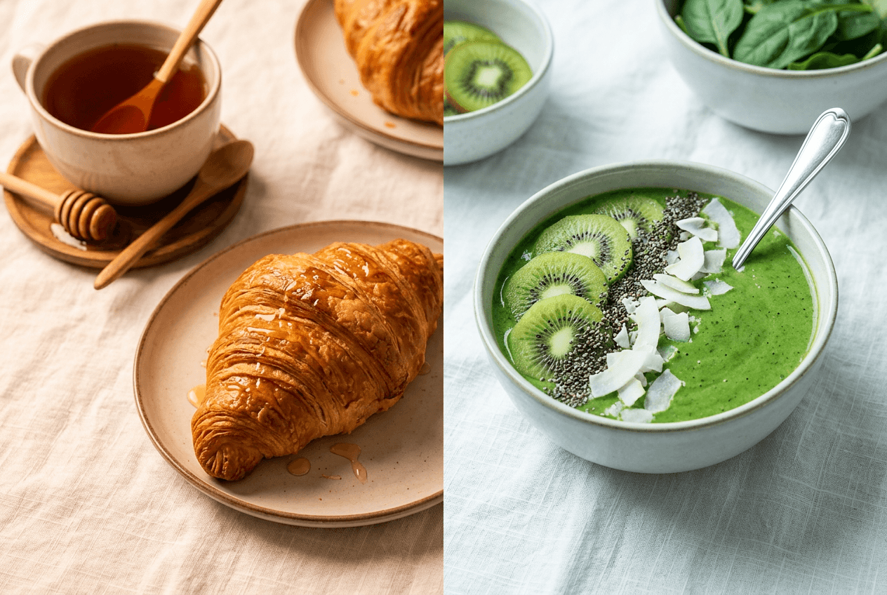
Warm tones (reds, oranges, yellows) → Comfort foods, baked goods, grilled meats, pasta dishes. These colors make food feel hearty and indulgent. Think golden-brown crust, caramelized onions, butter-glazed rolls.
Cool tones (greens, blues, teals) → Fresh salads, seafood, sushi, cold beverages. These colors suggest crispness, cleanliness, and health. Think dewy lettuce, iced drinks, raw fish.
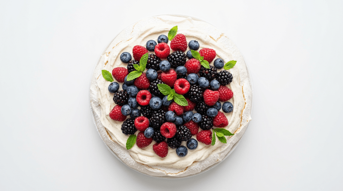
Complementary colors create visual punch. A bright red strawberry against white cream. Green basil leaves on a red marinara. These contrasts make the eye lock onto the food image.
Analogous colors create harmony. Earth tones together — browns, ambers, deep oranges — work beautifully for comfort food photography. Multiple shades of green for a salad spread feel cohesive and fresh.
For white backgrounds specifically, the food IS the entire color story. Every hue stands completely alone with no backdrop distractions. Your food color grading needs to be both more precise and more restrained than on textured or colored backgrounds.
For deeper tips on setting up your shot before editing, check out our food photography tips and food styling guide.
 Color theory comparison in food photography showing warm comfort food tones versus cool fresh food tones
How to Color Grade Food Photos in Lightroom (Step by Step)
Lightroom gives you three main tools for color grading food photography: the Basic panel (white balance and exposure), the HSL/Color Mixer (individual color control), and the Color Grading panel (split toning). Here's how to use each one for food images on white backgrounds.
Step 1: Fix White Balance First
This is non-negotiable. If your white balance is off, every other food photo color correction fights against a broken foundation.
The gray card trick: Before your food photography shoot, place a gray card where the food will sit — not on the white background itself. Take a reference shot. In Lightroom, use the White Balance eyedropper on the gray card to set a neutral baseline. This ensures your food colors are true before you start grading.
Without a gray card, here's a manual approach:
- Open the Basic panel in Lightroom
- Set the Temperature slider to roughly 5500-6000K for food shot in natural light (a neutral starting point)
- Adjust Tint slightly toward magenta (+5 to +10) — food almost always benefits from a touch of warmth
- Check the white background: zoom to 100% and hover your cursor over it. The RGB values should read close to equal (e.g., R: 248, G: 247, B: 246). If red is significantly higher, your whites are too warm. If blue is higher, too cool.
Why Auto white balance fails on white backgrounds: Your camera sees a massive white area and tries to neutralize it, pulling warmth out of the food image. The food ends up looking cold and sterile. Always shoot in RAW and set white balance manually in post for the best results.
For a complete breakdown of getting white balance and exposure right, see our guide on how to edit food photos. Getting proper lighting in the first place makes color correction far easier.
Step 2: HSL Adjustments by Food Type
The HSL (Hue, Saturation, Luminance) panel is where food-specific color grading really happens. These settings are especially critical when creating food color grading examples for bright white background images where every color is exposed against clean whites.
Citrus and yellow foods (lemons, curries, egg yolks):
- Saturation: Yellow +10 to +15
- Luminance: Yellow −15 to −20 (adds richness without going neon)
- Hue: Shift yellow slightly toward orange for a warmer, more appetizing tone
Red sauces and meats (marinara, steaks, berries):
- Hue: Shift red slightly toward orange (+5 to +10) for warmth
- Saturation: Red +5 to +10 (subtle — reds saturate fast)
- Add a touch of magenta in the highlights using the Color Grading panel to cut through the white background flatness
Greens (salads, herbs, avocado):
- Saturation: Reduce yellow saturation by −10 to −15 (eliminates the sickly fluorescent-light look that plagues green food on white)
- Luminance: Green +5 to +10 for brightness
- Hue: Keep greens centered or shift slightly toward aqua for a fresh look
Chocolate and coffee tones:
- Luminance: Orange +10 to +15 (brings out the warm glow in browns)
- Saturation: Orange +5 for subtle richness
- Hue: Shift orange slightly toward yellow for a golden quality
Pro tip: Use Lightroom's Targeted Adjustment Tool (the crosshair icon in the HSL panel). Instead of guessing which slider affects your food image, click directly on the food in your photo and drag up or down. Lightroom automatically moves the right combination of sliders — faster and more accurate than eyeballing it.
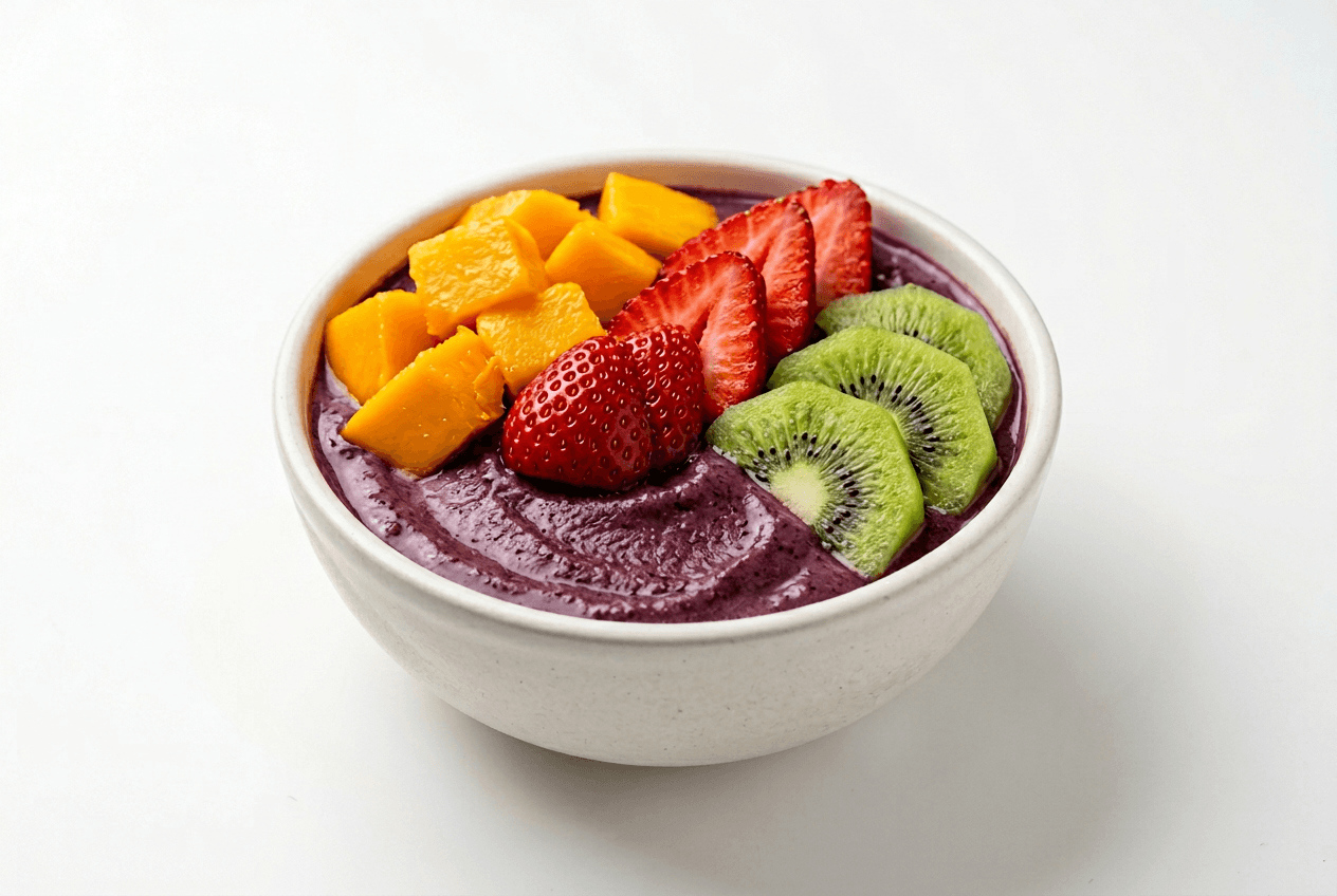 Colorful acai bowl on white background showing HSL color channels for food color grading adjustments
Step 3: Tone Curve for Depth
The Tone Curve adds dimension and is a key step in color grading food photography. For food on white backgrounds:
-
Lift the shadows slightly — Drag the bottom-left point of the curve up by about 5-10%. This prevents deep, unflattering blacks in food shadows that make dishes look heavy. Lifted shadows give food an airy, appetizing quality on bright white backgrounds.
-
Create a gentle S-curve — Pull the shadow midpoint down slightly, then pull the highlight midpoint up. This adds contrast without crushing detail. For food photography, a subtle S-curve is almost always better than pushing the Contrast slider.
-
Don't clip the highlights — On white backgrounds, your highlights are already near maximum. Push them further and you'll blow out the white, losing the edge detail between food and background in your image.
The goal: visible depth and texture in the food, a clean white background, and a naturally appetizing image.
Step 4: Color Grading (Split Toning) for Mood
Lightroom's Color Grading panel (formerly Split Toning) lets you add colors to shadows, midtones, and highlights independently. These food photography editing tips help create mood without overdoing it:
Warm comfort food (baked goods, stews, grilled meats):
- Shadows: Shift toward warm orange/amber, saturation 8-12%
- Highlights: Shift toward golden yellow, saturation 5-8%
- This adds a golden glow that says "homemade" and "delicious"
Fresh and clean (salads, sushi, smoothie bowls):
- Shadows: Shift toward cool blue/teal, saturation 5-8%
- Highlights: Leave neutral or add a barely-there warm tone, saturation 3-5%
- Creates a crisp, clean feeling without making the food look cold
The critical rule: Keep saturation below 15% in food photography. Anything higher and the color grading becomes visible as an obvious filter rather than a subtle mood enhancer. Subtlety is everything.
The Balance slider controls the boundary between shadows and highlights. For food on white backgrounds, keep balance slightly positive (+10 to +20) so the white stays unaffected by shadow color grading.
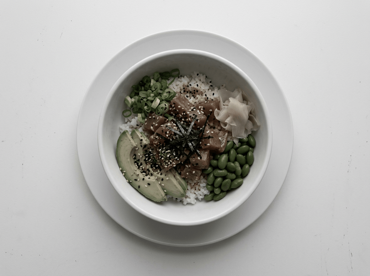
Food Color Grading Examples for Bright White Background: The Hard Part
This is the specific challenge that frustrates food photographers. You want the food vibrant and appetizing, but the white background needs to stay actually white — not warm-white, not blue-white, not gray-white.
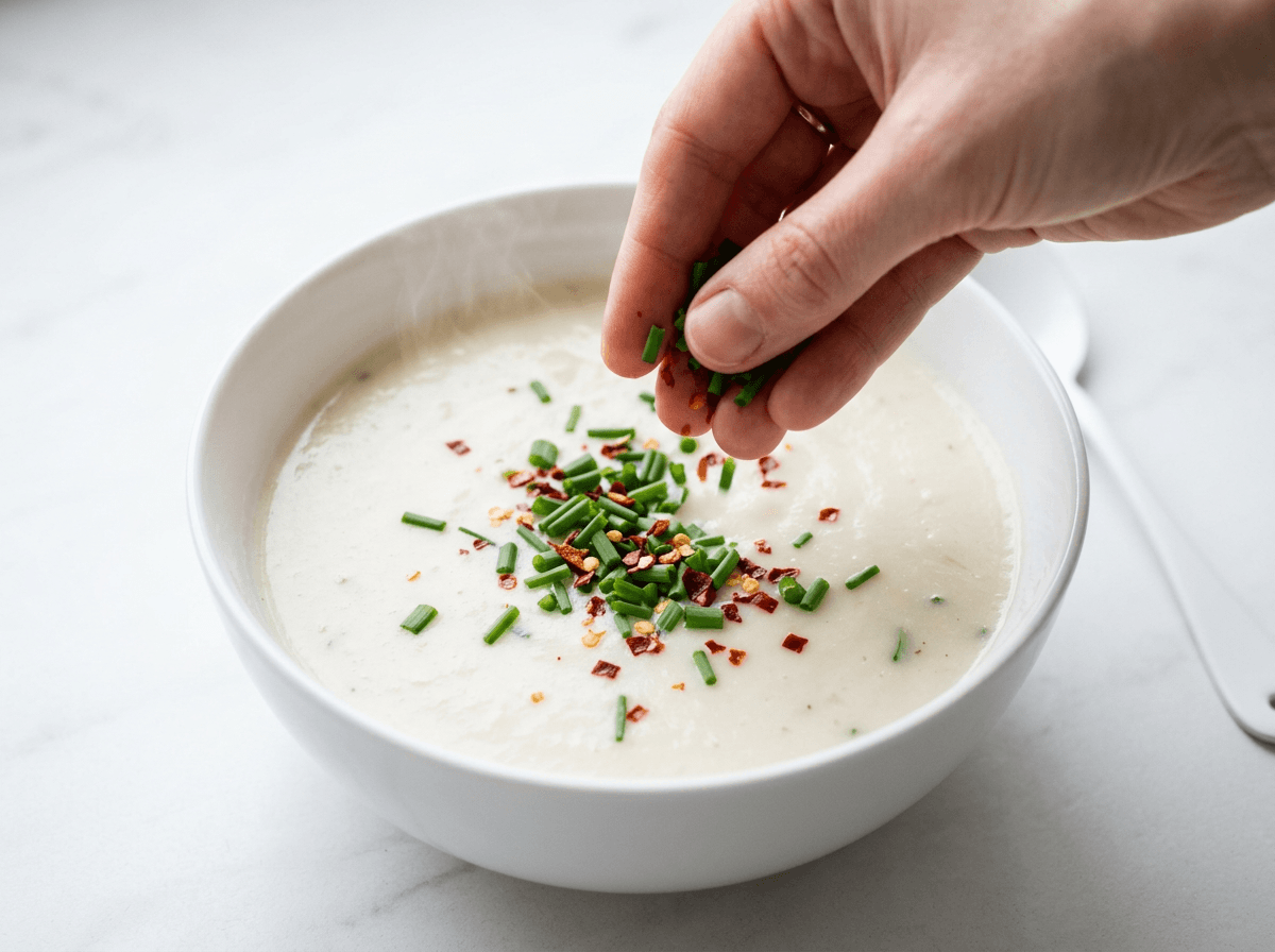 Food color grading challenge on white background with vibrant garnish colors against white soup and surface
Here's a systematic approach for white background food photography color grading:
1. Expose for the background, then recover the food. White backgrounds trick your camera into underexposing by 1-2 stops. Counterintuitively, you need to overexpose slightly at capture to get true whites. In post, push the Whites slider until the background reads RGB 245-250 (pure 255 is too blown — you want a touch of detail in the image).
2. Use luminance to control color spill. Food colors bleed onto white surfaces via reflected light. If your curry is bright yellow, the white background near it will have a yellow tint. Fix this by reducing Yellow and Orange luminance in the HSL panel, or use a radial mask to desaturate the background edges.
3. Mask the food separately. Lightroom's AI masking (Select Subject) lets you isolate the food from the background. Apply your warm, appetizing color grade to the food mask only. Then create an inverted mask for the background and ensure its colors stay neutral. This is the single most powerful technique for white background food photo color correction.
 Ungraded food photo on white background showing muted colors that need color grading correction
4. Monitor your RGB values. While grading, periodically hover over the white background and check RGB readings. For a true neutral white, all three values should be within 2-3 points of each other. If R is 250 but B is 240, you have a warm cast creeping into your image.
5. Use the calibration panel for final polish. Lightroom's Camera Calibration panel (bottom of the Develop module) fine-tunes how your camera interprets each primary color. Small adjustments — shifting Red Primary hue toward orange, or increasing Blue Primary saturation — can correct persistent color casts that other panels can't fix.
Our food background editor can also replace backgrounds entirely if your whites are unsalvageable — a handy shortcut for food photography on white backgrounds.
5 Food Color Grading Mistakes That Make Food Look Fake
Even experienced food photography editors fall into these traps. Here are the tips for what to avoid in your color grading:
 Oversaturated food photography example showing common color grading mistake of pushing colors too far
1. Oversaturation syndrome. The most common food photo color correction mistake. Strawberries that glow like neon signs. Lettuce that looks radioactive. The fix: use Vibrance instead of Saturation for global adjustments — it protects already-saturated colors from going nuclear. For targeted saturation in the HSL panel, stay within +10 to +15 on any single slider.
2. Pushing orange and red too far on meats. A little warmth makes grilled chicken look golden. Too much makes it look sunburned — like a bad spray tan on a chicken breast. Keep red and orange hue shifts under +10, and if the meat starts looking one-dimensional in your image, pull back.
3. Adding green to shadows. A popular look in lifestyle photography (that "film emulation" aesthetic). For food photography, it's a disaster. Green shadows make food look spoiled. As one colorist community noted: "the greens could make people feel disgusted." Stick to neutral or warm shadows for food images.
4. Ignoring white balance before grading. Building food color grading on incorrect white balance is like painting over wallpaper — the underlying problem always shows. Fix white balance first, every time. If your whites aren't neutral, nothing else looks right.
5. Trusting Lightroom's Auto settings. Lightroom's Auto doesn't understand food photography. It treats every photo like a landscape or portrait — it doesn't know that a slight warm cast on bread is appetizing, or that shadows under a bowl should stay lifted. Always color grade food manually, or use presets designed specifically for food photography.
For more food photography tips on getting colors right in-camera, our food photography equipment guide covers the gear that helps from the start.
Skip the Learning Curve: AI Food Color Grading
Everything above takes 15-30 minutes per food photo once you know what you're doing. Longer if you're still learning.
Here's the alternative: FoodShot AI handles food color grading automatically with 30+ style presets — each one trained specifically on food photography, not generic photo filters.
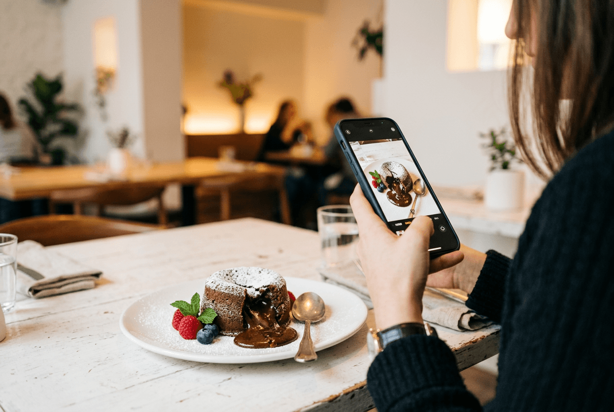 Smartphone capturing chocolate lava cake for AI food color grading showing phone-to-professional workflow
Upload a food photo, pick a style (Delivery, Restaurant, Fine Dining, Instagram, and more), and get a professionally color-graded image in about 90 seconds. The AI understands food-specific color rules: warming baked goods without oversaturating, keeping greens fresh without pushing them neon, maintaining natural whites on clean backgrounds.
Some specific things FoodShot handles that would take multiple Lightroom adjustments:
- Lighting style adjustment — Adjusts color temperature alongside lighting direction for a cohesive food photography look
- Background handling — The food background editor swaps to a clean white (or any scene) while the AI re-grades the food colors to match
- Style presets tuned per category — "Delivery" optimizes differently than "Fine Dining" because delivery app thumbnails need brighter, punchier colors than a moody restaurant menu
You can try it free with 3 generations — no card required. Paid plans start at $9/month (billed annually) for 25 generations with watermark removal and commercial license.
For restaurant owners and food businesses needing dozens of food photos graded consistently, this eliminates the biggest bottleneck in content creation. Pair it with our tips on taking food photos with your phone and you've got a complete food photography workflow from capture to finished, color-graded image — whether you're shooting on a bright white background or any other surface.
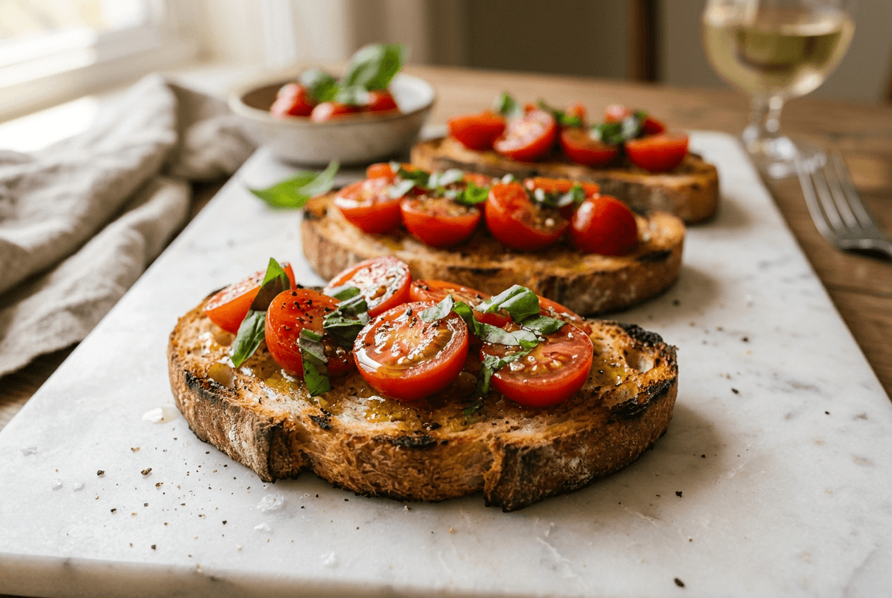 Professionally color-graded bruschetta showing vibrant natural food colors achieved with AI food photography tools
Frequently Asked Questions
What settings should I use for food color grading on a white background?
Start with correct white balance (5500-6000K for natural light). In the HSL panel, boost red and orange saturation +5-10 for warm foods, reduce yellow saturation -10 to -15 for greens. Use a gentle S-curve in the Tone Curve. For split toning, keep saturation below 15%. Push Whites until the background reads RGB 245-250. Use Select Subject masking to grade food and background independently. These food color grading examples for bright white background photography give you a solid starting point.
How do I keep whites white while making food colors pop?
Use Lightroom's AI Subject masking to separate food from background in your image. Grade the food with warm, appetizing tones on the subject mask only. On the inverted background mask, ensure neutral colors by checking that RGB values are within 2-3 points of each other. If the background picks up a color cast, reduce that color's luminance in the HSL panel. For more food photo color correction tips, see our guide on how to edit food photos.
What's the best app for food photo color grading?
For manual control, Adobe Lightroom (desktop or mobile) remains the gold standard for food photography editing with its HSL panel and Color Grading tools. Capture One offers similar color grading functionality. For an automated approach, FoodShot AI uses food-trained presets to handle color grading in 90 seconds — no editing skills needed. See our best food photography apps for a full roundup.
Does color grading work differently for white vs dark backgrounds?
Yes, significantly. White backgrounds require more precise white balance (any color cast is immediately visible) and benefit from subject masking to grade food independently. Dark backgrounds are more forgiving — warm casts often look intentional, and you can push saturation further. White backgrounds also compress the dynamic range of the image, so increase exposure at capture and be careful with highlight recovery in your food color grading.
Can I color grade food photos on my phone?
Absolutely. Lightroom Mobile gives you access to the same HSL, Tone Curve, and Color Grading panels as desktop — great for food photography editing on the go. Snapseed offers selective color tools for quick adjustments. For the fastest results, FoodShot AI's mobile app (iOS and Android) handles food color grading with one tap — especially useful for restaurant owners who shoot and publish food photos directly from their phones.