50 Food Menu Background Ideas for Stunning Menus (2026)
Choosing the right food menu background can make or break how customers perceive your dishes. Before a customer reads your restaurant name, scans a price, or sees a single dish, the surface behind your food is already telling them whether to expect a $12 burger or a $45 wagyu steak.
Quick Summary: We've curated 50 food menu background ideas organized by restaurant type — from dark marble for fine dining to clean white for delivery apps. Each idea includes the mood it creates, which foods pair best, and how to get the look. Plus, we show you how to swap menu backgrounds instantly with AI instead of reshooting your entire menu.
One study found that specialty food products photographed on dark slate backgrounds outperformed the same products on white marble by 42% in click-through rates. The restaurant menu background isn't decoration — it's a conversion tool.
Here are 50 menu background ideas to match every restaurant concept, organized so you can jump straight to your category.
Fine Dining Food Menu Backgrounds
Fine dining demands food menu backgrounds that whisper luxury. Dark, low-texture surfaces keep the focus on meticulous plating while signaling a premium experience. For more on shooting fine dining dishes, see our guide to fine dining food photography.
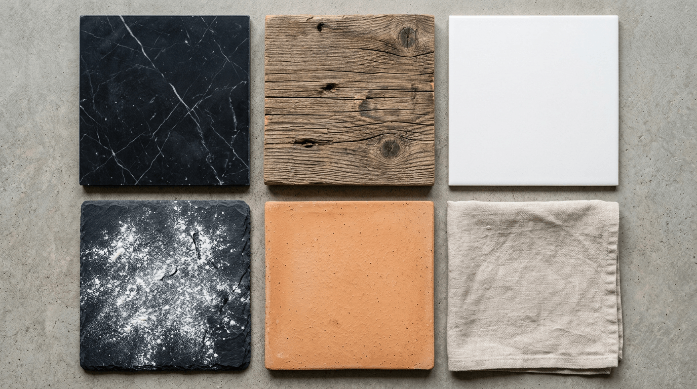
1. Dark Marble Rich veining on a near-black base. The subtle pattern adds visual interest without competing with the food. Best for: white-plated dishes, seafood towers, dessert courses.
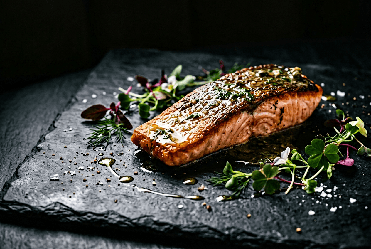
2. Black Slate Matte and moody. Slate absorbs light rather than reflecting it, which makes glossy sauces and vibrant garnishes pop. Best for: seared proteins, tasting menu courses, dark chocolate desserts.
3. Polished Granite Slightly reflective with a deep, speckled texture. Feels more refined than slate but less formal than marble. Best for: charcuterie presentations, amuse-bouches, cocktails.
4. Deep Navy Linen Fabric adds a tactile softness that stone can't match. Navy reads as sophisticated without the heaviness of pure black. Best for: seafood, light-colored pasta, citrus desserts.
5. Smoked Glass Translucent and contemporary. Creates a floating effect when food is plated on it. Best for: minimalist plating, molecular gastronomy, architectural desserts.
6. Dark Walnut Wood The only warm-toned option here, and it works — tight grain with a near-chocolate color reads as heritage luxury. Best for: steakhouse menus, aged cheese courses, wine-paired dishes.
7. Charcoal Stone Raw, unpolished, and slightly rough. More organic than slate, with subtle grey variations that add depth. Best for: farm-to-table fine dining, root vegetable dishes, rustic-elegant plating.
8. Brushed Gunmetal Industrial meets refined. The directional brushing catches light in interesting ways. Best for: modern tasting menus, deconstructed dishes, small plates.
9. Onyx Surface High-gloss black with subtle warm undertones. Dramatic and unapologetically luxurious. Best for: caviar service, gold-leaf desserts, champagne pairings.
10. Black Velvet Texture Ultra-matte with a fabric-like appearance. Absorbs nearly all light, making food colors explode. Best for: colorful desserts, sushi presentations, dishes with microgreens.
Casual Dining Restaurant Menu Backgrounds
Casual dining menu background ideas should feel warm, approachable, and lived-in. Think surfaces you'd actually find in a neighborhood restaurant — nothing too polished, nothing too precious. The right restaurant menu background tells customers "relax, you'll enjoy this."
11. Reclaimed Wood Planks Weathered, slightly uneven, with visible nail holes or paint remnants. Tells a story of authenticity. Best for: burgers, BBQ, comfort food platters.
12. Natural Linen Wrinkled slightly, not pressed flat. The imperfection is the point — it looks real and inviting. Best for: brunch dishes, sandwiches, grain bowls.
13. Terracotta Tile Warm orange-brown with natural variation in color. Immediately feels Mediterranean or Southwestern. Best for: tapas, flatbreads, grilled vegetables.
14. Kraft Paper The ultimate casual signal. Works as a literal tabletop and photograph background. Best for: fish and chips, tacos, street food presentations.
15. Butcher Block Thick, end-grain maple or oak. The criss-cross pattern adds texture without distraction. Best for: steak sandwiches, carving presentations, cheese boards.
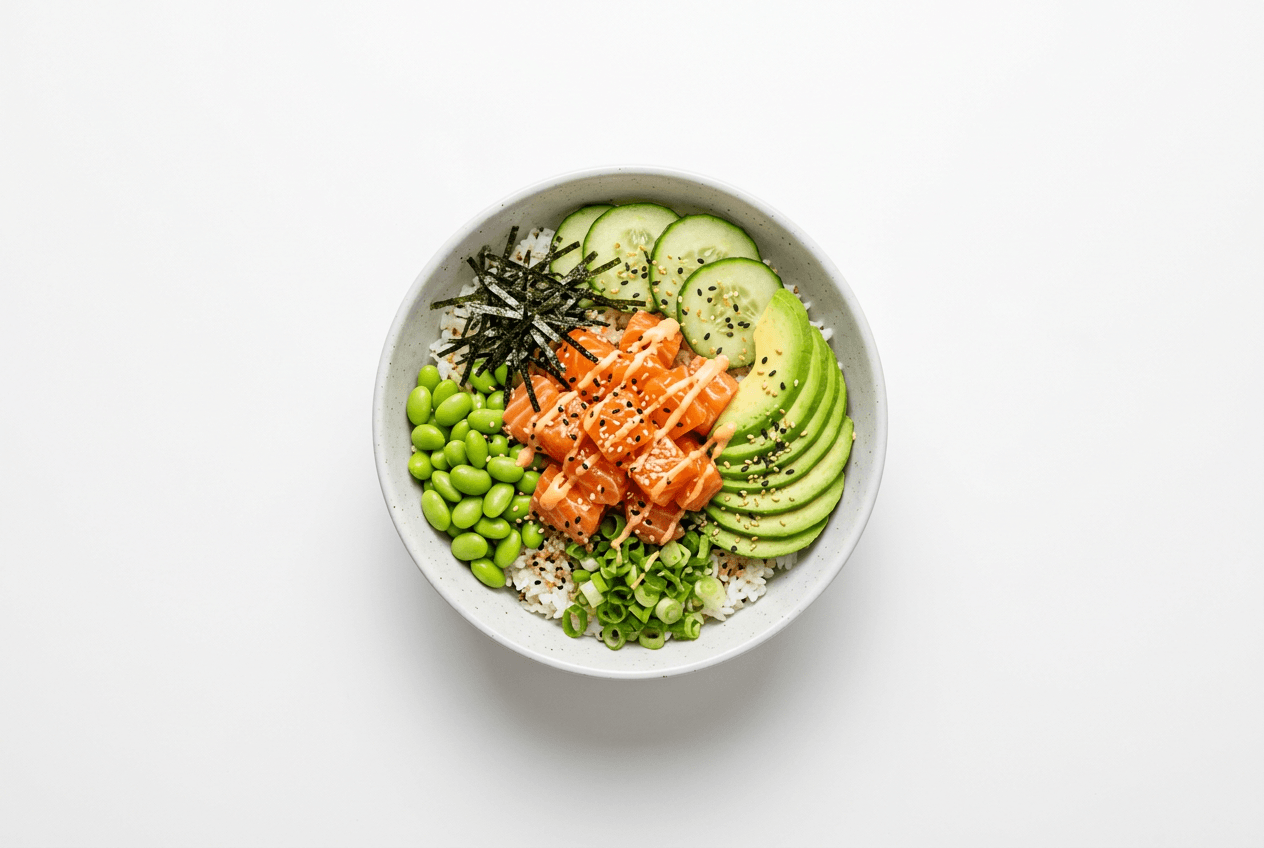
16. Woven Rattan Tropical and relaxed. The basket-weave pattern adds geometric interest. Best for: poke bowls, acai bowls, tropical cocktails, summery dishes.
17. Warm Oak Plank Smoother and more refined than reclaimed wood, with a honey-gold tone. Best for: pasta dishes, roasted chicken, comfort food with a slight upscale twist.
18. Exposed Brick (Flat Texture) A flat-lay-friendly brick-pattern surface. Urban energy with warmth. Best for: pizza, wings, craft beer pairings.
19. Denim Fabric Unexpected and memorable. The dark indigo provides contrast while the weave adds subtle texture. Best for: American diner classics, milkshakes, loaded fries.
20. Copper-Patina Surface Green-tinged aged copper. Unique and eye-catching with a vintage industrial vibe. Best for: cocktail menus, small plates, gastropub specials.
Cafe Menu Background Ideas
Cafe menu background designs lean light, bright, and Instagram-worthy. They're built for spaces that serve flat whites, avocado toast, and pastries — and for customers who photograph everything. See how cafes use AI to refresh their visual menus with AI food photography for cafes.
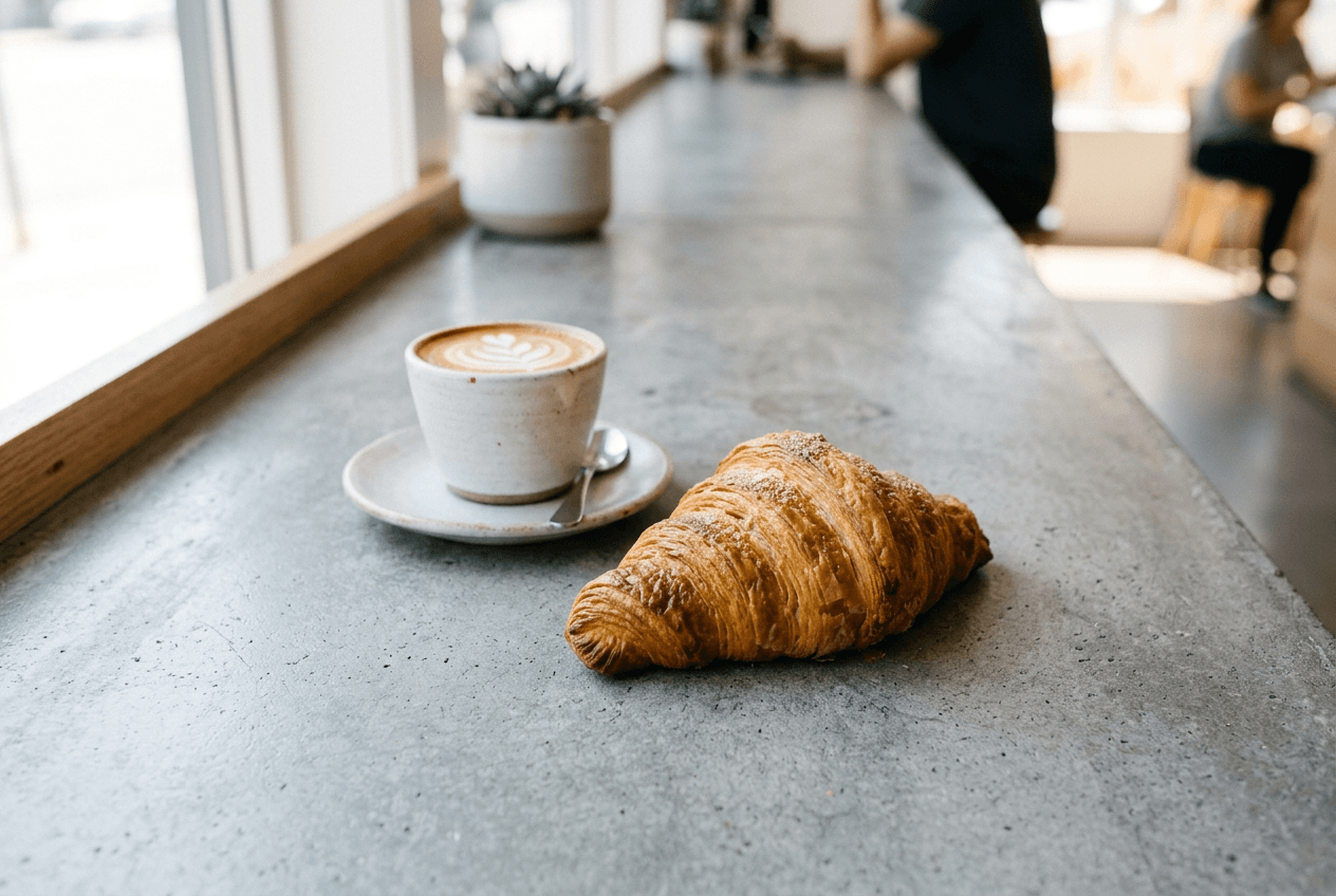
21. Polished Concrete Smooth, cool-toned grey with subtle surface variation. Modern coffee shop energy. Best for: latte art, minimalist pastries, open-faced sandwiches.
22. White Marble (Calacatta) The classic cafe aesthetic — white base with warm grey-gold veining. Clean but not sterile. Best for: croissants, fresh fruit, iced drinks.
23. Mint Green Painted Wood Slightly chippy paint on aged wood. Reads as charming and intentionally vintage. Best for: macarons, layer cakes, floral-garnished drinks.
24. White Subway Tile Geometric grid pattern with visible grout lines. Immediately signals "modern cafe." Best for: bagels, toast arrangements, coffee flights.
25. Terrazzo Flecked stone aggregate in a neutral base. Has enough visual interest to work without food photography props. Best for: smoothie bowls, pastries, small bites.
26. Blush Pink Surface Soft, dusty rose. Warm and feminine without being saccharine. Best for: strawberry desserts, pink lattes, floral cakes.
27. Raw Plywood Unfinished, light-toned wood with visible grain. Looks intentionally DIY and creative. Best for: artisanal bread, granola bowls, simple plated salads.
28. Light Blue Watercolor Wash Painted surface with visible brush strokes in a muted, watery blue. Dreamy and artistic. Best for: blueberry pastries, iced lattes, breakfast spreads.
29. Speckled Ceramic The surface texture of a handmade pottery mug, scaled up. Organic and artisanal. Best for: matcha drinks, overnight oats, small pastries.
30. Frosted Glass Translucent and ethereal. Diffuses light underneath for a soft glow effect. Best for: delicate pastries, tea service, minimalist plating.
Bakery Food Menu Background Images
Bakery backgrounds should look like they belong in a kitchen. A little messy, a little warm, a lot authentic. The best food menu background images for bakeries hint that something was just baked moments ago. For a deeper dive, check out our bakery food photography guide.
31. Flour-Dusted Dark Surface Dark wood or slate with a visible dusting of flour. Instantly signals "fresh from the oven." Best for: bread loaves, croissants, rolled pasta, pie dough.
32. Parchment Paper Slightly crinkled, with translucent grease spots or flour marks. Looks real because it is (or should be). Best for: cookies, scones, hand pies, fresh rolls.
33. Vintage Baking Sheet Weathered aluminum with dark spots from years of use. Tells the story of a well-loved kitchen. Best for: rows of cookies, individual tarts, focaccia, biscuits.
34. Marble Pastry Slab White or grey marble — the actual surface bakers use for rolling dough. Functional and beautiful. Best for: laminated pastries, chocolate work, rolled fondant cakes.
35. Cream Linen with Crumbs A light-colored cloth with intentional scatter of crumbs, seeds, or flour. Suggests someone just broke bread. Best for: sourdough, torn bread photos, morning pastry spreads.
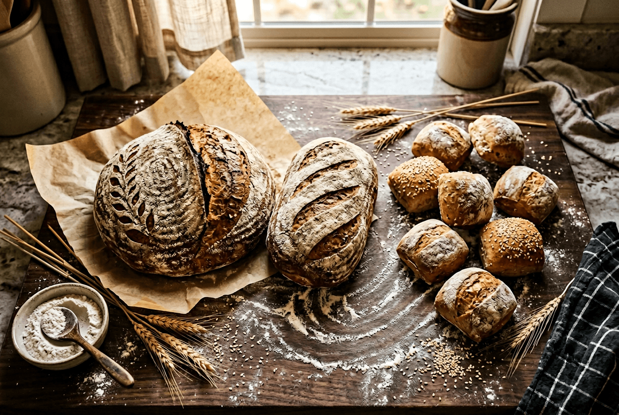
36. Wire Cooling Rack (Overhead) Shot from directly above, the geometric grid of a cooling rack creates clean lines and interesting shadows. Best for: just-baked cookies, glazed donuts, freshly iced cupcakes.
37. Copper-Toned Surface Warm metallic with a rosy gold hue. Adds warmth to golden baked goods without clashing. Best for: brioche, croissants, golden-crusted bread, caramelized pastries.
38. Light Butcher Block Pale maple or birch, well-worn. Lighter and airier than the dark fine dining version. Best for: breakfast pastries, sliced bread, fruit tarts.
39. Cotton Canvas Drop Cloth Thick, slightly textured off-white fabric. A painter's tool repurposed for the kitchen. Best for: artisanal bread, rustic cakes, muffin displays.
40. Warm Honey Wood Golden-toned wood with visible knots and grain. Cozy, inviting, and classic. Best for: cinnamon rolls, banana bread, pie slices, anything that feels "homemade."
Delivery App Menu Background Design
Delivery app photos live at 200×200 pixels on a phone screen. Busy backgrounds become visual noise at that size. The rule for menu background design on delivery platforms: less is more. For platform-specific requirements, see our delivery app food photography guide and our Uber Eats photo requirements breakdown.
41. Clean White The gold standard for delivery apps. Maximum contrast, zero distraction, works with every food color. Best for: literally everything — this is your safest bet.
42. Soft Grey Gradient A gentle fade from light grey to white. Adds subtle depth without competing with the dish. Best for: dishes that look washed out on pure white (white rice, cream-colored soups).
43. Bright Single-Tone Color A solid bold color (red, yellow, teal) matched to your brand. Stops the scroll in a sea of white backgrounds. Best for: brand-differentiated listings, featured items, promotional dishes.
44. Transparent/Cutout (PNG) Food isolated with no background at all. Many delivery platforms composite these onto their own templates. Best for: platform flexibility, ads, social media repurposing. FoodShot's background editor can create these in seconds.
45. Light Wood A pale, clean wood surface. Slightly warmer than white, slightly more interesting than grey. Best for: breakfast items, sandwiches, healthy bowls.
46. Subtle Linen Texture White or off-white with just enough fabric texture to not look like a blank canvas. Best for: bakery items on delivery apps, artisanal brands.
47. Soft Shadow on White White background with a carefully placed natural shadow underneath the dish. Adds dimensionality and a "floating" effect. Best for: plated dishes, round bowls, items that need grounding.
48. Branded Color Block Your brand's primary color as a solid background — instantly recognizable when scrolling. Best for: chain restaurants, ghost kitchens, brand-heavy operators.
49. Minimal Pastel Very light pink, mint, or lavender. Just enough color to differentiate from competitors' white backgrounds. Best for: dessert-focused brands, bubble tea shops, acai bowl concepts.
50. Crisp Off-White Not pure white but close — a warm ivory or very light cream. Feels less clinical than #ffffff while still looking clean. Best for: premium delivery brands that want clean without sterile.
Choosing a Food Menu Background by Cuisine Type
The best food menu background doesn't just match your restaurant type — it reflects your cuisine's cultural identity. Here's a reference for menu background design by cuisine, based on the color psychology research behind restaurant design (Cornell University Food and Brand Lab has published extensively on how visual context shapes food perception):
Italian
Go-to surfaces: Warm wood, terracotta, olive-toned linen, rustic stone Color palette: Browns, warm whites, olive greens, sun-baked oranges The feel: Tuscan farmhouse. A Sunday afternoon with family. The background should feel as warm as the food.
Japanese
Go-to surfaces: Minimalist stone, clean white, matte black slate, bamboo Color palette: Neutral greys, whites, natural blacks, muted greens The feel: Zen simplicity. Every element is intentional. Negative space is a feature, not a flaw.
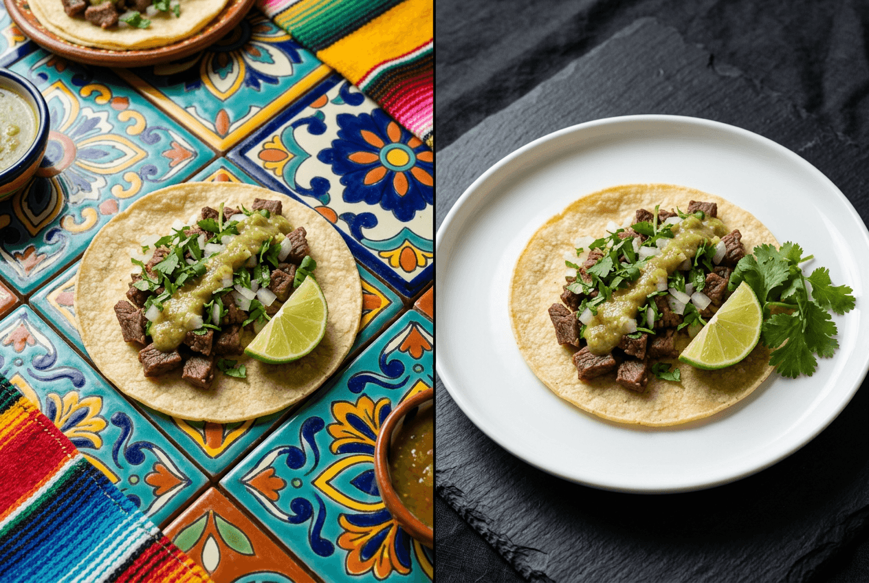
Mexican
Go-to surfaces: Vibrant hand-painted tiles, painted adobe, colorful woven textiles Color palette: Fiery reds, sunny yellows, deep oranges, turquoise accents The feel: Energetic and joyful. The background should have as much personality as the salsa.
French
Go-to surfaces: Elegant marble, soft pastels, pressed linen, aged zinc Color palette: Champagne tones, dusty pinks, soft greys, butter yellows The feel: Refined but not stiff. Think Parisian patisserie, not palace.
Indian
Go-to surfaces: Rich jewel-toned fabrics, brass or copper surfaces, carved wood Color palette: Deep saffron, ruby red, emerald green, gold accents The feel: Warm, layered, and richly textured — a visual echo of the spice complexity.
Thai
Go-to surfaces: Banana leaf, bamboo, dark teak wood, tropical greenery Color palette: Lush greens, warm golds, natural browns The feel: Fresh and tropical. The background should feel like outdoor dining in Chiang Mai.
American BBQ
Go-to surfaces: Dark stained wood, metal grill textures, leather, kraft paper Color palette: Charcoal, deep browns, flame reds, smoky oranges The feel: Unapologetically rustic. The surface should look like it's been near a smoker.
Mediterranean
Go-to surfaces: Blue-and-white tiles, whitewashed wood, olive wood, ceramic Color palette: Ocean blues, crisp whites, sandy beiges, terracotta The feel: Coastal and sun-drenched. Think Greek island taverna or Moroccan courtyard.
Swap Any Food Menu Background in 90 Seconds with FoodShot AI
Buying physical photography surfaces for all 50 of these menu background ideas would cost hundreds of dollars, take up storage space, and require reshooting every dish for every background change.
FoodShot AI's food background editor eliminates all of that. Upload any food photo, and swap the background to any surface — dark marble, rustic wood, clean white, or your own custom image — in about 90 seconds.
What you can do:
- Remove backgrounds entirely to create transparent PNG cutouts for delivery apps
- Replace backgrounds with 30+ preset environments (luxury restaurant, beach cafe, rooftop venue, and more)
- Upload custom backgrounds to match your exact brand aesthetic
- Process in bulk — update your entire 50-item menu without a single reshoot (available on the Scale plan)
This is especially valuable for seasonal updates. Swap from warm autumn wood to festive holiday backgrounds across your entire menu in an afternoon, not a week. No photographer needed, no studio rental, no scheduling headaches.
Just snap your dishes with any smartphone, upload to FoodShot's AI food photo editor, and choose your background. Plans start at $9/month with a free trial.
For the full picture on how to take food photos with your phone and then transform them for your menu, check out our complete guide to food photography for restaurant menus.
5 Quick Tips for Picking the Right Food Menu Background
1. Match your price point. Dark backgrounds signal premium. Light backgrounds signal accessible. Your menu background design sets price expectations before anyone reads a number.
2. Think thumbnail first for digital menus. That gorgeous textured slate might look incredible at full resolution, but at 200×200 pixels on a delivery app, it becomes distracting noise. Simplify for small screens.
3. Stay consistent across your full menu. Mixing five different backgrounds across 30 menu items looks chaotic. Pick one primary surface and stick with it — or use FoodShot's background editor to unify everything in minutes.
4. Use contrast to make food pop. Light food on light backgrounds disappears. Dark food on dark backgrounds vanishes. The best pairings create contrast — a golden croissant on dark slate, a chocolate cake on white marble.
5. Test with your actual dishes. A background that looks stunning on Pinterest might clash with your specific food colors. Always test with real photos before committing to a full reshoot. Upload a photo and try different backgrounds instantly to compare options side by side.
For more on styling and editing your food photos after choosing a background, see our food styling guide and food photography lighting tips. And if you're building a complete visual identity for your restaurant, our restaurant branding guide covers everything from colors to photography style.
Frequently Asked Questions
What makes a good food menu background?
A good food menu background creates contrast with your dish, matches your restaurant's brand identity, and doesn't compete for attention. Matte surfaces work best for glossy foods, while slightly textured surfaces add depth to simple presentations. The background should support the food — never upstage it.
What background color is best for food photography?
There's no single best color — it depends on the food. Dark backgrounds (black, charcoal, navy) make light-colored and colorful dishes pop, while light backgrounds (white, cream, soft grey) work well for darker foods. Clean white is the safest all-around choice, especially for delivery apps and digital menus.
How do I change the background of my menu photos?
The traditional approach is reshooting every dish on a new surface, which takes hours. The faster method: use an AI background replacement tool like FoodShot's food background editor. Upload your existing food photo, select a new background, and download the result in about 90 seconds — no photography skills required.
Should I use the same background for all menu items?
Yes, for consistency. A unified background across your entire restaurant menu creates a professional, cohesive look that strengthens your brand identity. Most successful restaurants use one primary background surface with occasional variations for featured or seasonal items.
What background works best for delivery apps?
Clean white or soft grey — every time. Delivery app thumbnails are tiny (around 200×200 pixels), so anything busy or dark gets lost. Uber Eats, DoorDash, and Grubhub all recommend clean, simple backgrounds. White gives maximum contrast, makes food colors accurate, and works at any thumbnail size. See our delivery app photography guide for full platform specs.