27 Food Photoshoot Ideas That Actually Sell the Dish
 Ali Tanis20 min read
Almost every guide to a photoshoot for food is written for photographers who want to become better photographers. This one is written for the person who has to put 40 dishes on a delivery app by Friday. That is a different job, and it needs different food photography.
The difference matters more than it sounds. Pinterest is full of gorgeous, heavily shadowed, prop-stuffed food photography — and a good chunk of it would be rejected outright if you uploaded it to your Uber Eats menu. So before the ideas, one page of rules. Then 27 named setups you can reproduce, each with the setup in a line, the mistake nearly everyone makes, and what it is genuinely best used for. No gear lectures, no career tips, no philosophy — just food photography that earns its place on a menu.
Quick Summary: The best ideas for a photoshoot for food depend on where the image lands. Delivery menu tiles are rule-bound — Uber Eats requires a single centred item at 5:4–6:4 with no text, no strong shadows and no people except hands — while posters, social and menu boards are wide open. Sort the 27 ideas below into those two buckets and shoot accordingly.
Read this before you copy a single Pinterest board
Pinterest has around 631 million monthly users, and food is one of its biggest categories — which is exactly why the top results for this search are pin boards. (Pinterest's Q1 2026 results put user growth in its tenth straight double-digit quarter.) Those boards are a fine mood source. They're a terrible spec sheet.
Here's what the platforms actually enforce. Uber Eats' store submitted menu photo guidelines say a menu image must show a single item from your menu, framed in the centre, ideally between 5:4 and 6:4. It cannot contain more than one item, depict people (hands are the one exception), be blurry, have strong shadows or insufficient lighting, show an unsanitary environment including dirty surfaces or used cutlery, carry logos or watermarks, or contain any text. DoorDash's merchant photo guidance is similar in spirit: photos get rejected for poor lighting, lack of clarity, or text and overlays.
Those are not style tips. They are pass/fail conditions on your photography, checked before your image ever reaches a customer.
Read that list again next to a Pinterest board. Dark-and-moody? Strong shadows. The messy, authentic, crumbs-and-a-used-fork look? Unsanitary surface. The gorgeous flat-lay grid of your whole brunch spread? More than one item. Text baked over the image? Rejected. Roughly half of the most-pinned food photography on the internet fails at least one of these checks.
None of those looks are wrong. They're just aimed at the wrong slot. So sort every idea here into two buckets before you shoot:
- Menu tiles — delivery apps, ordering pages. Rule-bound, literal, well-lit, one dish, no text. Boring is fine here; boring converts. The photography exists to help someone decide, not to win an award.
- Marketing — posters, social, menu boards, window graphics, decks. No rules but your own taste. This is where moody, messy and typographic belong, and where you create the images that give a brand a personality.
Nearly every "why did my photo get rejected" story is someone who shot a beautiful marketing image and uploaded it as a menu tile. Get the bucket right and your food photography does its job. Get it wrong and the most beautiful photos you own sit in a rejection queue.
That single distinction is the most useful thing on this page. Everything below assumes you know which bucket you are shooting for.
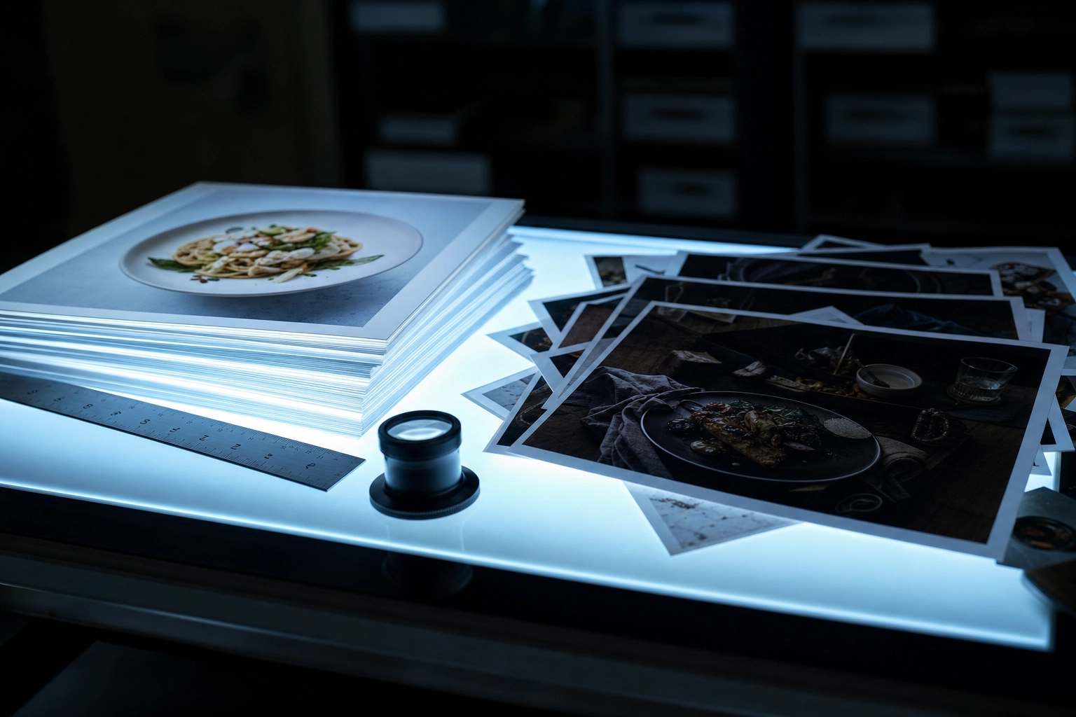 Printed food photos sorted on a backlit light table into bright menu-safe and dark moody piles
Angle ideas: where you put the camera
Angle is the first decision in food photography and the one most people never consciously make. It is also the cheapest to fix, because it costs nothing but moving your feet. Pick it from the food's geometry, not from habit. There are really only three angles that matter — overhead, 45 degrees and straight-on — and the food itself tells you which one. Tall food wants a low angle. Flat food wants a high one. That is the whole rule, and these five ideas are what it looks like in practice.
1. The 45-degree hero (the diner's eye)
Setup: Camera at seated eye height, food turned 45 degrees, main light behind and slightly left. The mistake: Using it on flat food. A soup or a curry at 45 degrees hides the thing you're selling. Best for: Anything with height — burgers, stacks, layered bowls. It's the closest angle to what a guest actually sees, which is why it reads as appetising without trying.
2. The 90-degree overhead flat-lay
Setup: Camera directly above the food, plate centred, everything else out of frame. The mistake: Being two degrees off true 90. A round plate turns into a subtle egg shape and the whole image looks amateur without anyone knowing why. Best for: Bowls, pizza, dim sum, anything whose pattern lives on top. It is the most forgiving angle in food photography — find true 90 degrees and even a phone will do the job.
3. The flat-lay grid
Setup: Four to nine dishes on one large surface, true overhead, even gaps between them. The mistake: Trying to use it as a menu tile. It's an instant rejection — multi-item photos break the single-item rule. Best for: Social, catering decks, print menus, hero banners. It's a brand shot, not a product shot.
4. The straight-on stack shot
Setup: Camera at plate level, dead-on, background pushed two metres back so it falls out of focus. The mistake: Forgetting that at plate level, your background is now the whole room. Everything on that back wall is in your photo. Best for: Layer cakes, pancakes, sandwiches — anything whose cross-section is the story. It is the one angle where bakery photography beats every other option outright.
5. The texture macro
Setup: Fill the frame with one detail — crumb, char, glaze, crystal. The mistake: Cropping so tight the food is unidentifiable. Abstract is not appetising. Best for: Bread, chocolate, BBQ bark. Also a strong second image on a listing where the first shot is the standard tile — the details a wide shot flattens are exactly what makes someone hungry.
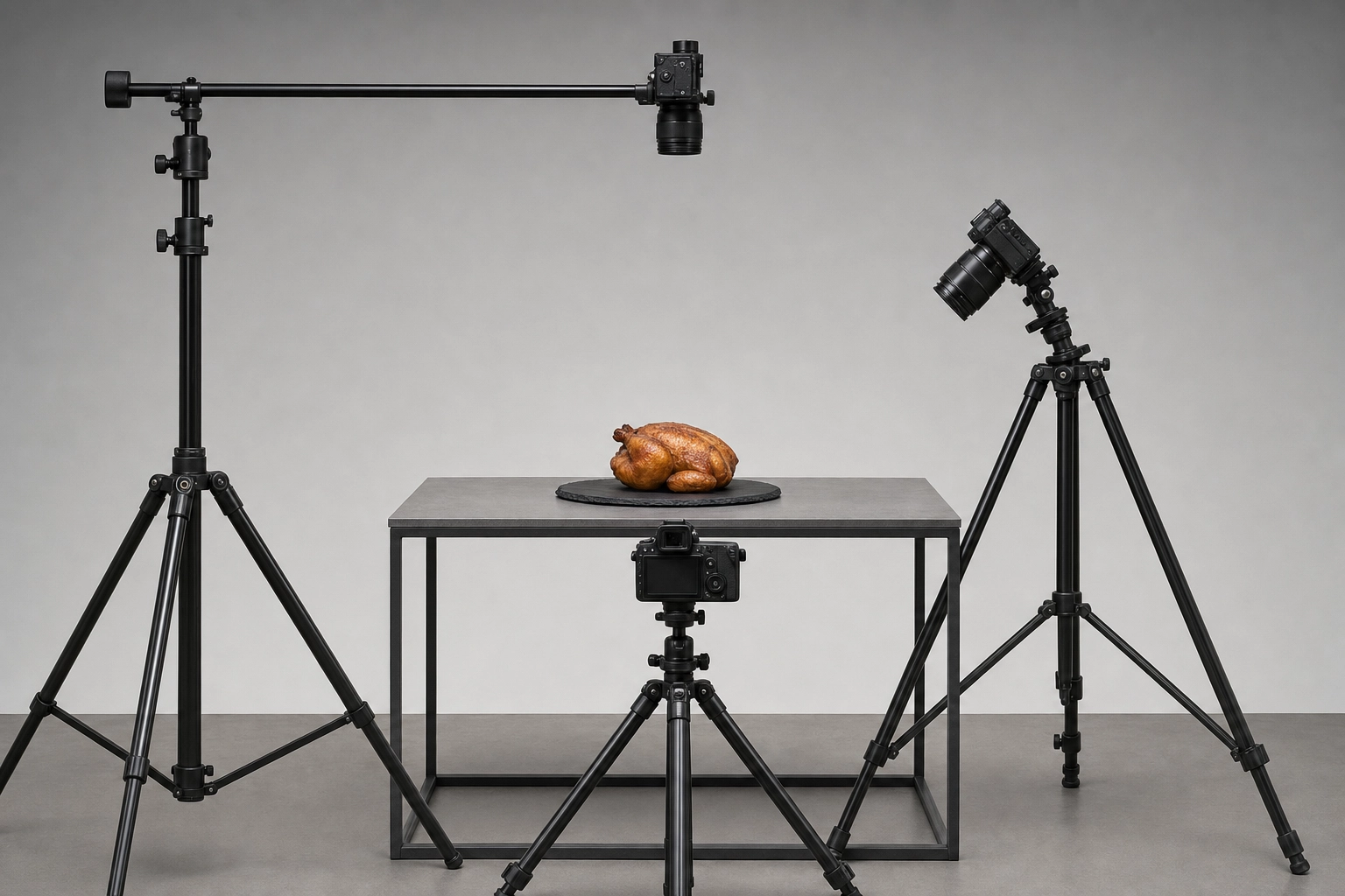 Three tripods aimed at one roast chicken from overhead, 45-degree and level angles showing camera geometry
Light and mood ideas
If you only fix one thing this year, fix the light. Every other variable in food photography is downstream of it — no amount of styling, editing or expensive plates will rescue a dish lit by a ceiling fluorescent. The good news: natural light through a window beats most studio kits for most dishes, and it is free. These six setups cover the bright-and-airy versus dark-and-moody decision, plus the boring middle option that quietly outperforms both.
6. Bright-and-airy window light
Setup: Large window at 90 degrees to the dish, white foam board on the opposite side bouncing fill back in. The mistake: Leaving the ceiling lights on. Mixed colour temperatures give you orange highlights and blue shadows that no editing pass fully rescues. Best for: Brunch, salads, cafes — and it is the safest natural light for delivery tiles. Natural window light is the single cheapest upgrade available to any food business.
7. Dark-and-moody single source
Setup: One small, hard source raking from behind, black cards either side to eat the fill, dark textured surface. The mistake: Falling in love with it and putting it on a delivery app. Strong shadows are an explicit rejection trigger, so this photography loses money the moment it becomes a menu tile. Best for: Posters, fine dining, whisky, steak, hero banners.
8. Hard-light shadow play
Setup: One bare source or direct sun, with a leaf, blind or grid casting a graphic shadow beside the plate. The mistake: Letting the pattern fall across the food. Shadows are the co-star, never the lead. Best for: Summer drinks, ice cream, campaign work.
9. Backlight for translucency
Setup: Light directly behind the glass, camera just below the rim, black card in front to define the edges. The mistake: Backlighting something opaque. A backlit burger is a silhouette. Best for: Beer, juice, broth, honey — anything light can pass through. See our beverage and cocktail photography notes for glass-specific handling.
10. Golden-hour side light
Setup: Low, warm light raking across the surface from the side to exaggerate every ridge and crumb. The mistake: Waiting for actual golden hour. It lasts 20 minutes and never coincides with a service window. Fake it with a warm gel and a low stand. Best for: Rustic bakes, food trucks, outdoor brand imagery.
11. The clean commercial shot
Setup: Two diffused sources at 45 degrees, near-shadowless, neutral surface, dish dead centre. The mistake: Dismissing it as boring. It is boring. It's also the highest-converting image you will ever make, and it satisfies every platform rule at once. Best for: Every delivery app tile you own. If you shoot one thing from this list, shoot this. It is the only idea here that is simultaneously good food photography and guaranteed-compliant photography.
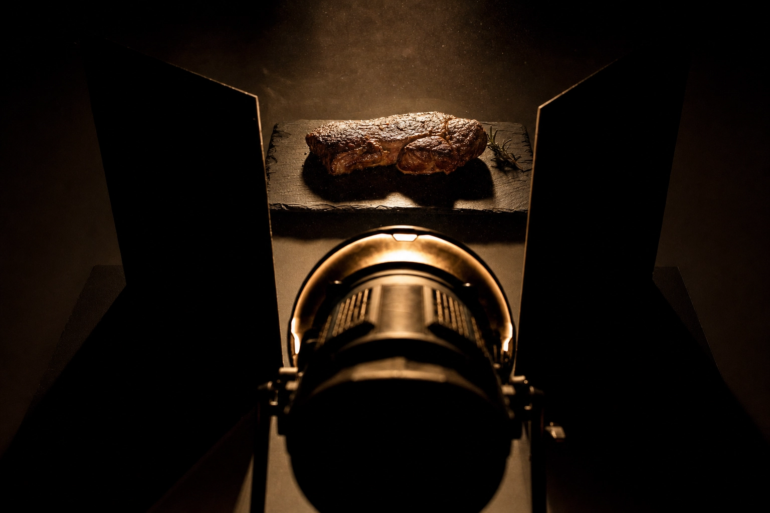 Dark and moody food lighting rig with black flag cards carving one hard light blade across a steak
Motion, steam and texture ideas
Stills only — there is no video anywhere in this section. The trick is implying movement inside a frozen frame, and it is the part of food photography that most rewards preparation. Every idea here needs the camera ready before the food is, because steam, pulls and pours all have a shelf life measured in seconds. Set up, focus, then plate.
12. The steam shot
Setup: Dark background, light from behind, steam lit from the rear so it separates. A damp cotton ball microwaved and hidden behind the plate outlasts the dish's own steam. The mistake: Shooting steam against a pale background, where it's simply invisible. Best for: Ramen, coffee, pies, anything that should read as just out of the kitchen.
13. The pour and the drip
Setup: Fast shutter, a second person pouring, focus locked on the landing point before the liquid moves. The mistake: One pour, one frame. Working photographers shoot 30 and keep one. Best for: Syrup on pancakes, sauce on pasta, spirits over ice.
14. The cheese pull
Setup: Warm the dish properly, pull slowly and steadily, fire at the tension point just before the strand breaks. The mistake: Getting the camera ready after the cheese is plated. You have about 40 seconds of pull before it cools into a rope. Best for: Pizza, toasties, birria, nachos.
15. The sprinkle in mid-air
Setup: Dark backdrop, backlight the falling salt, sugar or herbs so each grain catches an edge. The mistake: Sprinkling so much it reads as a spill rather than a finishing touch. Best for: Fries, donuts, desserts, anything finished at the pass.
16. Condensation and frost
Setup: Chill the glass hard, then mist it with a 50/50 glycerine and water spray. The mistake: Relying on real condensation, which runs off in about 90 seconds and leaves you with a wet glass and no beads. Best for: Beer, iced coffee, soft drinks, canned RTDs.
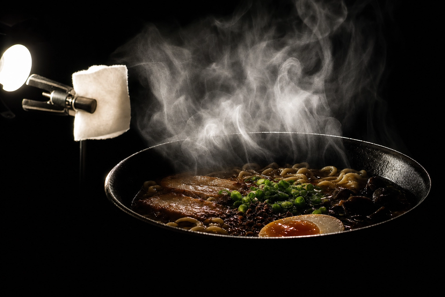 Backlit steam rising from a ramen bowl against black with the hidden cotton pad and bulb visible
Story and process ideas
These sell the why. They are rarely menu tiles and almost always the images people remember, because they show work rather than product. If your differentiator is craft, provenance or scale, this is the group that earns its keep.
17. Ingredient deconstruction
Setup: Every component laid out in order around or beneath the finished food, on a plain surface. Done well it can create a story no caption could. The mistake: Including things the customer can't taste in the result. It reads as padding. Best for: Signature dishes, provenance stories, About pages, catering proposals.
18. The hands-free process shot
Setup: Tripod locked off, dish caught mid-assembly, no faces in frame — hands only, if anyone at all. The mistake: Not knowing that hands are the one exception to Uber Eats' no-people rule. A shot of hands finishing a plate can legitimately run as a menu image; a shot of a smiling chef cannot. Best for: Bakeries, pizzerias, restaurants where craft is the differentiator.
19. Mise-en-place as backdrop
Setup: Finished food sharp in the foreground, prep station softly blurred behind it. The mistake: A background that reads as a dirty surface. There's a fine line between working kitchen and health violation, and platforms police it. Best for: Chef-led venues, kitchen credibility, ghost kitchens proving a real kitchen exists.
20. The half-eaten plate
Setup: A fork lifted mid-bite, one piece taken, crumbs placed on purpose. The mistake: Uploading it to a delivery app. Used cutlery is explicitly listed as a rejection reason. Best for: Editorial, blog, social. Never a menu tile.
21. The scale companion
Setup: A hand, a standard glass or a coin-sized prop beside the food so size is unambiguous. The mistake: Skipping it. A 12-inch pizza photographed alone looks personal-sized, and the refund requests that follow are entirely your own doing. Best for: Delivery, catering trays, sharing platters, anything where expectation gaps cost money.
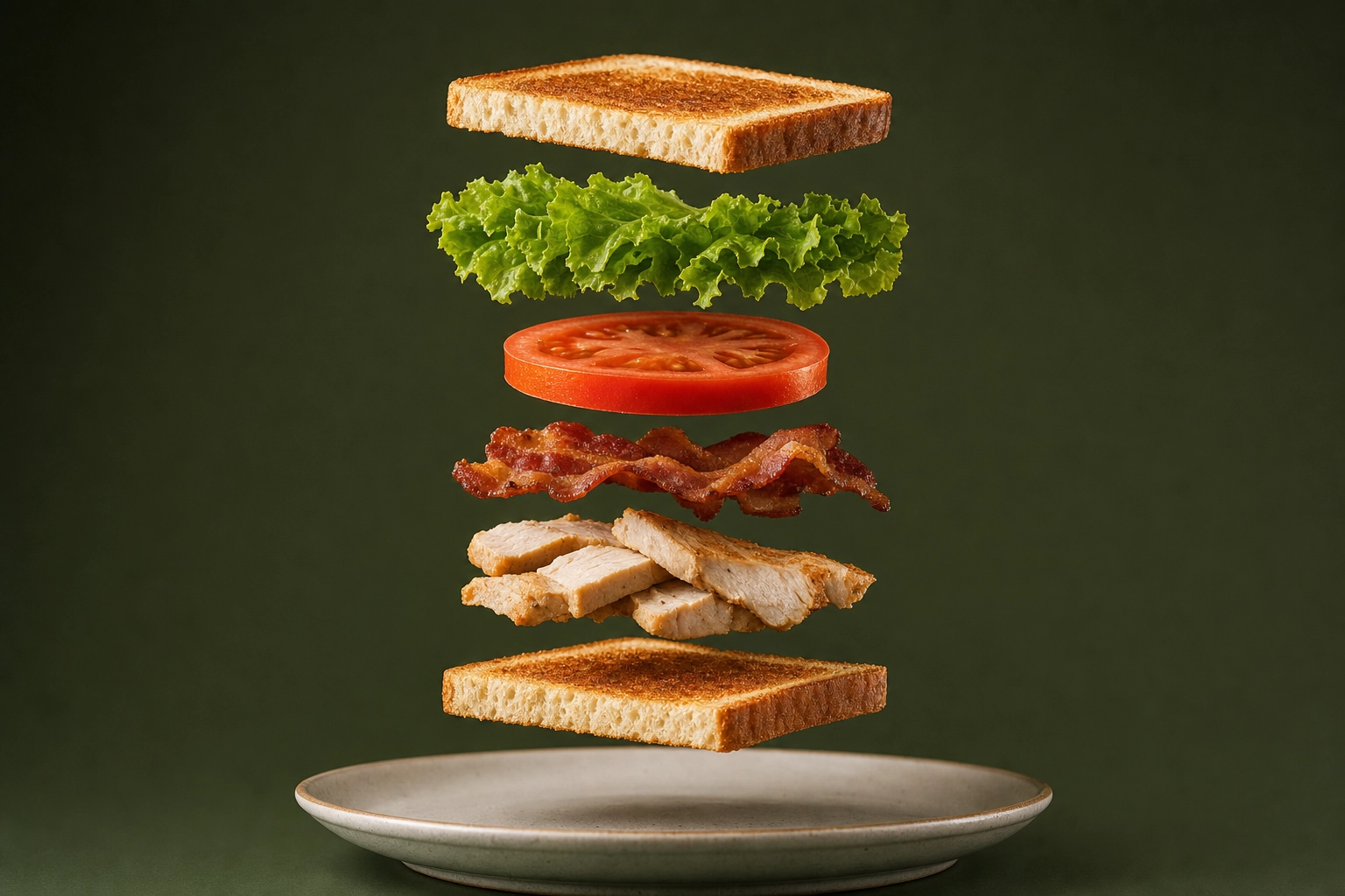 Club sandwich deconstructed into floating separate layers shot straight-on against olive green
Prop, colour and season ideas
Food styling is where most people over-correct. Two props beat ten, every time. The test is simple: remove one prop and ask whether the photo got worse. Keep removing until it does. Most food photography improves the moment a stylist stops adding and starts subtracting — and unlike lighting, good styling costs nothing but restraint.
22. Seasonal prop staging
Setup: Two or three in-season props maximum, all of them plausibly on that table in real life. The mistake: Props outnumbering the food. Keep it simple: if a stranger cannot tell what is for sale in two seconds, the styling has failed. Best for: Holiday menus, limited-time offers, seasonal campaigns.
23. Tone-on-tone monochrome
Setup: Food, plate and surface all inside one colour family — cream on cream, char on slate. The mistake: Matching so precisely the food dissolves into its background. You need one step of contrast somewhere. Best for: Fine dining, minimalist brands, print.
24. The complementary colour clash
Setup: Put the food on its colour opposite. Orange food on a deep blue surface. Green herbs against terracotta. The mistake: A surface so loud it wins the frame. Best for: Brown food that photographs flat — curries, fried chicken, stews, gravy-heavy plates.
25. Your own surface as signature
Setup: Choose one surface and one plate family, then shoot every dish on it. It is the simplest way to create a look that is recognisably yours. The mistake: A different surface per dish. Individually fine, collectively a jumble — and a menu grid is always viewed collectively. Best for: Brand consistency across a full menu. This single habit does more for a menu's coherence than any other idea here, and it costs nothing. The main benefit shows up at the grid level: twelve dishes on one surface look like a brand, twelve dishes on twelve surfaces look like a scrapbook.
Layout ideas that have a job to do
Two setups where text is not just allowed but expected — as long as the image never touches a delivery app. These are the layouts that create room for words, and they are the reason to shoot loose.
26. The negative-space-for-text layout
Setup: Push the food onto one third of the frame and leave the rest clean, evenly lit and uncluttered for a price, headline or logo. The mistake: Flattening the text into the photo and then uploading that same file as a menu tile. Text is a hard rejection on both major platforms. Keep a clean, text-free master and add type on a copy. Best for: Posters, menu board design, ads, table talkers.
27. The vertical poster crop
Setup: Shoot wide and loose, but compose knowing you'll crop to 4:5 or 9:16 later. The mistake: Shooting everything at 5:4 for delivery, then discovering there's no vertical crop hiding inside it. Decide the output before the shutter, not after. Best for: Window posters, stories, digital boards.
Which idea for which dish
The fastest way to use this list: find your category in the table, shoot those two ideas, move on. The pairings below are the ones that consistently do the most for each dish type — the first column is where to start, the second is the shot that gives the listing depth.
| Dish | Start with | Then try |
|---|---|---|
| Burgers, sandwiches | 45-degree hero (1) | Stack shot (4), sandwich angles |
| Pizza | Overhead (2) | Cheese pull (14) |
| Sushi, dim sum | Overhead (2) | Tone-on-tone (23) |
| Ramen, soup, pasta | Steam shot (12) | Overhead (2) |
| Coffee, beer, cocktails | Backlight (9) | Condensation (16) |
| Cakes, cupcakes | Straight-on stack (4) | Texture macro (5) |
| Bread, pastry | Golden-hour side light (10) | Texture macro (5) |
| Ice cream, desserts | Hard-light shadow play (8) | Sprinkle (15) |
| Fried chicken, BBQ | Colour clash (24) | Texture macro (5) |
| Tacos, burritos | 45-degree hero (1) | Deconstruction (17) |
| Brunch spreads | Flat-lay grid (3) | Bright-and-airy (6) |
| Fruit, cookies | Bright-and-airy (6) | Colour clash (24) |
Every dish type above has a deeper breakdown in the food-type library, where you will find dish-specific food photography tips — the ones that only matter for that ingredient, like how long a scoop survives under a light or why a crust photographs better cold. The per-dish shot lists in the menu photoshoot guide go further on quantities and sequencing, and they help if you are booking a full day rather than picking off dishes one at a time.
How to shoot all 27 without booking a studio
Here's the honest version. Twenty-seven setups is two or three full days with a food photographer, and day rates for commercial work run into four figures in most markets. Most independent operators shoot maybe four of these ideas, once, and then live with the results for three years while the menu changes around them. That gap — between the food photography you want and the shoot you can afford — is the actual problem this list has to solve.
Since you're likely arriving here from a Pinterest board, the relevant shortcut is Pinterest Style Transfer: you upload the pin whose look you want alongside a phone photo of your actual dish, and it matches that style to your food. It's the most direct answer to "I want that look, but with my ramen" — and it's the reason a mood board stops being just a mood board. That page walks through the three-step version.
It will not replace a food photographer for everything, and the honest framing matters more than the pitch. Two caveats, because this only works if you know the limits:
- Stills only. These are still images. Nothing here produces video, and any tool promising both is selling you something else.
- Commercial rights need a paid plan. The free plan watermarks output and is personal-use only. If it's going on a menu, you need a paid tier — see pricing.
And a real shoot still wins in one specific case: a dish nobody has ever plated, where you're inventing the look rather than matching one. For the other 90% of a menu — the burger, the latte, the tiramisu that looks like every other good tiramisu — you're matching a known style, and that's exactly the work AI food photography is good at. Browse the style library and you'll recognise most of these 27 ideas as presets.
Whichever route you take, staging fundamentals still apply — the styling tips in that guide are route-agnostic, because a badly styled plate is a badly styled plate whether a camera or a model renders it. If you are weighing a physical space, we have covered food photography studio setups separately.
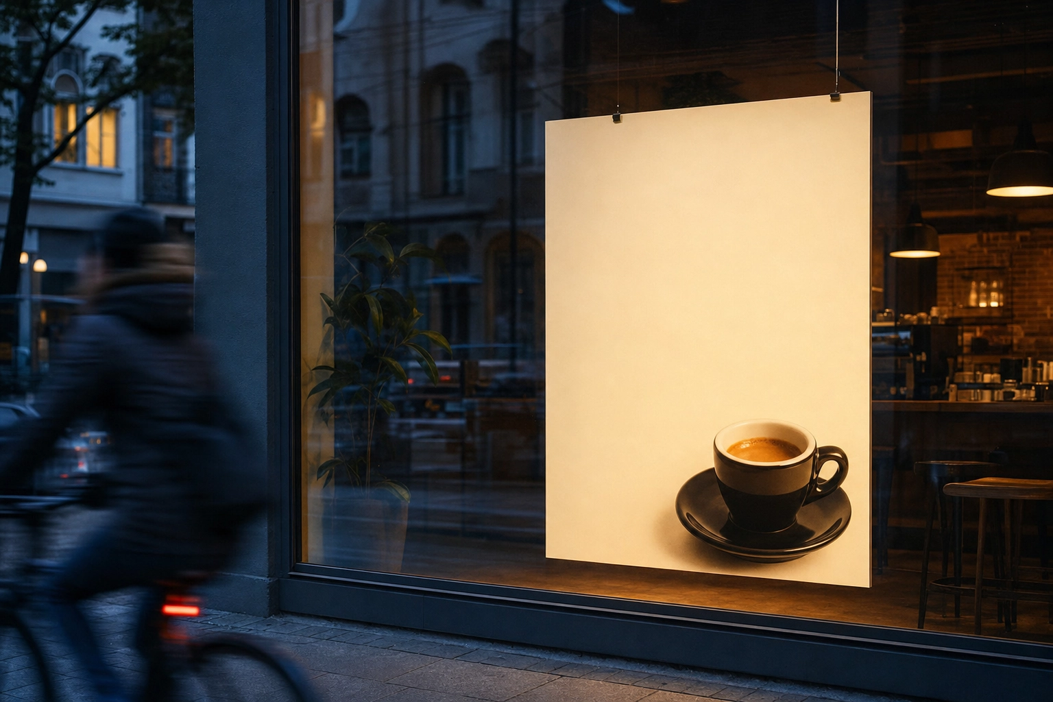 Cafe window poster with espresso cup in lower third and clean empty negative space for a headline
Frequently Asked Questions
How much does a food photoshoot cost?
Commercial food photography is typically quoted per day or per dish, and day rates commonly land in the four-figure range once you add a stylist, studio time and licensing — with per-dish pricing more common for menu photography. The real number depends on your market, whether food styling is included, and how many finished images you are licensed to use. Ask any photographer for their rate card and a sample shot list together; the two only make sense side by side. Get that shot list agreed before the quote, because scope creep is where food photography budgets die.
How many photos do I need for a full menu?
One clean tile per item you actually want to sell, not per item on the menu. Delivery platforms reward completeness, but a mediocre photo converts worse than no photo, so prioritise your top sellers and your highest-margin dishes first. Add two or three marketing photos — a grid, a process shot, a negative-space layout — for everything that is not the ordering page. As a rough planning number, most independent venues need 15 to 30 finished photos to cover a menu properly, not the 200 a full catalogue would imply. Our menu photography breakdown covers sequencing a full shoot and will help you scope it.
Can I use photos from Pinterest for my own menu?
No. Uber Eats requires that you own or have the right to use every image you upload, and pinning something doesn't grant you a licence. You can freely borrow the look — composition, lighting, palette are not protected — but the pixels belong to whoever shot them. That's the distinction style transfer relies on: your dish, your photo, someone else's aesthetic.
Which photoshoot for food idea should I try first?
Number 11, the clean commercial shot. It's the least exciting idea on this list and the one most likely to make you money, because it satisfies every platform rule and works on every dish. Once your menu tiles are consistent and approved, start experimenting with 7, 12 and 26 for your marketing. Then read up on restaurant food photography and getting more orders on Uber Eats to put the images to work. Most food photography tips fail because they arrive in the wrong order — compliance first, creativity second.
Pick three and shoot on Tuesday
Don't try 27 ideas. Try three: the clean commercial shot for your tiles, one mood idea for your posters, one process shot for your socials. Shoot them on your slowest day, on one surface, in one light. That is a real photoshoot for food — a shot list with a purpose, not a Pinterest board with ambitions. Pick the three you actually love, because those are the only ones you will bother to repeat next time the menu changes.
Worth knowing: research published in the International Journal of Hospitality Management found that adding pictures to menu items lifted attitudes, willingness to pay and purchase intent for dishes with plain, descriptive names — while for ambiguously named dishes the effect was conditional. In other words, the photo does the most work when the name is doing the least. Start there.