 Ali Tanis
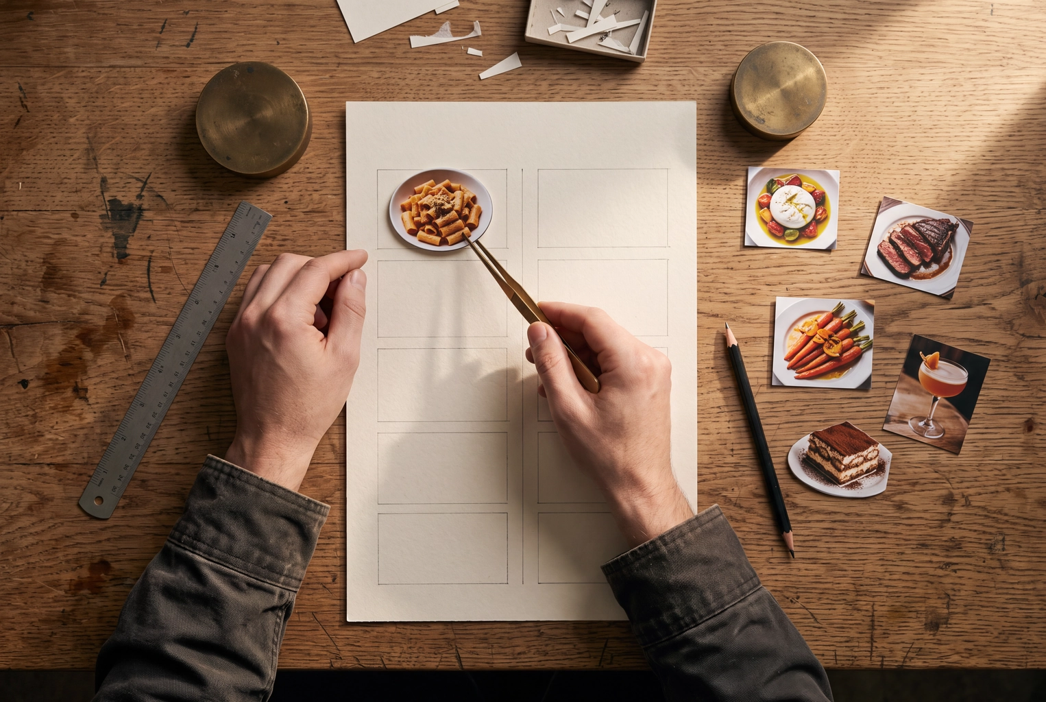
Menu psychology works, but not the way most lists claim. In real experiments, diners at a Culinary Institute of America café spent $5.55 more when prices had no dollar sign, and a Beijing restaurant chain raised demand for its five best sellers by 13 to 20% just by telling guests they were the most popular. Other famous tricks, like the "sweet spot" on page two, failed when researchers tested them.
Below, all 15 tricks get an evidence grade, the formats where they work (print, board, QR, delivery app) and a before/after to copy. The photo rules near the end matter more than most restaurant menu psychology lists admit: they decide which dishes get restaurant food photos.
Quick Summary: Menu psychology is real on average: a 2023 meta-analysis of 53 papers found that menu design changes what people pick. The tested winners are position (first or last in a section), true popularity labels, taste-led descriptions and prices without a currency sign. Boxes, sweet spots and color rules have little or no evidence. On delivery apps, a photo on every item has the biggest reported lift.
Does menu psychology actually work?
Yes, on average. Ip and Chark's 2023 meta-analysis in the International Journal of Hospitality Management pooled 53 papers with 16,522 participants and found that menu design does shift behavior; a companion p-curve analysis concluded the effects are real, not statistical luck. But "on average" hides tricks that never worked.
That's the honest answer to the Reddit thread asking whether menu psychology is hype. Some of it is. Three field tests of highlighted items found no significant change in their sales, and the most quoted number, a 27% lift from descriptive labels, comes from a researcher Cornell later found had committed academic misconduct.
So every trick below carries one of four grades:
- Field-tested: measured on real checks or real choices in restaurants or dining halls.
- Lab or online: used mock menus, surveys or scenarios. Directional, not proof of sales.
- Mixed: the studies disagree.
- No published test: a consultant rule we could not trace to any study.
15 menu psychology tricks, graded by evidence
| # | Trick | Evidence | Grade | Works on |
|---|---|---|---|---|
| 1 | Drop the currency sign | Yang, Kimes & Sessarego, 2009 | Field-tested | Print, board, QR |
| 2 | Round endings for quality, 9s for value | Naipaul & Parsa, 2001 | Lab or online | All formats |
| 3 | Break up the price column | None found | No published test | Print, board |
| 4 | Add a premium decoy | Attwood, 2020 vs Bujisic, 2024 | Mixed | Print, QR, delivery |
| 5 | List target items first or last | Dayan & Bar-Hillel, 2011 | Field-tested | All formats |
| 6 | Forget the "sweet spot" | Yang, 2012 (eye tracking) | Tested: not there | |
| 7 | Don't count on boxes | Kincaid & Corsun, 2003 | Field-tested: no effect | Print, board |
| 8 | Six or seven options per section | Johns, Edwards & Hartwell, 2013 | Lab or online | All formats |
| 9 | Print true "most ordered" ranks | Cai, Chen & Fang, 2009 | Field-tested | All formats |
| 10 | Describe taste, not health | Turnwald, Boles & Crum, 2017 | Field-tested | All formats |
| 11 | Name each plate plainly | Hou, Yang & Sun, 2017 | Lab or online | All formats |
| 12 | Let staff deliver scarcity | Nazlan et al., 2018 | Lab or online | Dine-in |
| 13 | Treat colors as branding | None found | No published test | Print, board |
| 14 | One photo per section in print | None found | No published test | Print, board |
| 15 | A photo on every delivery listing | DoorDash, Uber Eats, Just Eat | Platform data | Delivery, QR |
Do the field-tested tricks first and test the lab ones against your own sales. Which menu items deserve them is a job for menu engineering: find your most profitable items first.
Pricing tricks (1–4)
Pricing tricks change how a number feels, not what it is. Two of four have real evidence. For the numbers themselves, start with our menu pricing formulas.
1. Drop the currency sign
Guests spent more when prices appeared as plain numerals. In Yang, Kimes and Sessarego's 2009 study of 201 diners at a café run by the Culinary Institute of America, guests given a numerals-only menu spent an average of $5.55 (about 8%) more than those whose menu showed "$" or the word "dollars", Cornell reported. Spelling prices out did no better than the symbol.
- Works on: print, digital menu boards and QR menus. Delivery apps format prices for you.
- Before → after: "Burrata $16.00" → "Burrata 16"
One café, one test: cheap to copy, but don't plan on 8% everywhere.
2. Match price endings to the room
Endings send a signal. Naipaul and Parsa's 2001 study in the Cornell Hotel and Restaurant Administration Quarterly analyzed menus from 231 restaurants in Columbus, Ohio, then tested consumers: people picked .00 endings when choosing for quality and 9-endings when choosing for value. Chains leaned on 9s; independent restaurants on 0s.
- Works on: every format.
- Before → after (fine dining): "Duck breast 38.95" → "Duck breast 39"
- Before → after (counter service): "Smash burger 12.00" → "Smash burger 11.99"
3. Break up the price column
We found no published test of this one. The advice is to stop aligning prices in a right-hand column, because guests then scan down it for the cheapest line; William Poundstone popularized it in his book Priceless. It's plausible and free, since a column makes a menu feel like a price list, but it's a layout rule, not a finding.
- Works on: print and menu boards. Online, the app decides where prices sit.
- Before → after: "Ribeye .......... 46" → "Ribeye, 45-day dry-aged, marrow butter 46"
4. Add a premium decoy, but make it sellable
An expensive plate can make the next one feel moderate, but tests disagree. Attwood, Chesworth and Parkin's 2020 online trials found a decoy priced 30% higher did not shift people toward the target option; Bujisic and colleagues' 2024 study found a decoy pushed more people toward a pricier combo. Both used hypothetical choices, not real checks.
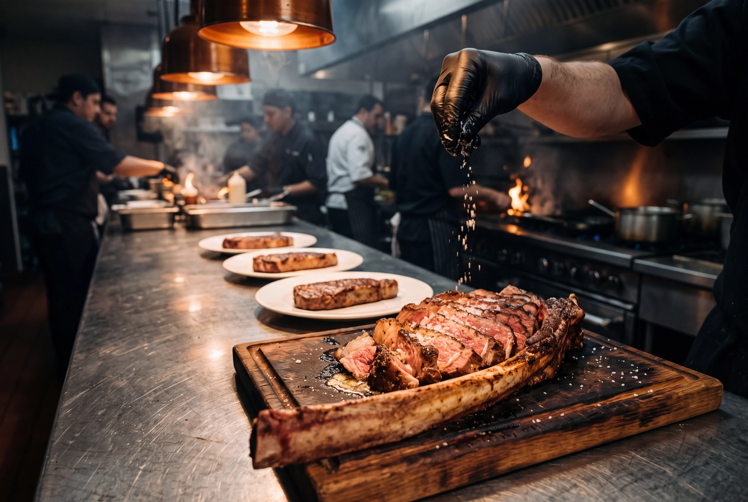 Sliced tomahawk steak for two dwarfing three strip steaks at a steakhouse pass, a premium price anchor at the top of a menu section
The best-known expensive example is Hooters' $199.99 plate of 20 wings with a bottle of Dom Pérignon, which researcher Sybil Yang has cited as a decoy. Only add an anchor you'd be glad to sell, because some guests will buy it.
- Works on: print, QR, delivery, and bar menus, where a rare bottle does the job.
- Before → after: steaks ending at 34 → a 64 tomahawk for two at the top of the section.
Layout tricks (5–8)
Position inside a section moves choices; decoration mostly doesn't. This is where menu design advice and the research part ways most often, so check these before you pay for a redesign. Our guide on how to design a restaurant menu covers the full layout.
5. List the items you want sold first or last
Edges win. In Dayan and Bar-Hillel's 2011 study in Judgment and Decision Making, which ran a lab test and a real-world test, menu items placed at the beginning or end of their category were up to twice as popular as the same items placed in the middle. The authors' advice: "Put the food you want to encourage at the extremes of the menu listings."
- Works on: every format, including QR and delivery lists.
- Before → after: the most profitable pasta sits fourth of seven → move it to first, and put the next-best margin last.
6. Forget the "sweet spot"
The sweet spot on page two, just above the middle, comes from a 1970s focal map drawn by a graphic designer, not from data. In Sybil Yang's 2012 eye-tracking study of 25 people reading a two-page menu, they read it like a book, and no area held their attention longer, SF State reported. She did find a "sour spot": a block of restaurant information and salads that got the least attention.
 Diner wearing eye-tracking glasses reading a two-page menu in a hospitality lab, the kind of test that found no menu sweet spot
- Works on: print. Don't rebuild a menu around a spot that isn't there.
- Before → after: star main moved to upper right of page two → star main leading its own section.
7. Don't count on a box to sell an item
Highlight boxes have failed real tests. Bowen and Morris (1995), Kincaid and Corsun (2003, a four-month field test on a three-page menu) and Reynolds, Merritt and Pinckney (2005) all tracked sales before and after moving or highlighting target items and found no significant difference. Cai and colleagues saw something similar: listing sample dishes didn't lift demand, while ranking them did (trick 9).
- Works on: use a box for news, like a new plate or a seasonal special. Avoid spending it on margin alone.
- Before → after: a boxed "Chef's favorites" with three plates → a boxed "New this month" with one.
8. Keep each section to six or seven options
Long lists tire guests. In Johns, Edwards and Hartwell's 2013 study, 241 people rated quick-service menus and 202 rated fine-dining menus of different lengths: satisfaction peaked at six options per category for quick service and seven to 10 for fine dining. That measured how people feel, not what they spent.
- Works on: every format. On delivery apps, long lists also push items below the scroll.
- Before → after: 14 burgers → seven, with the rest rotating as a weekly special. Our restaurant menu ideas help decide what stays.
Language tricks (9–12)
Words carry two of the strongest field results in menu psychology. True popularity facts and taste-led descriptions both changed real choices; clever names and printed scarcity did less. For the full method, see our 18 rewrites of menu descriptions.
9. Print true "most ordered" rankings
Telling guests what other diners pick works, in one of the cleanest tests in menu psychology. In a randomized natural field experiment at a Beijing restaurant chain, published in the American Economic Review in 2009, showing diners the five most popular dishes raised demand for those dishes by 13 to 20%. Naming five sample dishes without a ranking had no significant effect.
- Works on: every format. Delivery apps often build a popular row from sales data already.
- Before → after: "Chef's picks" → "Our 5 most ordered this month: 1. Lamb shoulder, 2. ..." (only if true).
10. Describe taste, not health
Health words put people off; taste words pull them in. In a Stanford dining hall serving about 600 diners at lunch, vegetables with indulgent labels were picked by 25% more diners than basic labels and 41% more than "healthy restrictive" ones, Turnwald, Boles and Crum reported in JAMA Internal Medicine in 2017.
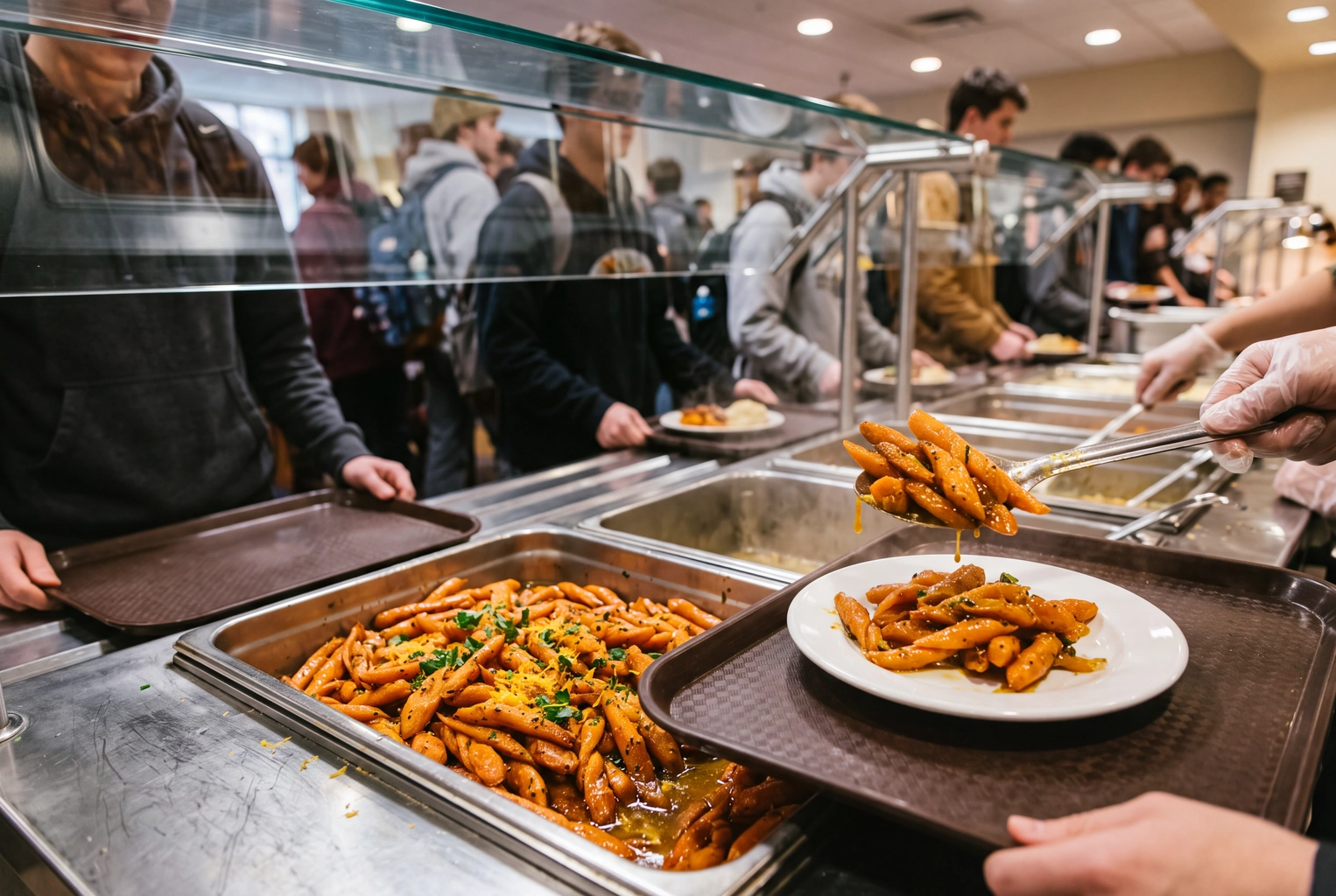 Glossy twisted citrus-glazed carrots served from a steam-table pan in a university dining hall, the taste-led labels that outsold healthy ones
You'll often see a 27% lift for descriptive labels, from a 2001 Cornell paper. Cornell found its lead author, Brian Wansink, had committed academic misconduct in 2018, and many of his papers have been retracted. Avoid it; use the Stanford result.
- Works on: every format.
- Before → after: "Low-sodium carrots" → "Twisted citrus-glazed carrots"
11. Name each plate plainly
Clever names can backfire, especially next to a photo. Hou, Yang and Sun's 2017 experiments found pictures raised liking, willingness to pay and purchase intent for plainly named dishes; with vague names, pictures put off some readers. Say what's on the plate first, add personality after.
- Works on: every format, and critical on delivery apps, where the name is often the only text shown.
- Before → after: "The Volcano" → "Volcano chili beef burger, molten cheddar"
12. Let staff say "only six left"
Scarcity sells better spoken than printed. In Nazlan, Tanford, Raab and Choi's 2018 scenario experiment, a server's scarcity message moved choices more than "limited quantities available daily" printed on the menu, and bundling the scarce plate into a set price made people pick it less.
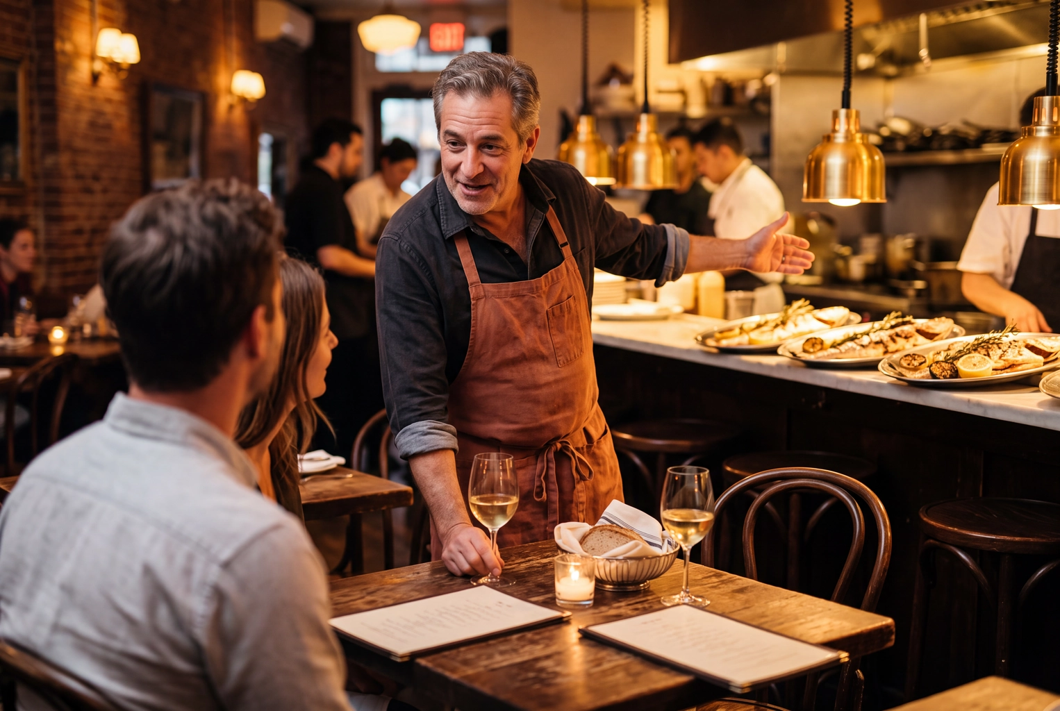 Server leaning in to tell a couple the whole roasted branzino special is almost gone, scarcity delivered by staff rather than the menu
- Works on: dine-in. Keep it true: say it when the kitchen really has six.
- Before → after: "Limited daily!" printed under the special → a server line at greeting, with the special priced on its own.
Color and photo tricks (13–15)
Color rules have no menu evidence; photo rules do, but they flip between print and delivery. Most menu psychology lists skip this part, and it decides where your photo budget goes.
13. Treat menu colors as branding
We found no study showing that a menu's colors change which dishes diners buy. The "red and yellow make people hungry" rule comes from general color research and fast-food branding, not from menu sales tests. Colors belong to the brand experience: pick them for legibility, and spend your testing time on position and words.
- Works on: print and boards, as branding only.
- Before → after: a red menu "for appetite" → your brand colors, with strong contrast between text and background.
14. One photo per section on printed menus
We found no controlled test of this rule, so treat it as practitioner consensus. It follows from the research above: a photo singles one plate out, the way a ranking does, and photos raise willingness to pay for plainly named dishes. Put a photo on every line and nothing stands out.
So pick one hero per section, ideally your most profitable plate placed first or last, and make that photo excellent; a weak hero photo is worse than none. Our guide to photo menus covers when a full picture menu makes sense, as on a restaurant menu board.
- Works on: print, menu boards.
- Before → after: 22 small photos on a two-page menu → one large photo per section, six in total.
15. A photo on every delivery listing
Online the rule flips: every listing without a photo loses. DoorDash says menus with item photos get up to 44% more monthly sales (its data on 15,000+ merchants, Q2 2022); Uber Eats says new stores with photos and descriptions on 70%+ of their menu in week one earned $330 more per week; Just Eat says a listing with a photo gets 16% more orders. All three are platform data with little published method, so we graded them in our food photography statistics.
That's where FoodShot fits. It turns a phone shot of each plate into a professional photo in about a minute, so covering a full delivery menu plus the print heroes isn't a shoot-day project. It doesn't design or print menus; plans start at 25 photos for $15 a month. Check each app's rules on edited photos first: our guide to AI food photos on delivery apps helps.
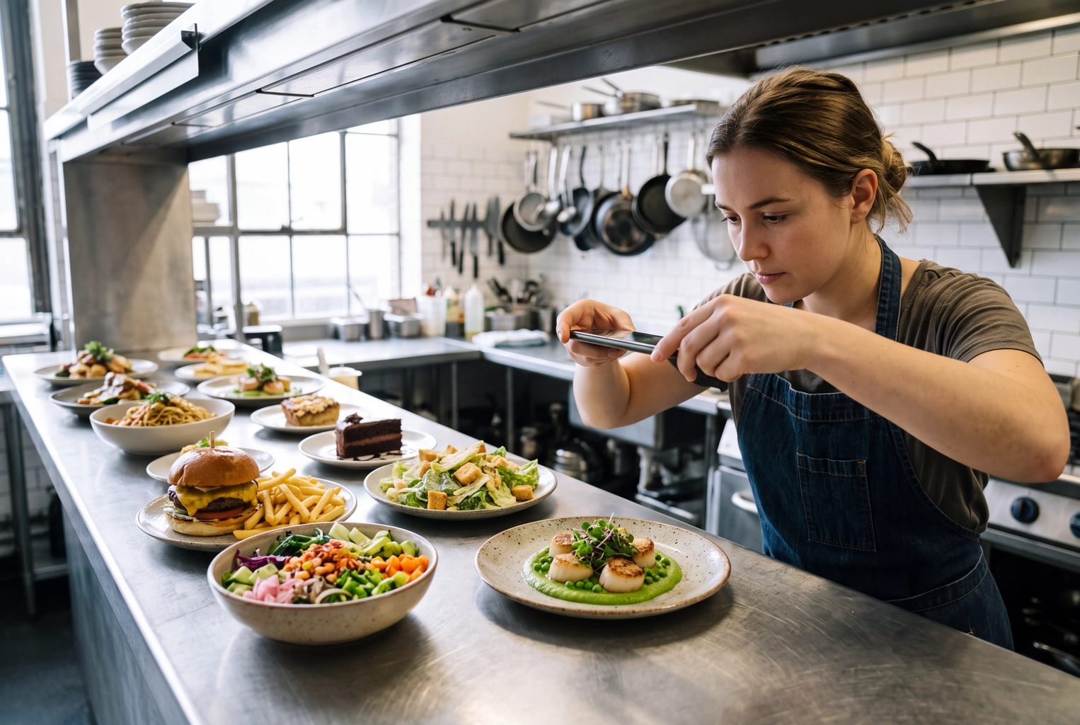 Cook shooting seared scallops from above with a phone at the pass while the rest of the delivery menu waits, a photo for every delivery item
- Works on: delivery apps, QR menus, websites.
- Before → after: 9 of 40 listings with photos → all 40, each meeting the app's specs (DoorDash, Uber Eats).
What changes on QR menus and delivery apps
Menu psychology online keeps the tricks built on sequence and words and loses the ones built on page layout. Price formatting, page spreads and boxes mostly don't carry over to QR ordering or delivery apps, because the app controls them.
- The first slot in each category is the edge. Guests scroll, so the top entry works like the first line on paper, and the last entry in a long list may never get screen space.
- Markups cost more than they look. DoorDash's merchant guidance says restaurants that mark up menu prices can see up to 37% fewer sales and up to 78% lower reorder rates, in a 2023 internal study of more than 4,500 small restaurants.
- The thumbnail does the describing. Names get cut after a line or two, so the photo and a plain name carry the sale. See delivery app photos for what each platform accepts.
A 10-minute menu psychology audit
This menu psychology check helps before any redesign. Run it on your current menu with a pen and a timer, one minute per check; anything you mark "no" goes on the list.
- Margins known? Mark the most profitable plate in each section. If you can't, do menu engineering first.
- Edges? Is each of those plates first or last in its section?
- Currency signs? Any "$" left on print, board or QR?
- Endings? Do price endings match your positioning: round for quality, 9s for value?
- Length? Any section over seven options, or 10 for fine-dining mains?
- Names? Could a stranger tell what every plate is from its name alone?
- Words? Any "light", "low-fat" or "healthy" labels to swap for taste words?
- Popularity? Is there a true "most ordered" line with real ranks?
- Print photos? One strong photo per section, no more?
- Delivery photos? Do all delivery items have a photo that meets the app's specs?
Most menus fail three or four. Fix the field-tested ones first: checks 2, 3, 7 and 8, plus 10 for delivery.
Frequently Asked Questions
Is menu psychology manipulative?
It's persuasion, and the line is honesty. Sequencing a menu, writing about taste and dropping a currency sign mislead no one. Fake "most popular" labels, invented scarcity and photos that don't match the plate do, and guests notice when the food arrives. Make true information easier to act on, and the experience stays honest.
What is the difference between menu psychology and menu engineering?
Menu engineering decides which items deserve promotion, using each one's profit and popularity. Menu psychology decides how to present them: position, words, prices and photos. Engineering comes first; making presentation changes without margin data can steer guests to the wrong plates.
Should a restaurant menu have photos?
On delivery apps, yes, on every listing: the platforms report lifts of 16% to 44%. On a printed menu, use one strong photo per section on the plate you most want sold, with a plain name beside it. Either way, show the plate you actually serve; restaurant food photos made from your own phone shots keep that true.