Creative Food Photography: 15 Ideas Beyond the Flat Lay
 Ali Tanis22 min read
Most "creative food photography" lists are a mood board with captions. They show you a beautiful levitating croissant, tell you to be bold, and stop there. What they never tell you is that half of these ideas will quietly cost you orders in the wrong place.
So this list does both jobs. Fifteen creative food photography ideas that genuinely go beyond the flat lay, each with the concept, how it's actually built, and the honest verdict on when it's the wrong choice. Most food photography tips stop at composition; these are art-direction ideas, and each needs a verdict attached. If you still need the fundamentals — angles, thirds, depth of field — start with our food photography techniques guide and come back. This one assumes you can already shoot a dish well and want it to look like nobody else's.
Quick Summary: Creative food photography works when the idea sharpens the dish instead of hiding it. Use levitation, frozen splashes, chiaroscuro, macro abstraction and color blocking for brand and social work — and keep one clean, honest photo per item for menu and delivery listings. Each of the 15 ideas below comes with a "best for" and a "skip it for".
The One Question Every Creative Food Photo Has to Answer
Cover the caption. Look at your image for one second at the size of a phone thumbnail. Can you name the dish?
If yes, the creative idea is doing its job. If no, you haven't made a bad photograph — you've made a photograph for a different purpose. That's the entire framework, and it saves a lot of arguments. Commercial photographers apply it instinctively. Most food businesses have never been told it exists.
Food photography has two separate jobs, and they pull in opposite directions:
- Selling the dish. Menus, delivery tiles, ordering pages, ads with a price on them. Uber Eats' merchant photo guidelines are blunt: one item, accurately represented, top-down for plates and bowls or 45 degrees for taller items. Heavy shadow, multiple items and photos that don't match what arrives are the classic rejection reasons.
- Selling the brand. Instagram, Pinterest, campaign posters, a press kit. Here the image can be strange — dark, abstract, funny, or barely food at all — because its job is to make someone feel something and remember who you are.
A creative shot that obscures the dish is a great brand asset and a bad delivery app photo. Both statements are true at once. Every idea below is tagged accordingly, so you can be adventurous exactly where it pays — and so you can find the two or three concepts actually worth your time.
15 Creative Food Photography Ideas Beyond the Flat Lay
These are ordered roughly from most to least approachable. You do not need all fifteen. Most food businesses find two or three that fit the brand and run them for years. Each entry gives you the concept, the setup tips, and the case where the idea actively hurts you.
1. Levitation: Ingredients Suspended Mid-Air
The concept: gravity switched off. Toppings hover above a burger, chips float in a diagonal arc, cereal explodes upward. It reads as impossible, which is why it stops a scroll.
How it's done: two working methods. Thread thin monofilament or florist's wire through the item — two holes, not one, because a single hole lets the piece spin. Or hide a rigid support directly behind the item, on the axis away from the camera, so the food hides its own stand — skewers, museum putty and acrylic rod all work. Clear fishing line is highly reflective; matte thread matched to your backdrop disappears far more easily under studio light. Whatever still shows gets retouched out.
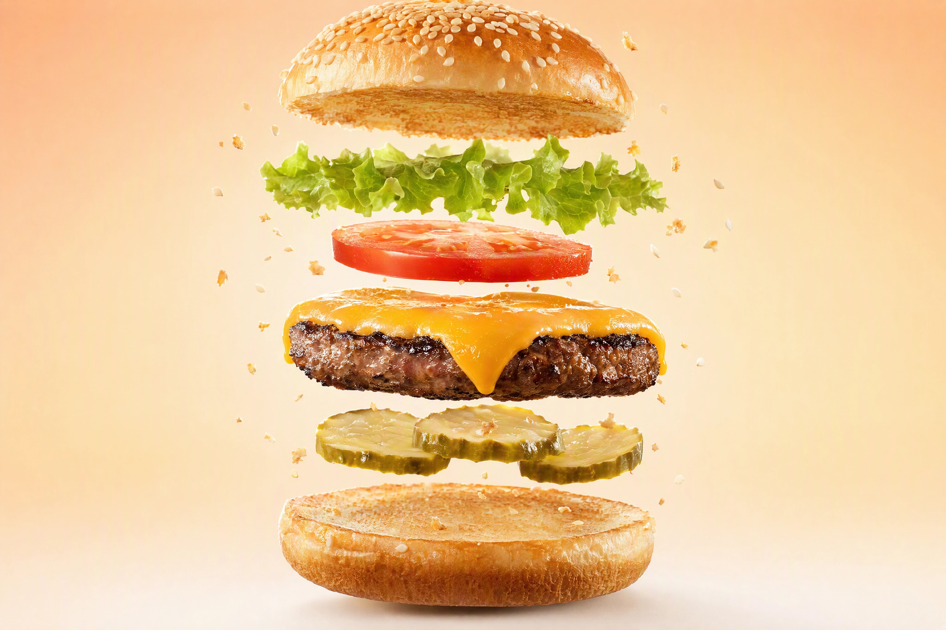 Levitation food photography: a deconstructed cheeseburger with every layer suspended in mid-air on a peach backdrop
This is styling work far more than camera work. The camera sits on a tripod for an hour while you get one chip to hang straight.
Skip it when: the levitation turns your dish into a schematic. A suspended burger with every layer separated is fun, but it's no longer a burger anyone can order. Keep it for launch posts and print, never a menu tile.
2. The Frozen Splash and the Hard Pour
The concept: liquid caught mid-collision. A strawberry breaking the surface of a cocktail, milk hitting espresso, a crown splash rising off a bowl of soup.
How it's done: here's the part most photography tips get wrong. When flash is your only light, shutter speed does not freeze the splash — flash duration does. Work in a dark room, set the shutter to sync speed (usually 1/160s to 1/250s), close down to f/8–f/11, focus manually on a marker where the action will happen, and fire in burst. Then turn your flash power down: a speedlight at 1/128 power puts out a pulse shorter than 1/19,000 of a second, far faster than any shutter. In daylight without flash you'll need roughly 1/3200s or faster and a lot of sun. Expect to shoot 40 frames to capture one keeper. Studio photographers trigger the flash with a sound sensor; burst mode and patience get you close enough.
Skip it when: the splash covers the glass or the plate. On a cocktail photography list shot, the drink has to look drinkable, not chaotic. Splash frames are campaign images.
3. Deconstruction and Ingredient Mapping
The concept: the dish taken apart and laid out as its components — every herb, spice, raw protein and finished sauce — arranged like a parts diagram. The strict version is called knolling, a term coined in 1987 by Andrew Kromelow, a janitor at Frank Gehry's furniture fabrication shop who arranged tools at right angles so nothing could go missing.
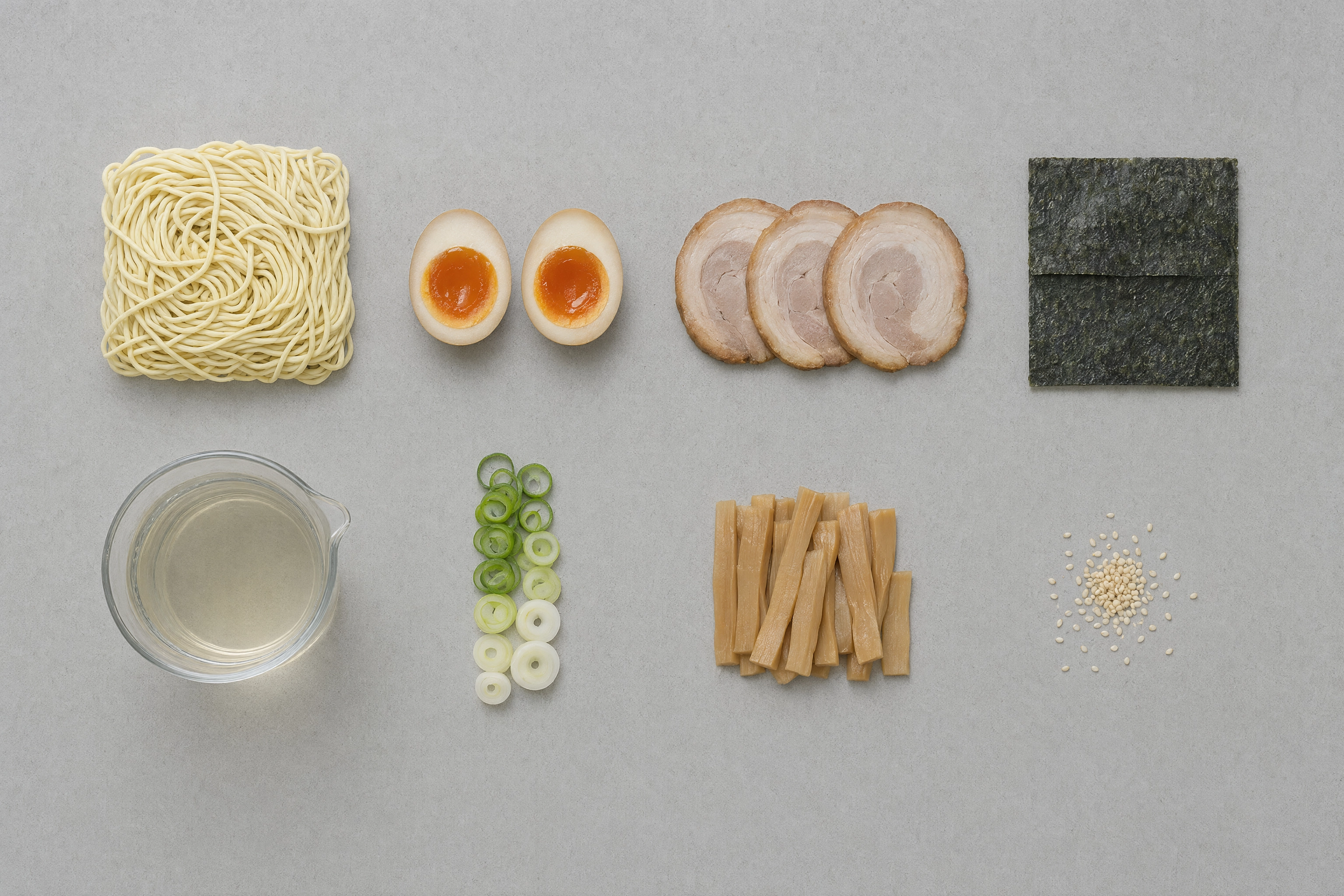 Knolling food photography: every component of a ramen bowl aligned in a right-angle grid on pale grey concrete
How it's done: group items by type, align every edge parallel or perpendicular, allow no overlaps, and shoot from directly overhead with flat even light. That alignment is the entire difference between knolling and a generic flat lay. It also happens to be one of the strongest ways to communicate provenance and quality — a spread of whole ingredients says more about sourcing than any adjective on a menu. Food photographers use it for recipe features because one frame can capture every component at once.
Skip it when: it's your only image for that dish. An ingredient map is an argument, not an appetite trigger. Pair it with the plated shot.
4. Extreme Color Blocking
The concept: the food sits on a single, loud, saturated field of color with no props and no styling tricks at all. Cobalt behind a lemon tart. Hot pink behind a green matcha cake. It's the most efficient way to make an ordinary item look designed.
How it's done: seamless paper or a painted board, both floor and wall in the same shade so there's no visible horizon. Light it evenly and frontally so the color stays flat and uniform. Pick the hue against the food, not with it: a complementary pairing (orange on blue, purple on yellow) gives maximum separation, while a near-neighbour hue makes the food sink. Our guide to aesthetic food backgrounds has thirty of these pairings sorted by mood, and it's the fastest way to find colors that suit your brand.
Skip it when: the platform wants neutral. Most delivery catalogues expect a plain or white field, and a screaming background reads as a rejection risk. Keep color blocking for social, packaging and posters.
5. Tone-on-Tone: The Monochrome Plate
The concept: the inverse of color blocking. Food, plate and surface all share one hue, so nothing but form, edge and texture carries the frame. White cauliflower on white marble in white ceramic. Chocolate on chocolate on chocolate. Photographers love this one because the result can feel expensive without a single prop in frame.
How it's done: match the surface and plate to the dominant color of the food, then light hard and low so shadow does the separating. Without a strong directional source it becomes a smear. Two degrees of tonal shift — a slightly warmer plate, a slightly cooler backdrop — keeps it from collapsing.
Skip it when: the dish is already visually flat. Monochrome amplifies structure, so it flatters a scallop or a meringue and destroys a stew.
6. Dark and Moody Chiaroscuro
The concept: Caravaggio for dinner. Most of the frame falls to near-black and a single shaft of light picks out the food. Chiaroscuro is a Renaissance painting technique, and Baroque still lifes remain the best reference you can study.
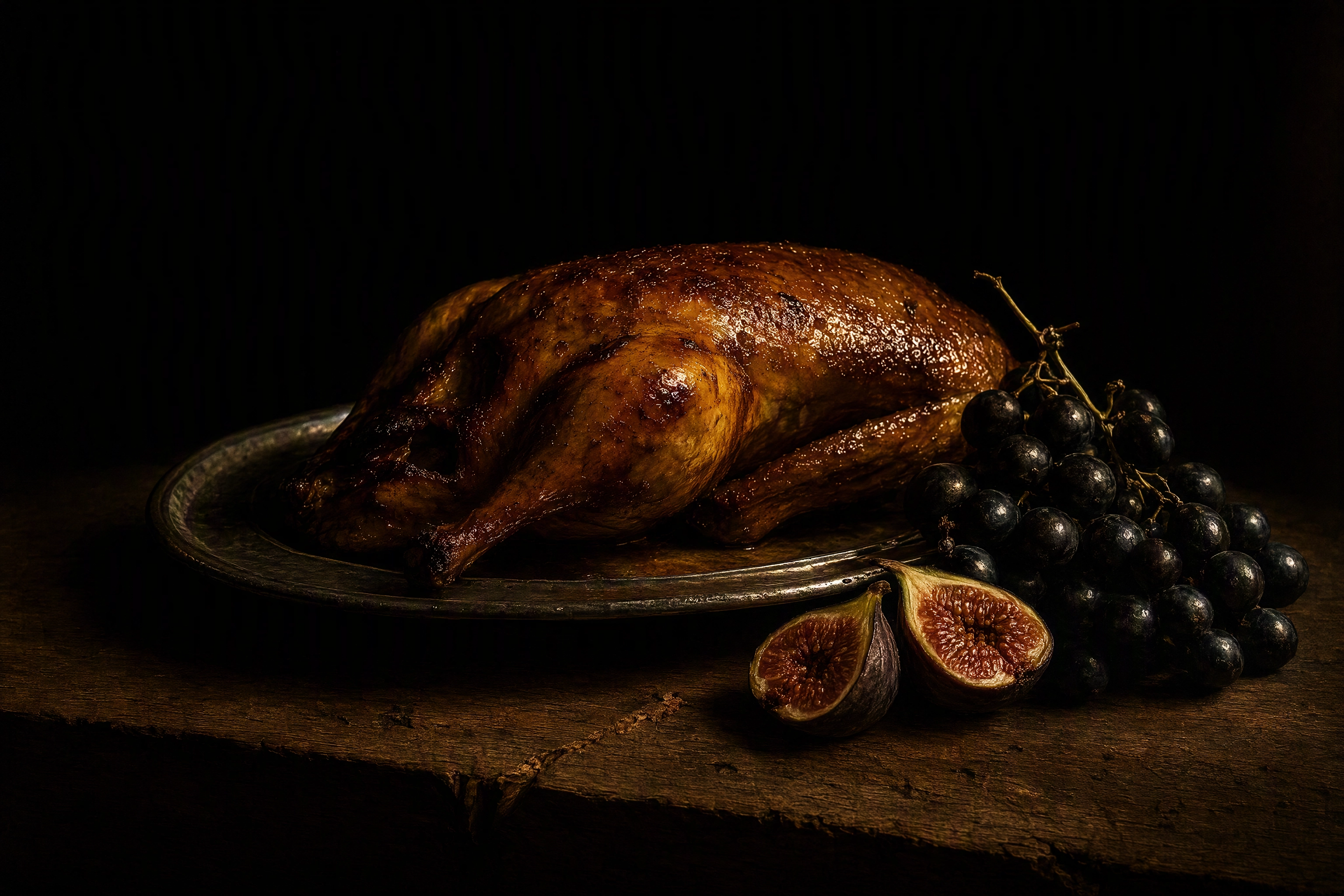 Chiaroscuro food photography: a roast duck lit by a single shaft of light against a black background in Baroque style
How it's done: one light source, nothing else. Place it roughly 90 degrees to the subject, feather it so only the hero gets hit, and surround the set with black foam board — that negative fill absorbs stray bounce and deepens the shadows. Expose for the highlights and let the rest go.
The mistake almost everyone makes in dark food photography: shooting a normal, evenly lit frame and dragging the exposure down in editing. That gives you muddy, not moody: the drama comes from the lighting, not the slider. Our food photography lighting guide covers the one-light setup.
Skip it when: the food is dark to begin with, or the image will run at thumbnail size. Braises, chocolate and coffee disappear into their own shadows.
7. Hard Light and Shadow Play
The concept: the shadow becomes the graphic element. A palm frond, a slatted blind, or a shape cut from black card thrown across the surface next to the plate. It reads as sunshine and confident 1990s advertising energy.
How it's done: one small, bare source — a bare bulb, a bare flash head, or genuine hard midday sun. The further the source, the crisper the shadow edge. Place your cut-card gobo between the light and the set, then rotate it until the shadow runs diagonally through empty space rather than across the food. Hard light also makes gloss look glossier, so it flatters glazes, syrups and anything wet. Try it on a bright, simple dish first — busy plates and hard shadow fight each other.
Skip it when: the shadow lands on the dish. A stripe across a plate reads as a lighting accident to anyone who isn't a photographer, and on a photo menu it looks like a fault.
8. Macro Texture Abstraction
The concept: crop so close the food stops being a dish and becomes terrain. Sourdough crumb as a cave system, salt crystals on caramel as a mountain range. Nobody can name the ingredient, and that's the point.
How it's done: a true macro lens at 1:1 magnification renders the subject life-size on the sensor, where the strangeness starts. At that magnification depth of field is measured in millimetres, so you need a tripod, manual focus, and usually focus stacking — a series of frames stepped through the subject, merged in software, the same discipline our DSLR food photography guide covers. Rake the light hard across the surface to make texture read; light from the front kills it. A macro frame rewards details nobody notices at plate distance: sugar crystals, gluten strands, the fuzz on a raspberry. Our best lens for food photography breakdown covers which macro focal lengths are worth it.
Skip it when: the image needs to be understood alone. Abstraction works in a set, next to a wide shot that explains it. On its own it's a texture, not a product.
9. Backlit Translucency
The concept: light through the food rather than onto it. Citrus wheels, herb leaves, thin-sliced charcuterie, jelly, honey, sorbet, anything glass. Colors go stained-glass intense and the whole frame glows.
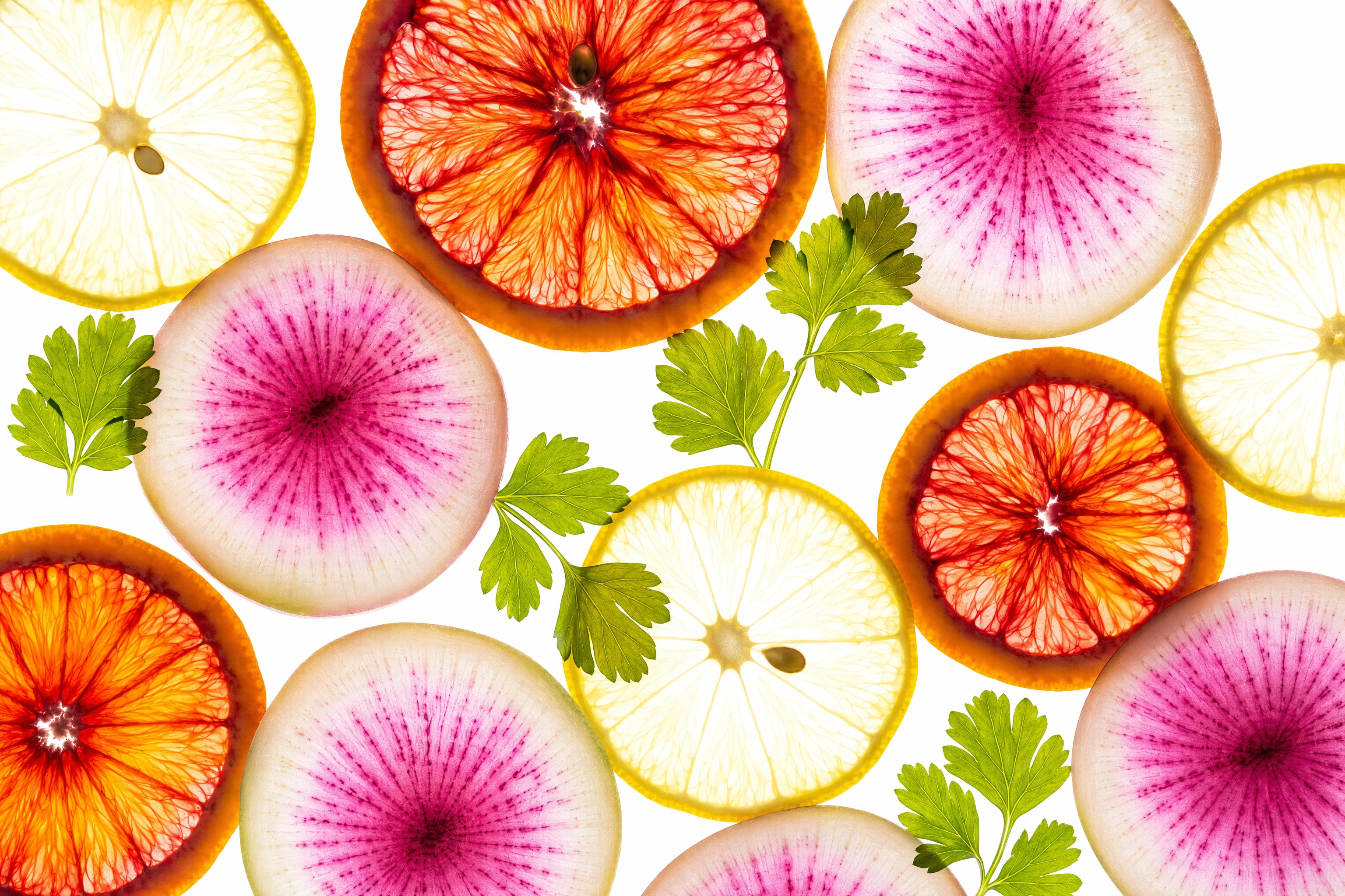 Backlit food photography with translucent blood orange, lemon and radish slices glowing like stained glass on a light table
How it's done: a light table, or a bright window with the food on glass and a white board underneath to lift shadows. Expose for the food and let the background clip to pure white. Slice thinner than feels sensible — 2mm citrus reads beautifully, 6mm reads as a lump. This is the single best trick in fruit photography, it costs nothing, and it produces photos that look nothing like the rest of your feed.
Skip it when: the food is opaque, or you need surface gloss and crust. Backlight flattens the front of the subject; steak and fried chicken need side light.
10. Negative Space as the Whole Composition
The concept: not just a bit of breathing room, which is standard composition. Here the emptiness is the subject: the dish takes maybe a fifth of the frame and the rest is unbroken surface. It signals confidence, restraint and expense, which is why fine dining menu photography leans on it so heavily.
How it's done: shoot much wider than instinct allows, place the dish low or on a third, and keep the empty area genuinely empty — no crumbs, no stray props, no texture changes. Build the void where your designer needs it, because this composition exists to hold a headline, a logo or a price. Shoot it horizontally for a web banner and vertically for a poster — two camera positions, two years of use.
Skip it when: it has to work as a small square. Crop a negative-space frame to a thumbnail and you get a tiny dish stranded in a lot of nothing.
11. Unexpected Surfaces
The concept: retire the reclaimed wood board. Try wet asphalt, brushed steel, crumpled foil, terrazzo, velvet, a mirror, glass block, cracked concrete or raw plaster.
How it's done: choose the surface for the story, not the mood board. Weight matters: rustic dishes anchor to rough surfaces, delicate pastry lifts off cool, smooth ones. Reflective surfaces double your food and halve your prop budget, but show every fingerprint. Shoot the same dish on three candidate surfaces back to back and compare the photos side by side. The winner is obvious in seconds, and it will help to shoot all three in identical light. Our backdrops guide and props guide cover what's worth buying.
Skip it when: the surface has more texture and pattern than the food. If your eye lands on the marble veining before the pasta, the surface won.
12. Scale Play and Miniature Worlds
The concept: tiny model figures placed in real food turn a broccoli floret into a forest and a cracker into a construction site. The reference work is Christopher Boffoli's Big Appetites series — hand-painted miniatures posed against real food, published in more than 80 countries.
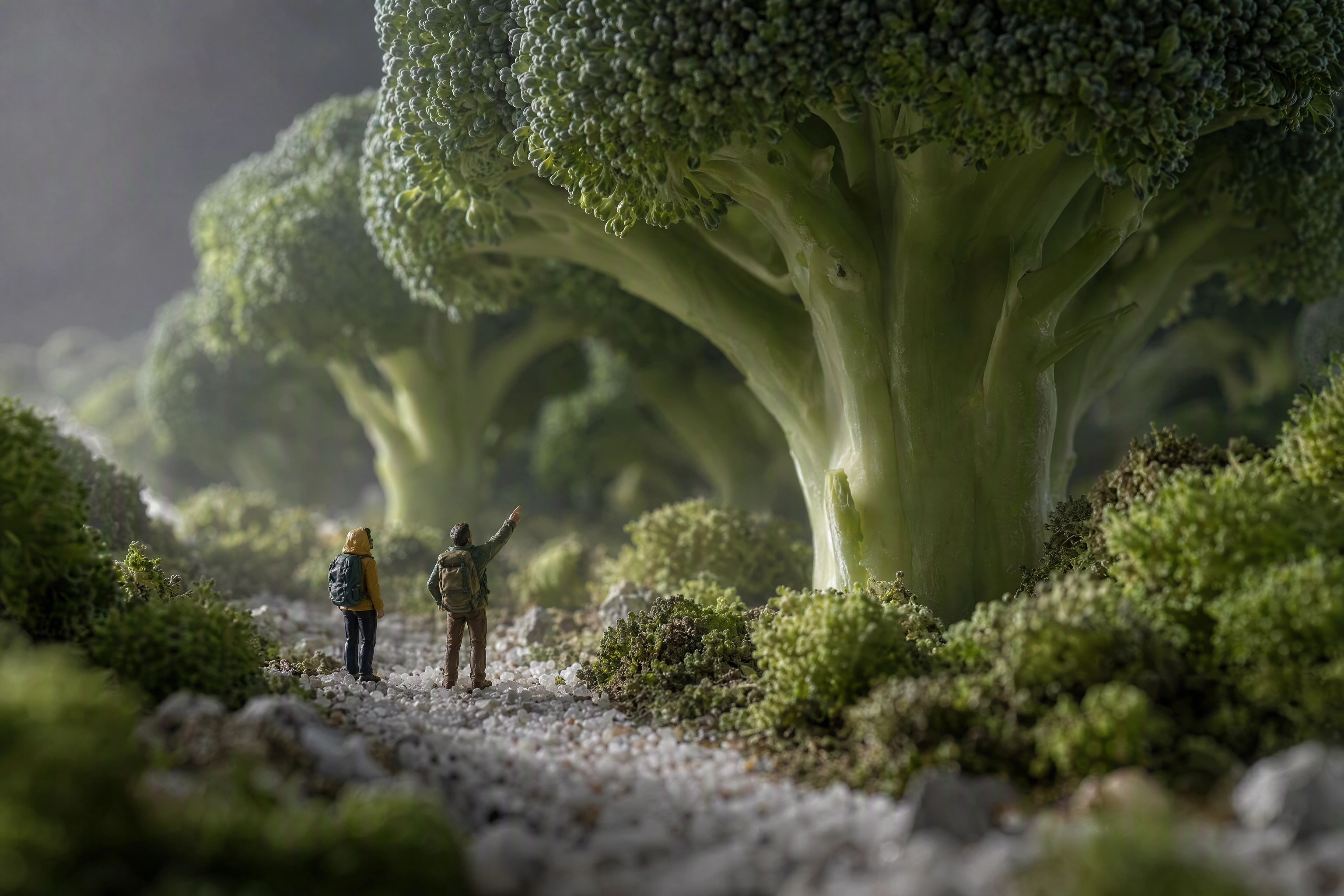 Scale play food photography with tiny model hikers standing beneath a broccoli floret photographed as a forest
How it's done: model railway figures (HO scale, 1:87) are the standard prop. Shoot with a macro lens and the camera down at the figures' eye level rather than from above, which is what sells the illusion of a landscape. Stop down or focus stack, or you'll lose the figures to blur instantly. A dry sense of humour helps more than gear or tips do.
Skip it when: the joke outruns the appetite. This is a brand and editorial idea. A restaurant almost never needs it on a menu, though it makes exceptional Instagram content.
13. Food as Graphic Pattern
The concept: repetition until the food becomes wallpaper. Forty-eight identical macarons in a grid. Rows of dumplings. Sardines aligned like a textile print. The individual item stops mattering; the rhythm takes over.
How it's done: shoot straight overhead, measure your spacing rather than eyeballing it, and use flat even light so no item is brighter than its neighbours. Then break the pattern exactly once: one macaron the wrong color, one bite taken. That single fault is what the eye locks onto, and it turns wallpaper into a picture.
Skip it when: your kitchen can't produce items that match. Pattern photography is unforgiving: uneven bakes, mismatched portions and wobbly rows all show up instantly at this angle. Near-perfect consistency is a production question, not a photography one.
14. Gels, Neon and Colored Light
The concept: the color comes from the light rather than the props. A single magenta gel across a dessert. Split gels — teal from one side, orange from the other. Or the venue's own neon, used as your key.
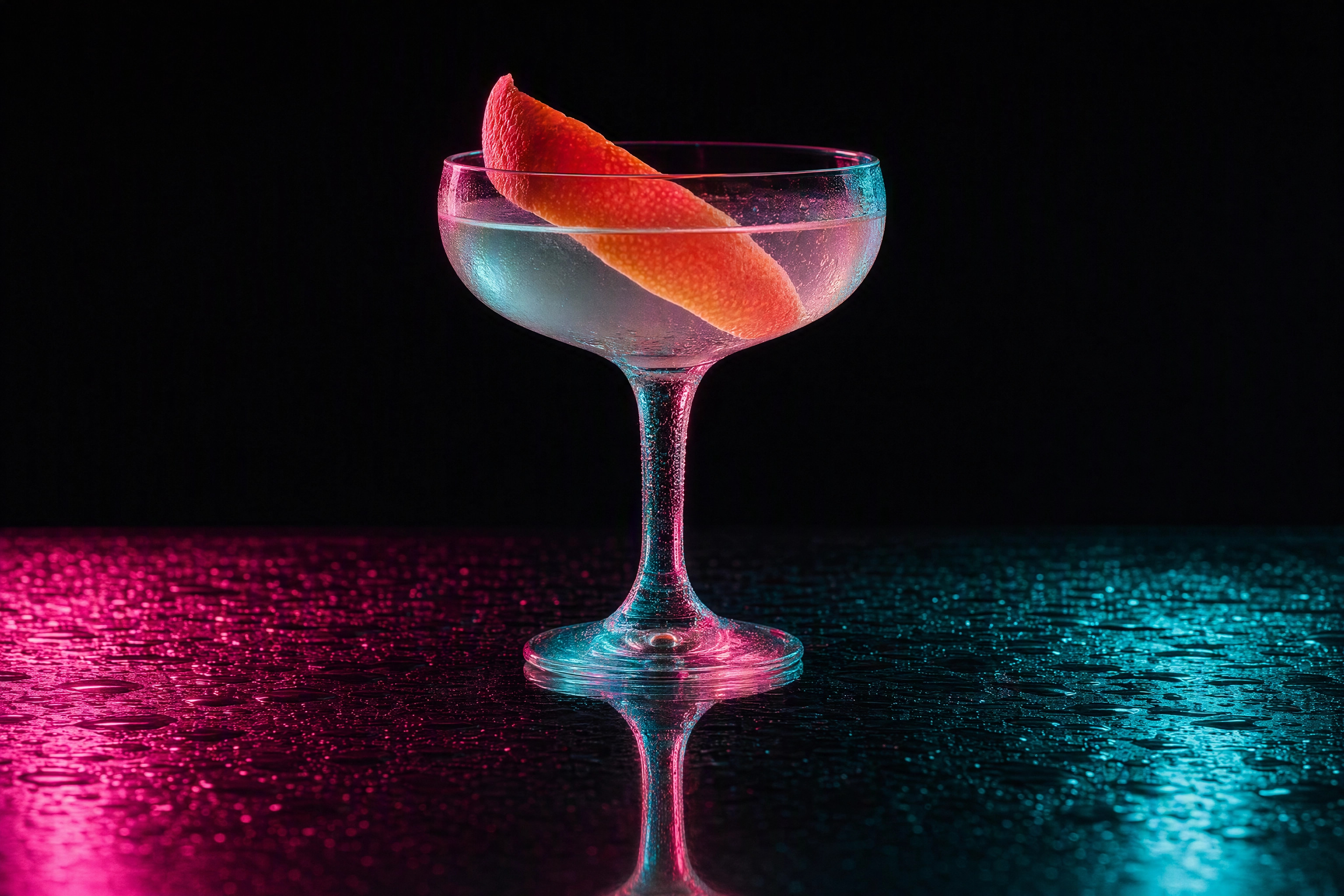 Gel lighting food photography: a cocktail lit by split magenta and teal gels on a reflective black bar top
How it's done: gel a small flash or an LED panel and keep one clean, unfiltered source on the food itself, so the dish holds its true color while the environment goes electric. Split lighting means two gelled sources at roughly 45 degrees on opposite sides, nothing filling the middle. This look belongs to bars and lounges more than anywhere else, and it suits drink photography and beverage brands.
Skip it when: color equals information. A gel that shifts a steak green or makes lettuce look grey is worse than a boring photo, because on a menu color communicates doneness and freshness. Never gel a listing image.
15. The Aftermath
The concept: shoot after the meal instead of before. Crumbs, a smeared plate, a half-eaten slice, wine rings, a crumpled napkin. It's the only creative idea on this list that photographs the experience rather than the product, and people love it because the frame can feel like a memory instead of an advert.
How it's done: engineer the mess — this is a styling exercise, not a lighting one. Real leftovers look sad; a built aftermath looks lived in. Keep one clean anchor in the frame, a full glass or an untouched second plate, so the image reads as "a good dinner" rather than "abandoned table". Warm, low, late light does the emotional work.
Skip it when: you're in a hygiene-sensitive category, or the platform requires a full, undisturbed serving. Aftermath frames are for content creators, newsletters and interiors — never for the ordering flow.
Where Each Creative Shot Actually Belongs
The whole list of creative food photography ideas, sorted by where each image earns its keep.
| Idea | Best for | Avoid on |
|---|---|---|
| Levitation | Launch posts, print, packaging | Menus, delivery tiles |
| Frozen splash | Drink campaigns, social | Catalogue listings |
| Deconstruction | Provenance stories, press | A dish's only photo |
| Color blocking | Social grids, posters, packaging | Neutral-background platforms |
| Tone-on-tone | Editorial, brand identity | Busy, mixed-color dishes |
| Chiaroscuro | Fine dining, hero banners | Thumbnails, dark foods |
| Shadow play | Summer campaigns, cafe socials | Anything where shadow hits the dish |
| Macro abstraction | Texture sets, headers | Standalone product shots |
| Backlit translucency | Fruit, drinks, desserts, ads | Fried and crusted foods |
| Negative space | Posters, banners, menu covers | Square thumbnails |
| Unexpected surfaces | Brand identity, seasonal | When the surface out-textures the food |
| Scale play | Editorial, press, viral social | Menus |
| Graphic pattern | Bakery socials, wall art | Single-item listings |
| Gels and neon | Bars, nightlife, RTD | Any listing where color signals quality |
| Aftermath | Newsletters, blogs, interiors | Ordering flows |
The rule underneath the table: earn one clean, honest, well-lit photo of every item first. Then get strange. Creative food photography is the second layer, never the foundation. A menu photo set that converts is a business asset; creative work is a brand asset. You need both, in that order.
How to Try 15 Concepts Without Rebuilding Your Set 15 Times
The barrier to creative food photography has never been imagination. It's that each look here is a different physical set — seamless paper, a light table, black foam board, a gel kit, three backdrops, model figures. Professional photographers with a studio rebuild between setups. A cafe owner mid-service cannot, and no amount of food photography tips solves a floor-space problem.
That's the specific problem FoodShot AI's Builder Mode was designed for. You pick a background surface and a plate style, then apply it to your own dish photo — so auditioning "chiaroscuro versus color blocked versus wet asphalt" costs three taps rather than three afternoons. The style library runs to over 200 curated looks across delivery, menu and fine dining categories, and several variations from one upload let you compare honestly, side by side. Pinterest style transfer does the same job from a reference image you already love.
A practical workflow that works for most food businesses:
- Shoot one clean hero of each dish. Good light, honest framing, no tricks. This is your menu set and your source file.
- Audition looks on the same photo. Run three or four options against one dish and see which reads as your style, not a generic filter.
- Keep two. Pick a signature style for social and a clean style for listings, then apply both for a season. Consistency is what makes a grid feel designed, and it will help any new team member match it.
- Reshoot only what fails. If a concept needs a real prop — model figures, a levitation rig, a splash — that's a genuine studio day. Everything else is styling and surface.
Be clear about what this does and doesn't replace. AI food photography is stills only, built for food and drink rather than general image editing, and commercial rights come with paid plans from $15/mo. It won't shoot your dining room, your team, or your chef's hands mid-plate. Those stay jobs for a human food photographer, and honest food brands keep both in the mix.
A Five-Shot Creative Set to Start With
If you run a small food business and want a creative set that earns its keep by next month, start here — the widest range of use with the least equipment:
- Backlit translucency for one signature drink or dessert — window light and a sheet of glass.
- Negative space on your best-looking plate — designers will use this all year for banners and posters.
- Hard-light shadow play on a bright dish — one bare bulb and a piece of cut card.
- Graphic pattern of your most repeatable item — pastries, tacos, cookies.
- Chiaroscuro on the dish you're proudest of — one window, one black board, one afternoon.
Shoot these images once, use them for a year, and rotate one new concept each season. Write down what you did — the best food photography tips are the ones you wrote down yourself. For more setups you can run in a working kitchen, our food photoshoot ideas list has 27 named scenarios, and the food styling guide covers the styling and prep side.
Frequently Asked Questions
What makes food photography creative rather than just well-lit?
Craft makes a photo good; a point of view makes it creative. A well-lit plate follows the rules — good angle, clean composition, appetising color. A creative frame sets out to capture an idea on top of that: an impossible arrangement, a light that shouldn't be there, a crop that hides more than it shows. The test is whether someone could describe your image in one sentence and have it sound interesting. "A burger, lit nicely" isn't an idea. "A burger dismantled and floating in order" is.
Can I use creative food photos on Uber Eats or DoorDash?
Mostly no, and this is the expensive mistake. Delivery platforms want a single item, accurately represented and legible at thumbnail size. Deep shadow, heavy props, multiple items and abstract crops are common rejection and low-conversion causes. Put your clean food photos on the listing and save creative work for social, print and ads. The two contexts genuinely reward different images.
Do I need a studio or flash for these creative food photography ideas?
Six of the fifteen need nothing but a window: negative space, tone-on-tone, backlit translucency, graphic pattern, unexpected surfaces and the aftermath. Try those first, ideally with the phone food photography setup you already own. Chiaroscuro and shadow play need one controllable source — a hard-sun window or a cheap LED. Only frozen splashes truly require flash, because they depend on short flash duration.
How many creative shots should a restaurant actually have?
Fewer than you'd think. One clean photo per menu item is non-negotiable, which is the baseline our restaurant food photography guide sets out. Beyond that, five to eight strong creative images per season covers a social calendar, a newsletter and a campaign. You don't need a perfect set: three images in one recognisable style do more for a brand than twenty in twenty different styles.
Which creative food photography idea is easiest to start with?
Backlit translucency. Slice a lemon, orange or radish thin, put it on a window pane with the sky behind it, expose for the food and let the background go white. Two tips: slice thinner than feels sensible, and shoot on an overcast day so the light is even. It takes four minutes, needs no gear, and will help you see your ingredients differently. Negative space is a close second — move the camera back and resist filling the frame.
Does creative food photography still need to look like the real dish?
On anything transactional, yes — absolutely. If a customer can order it, the photo has to match what arrives, down to the details of portion, ingredients and presentation. Platforms enforce this, and customers punish the gap in reviews faster than any algorithm. Brand and editorial imagery is free to be stylised, surreal or abstract, because nobody clicks "add to cart" from a levitating croissant. Know which one you're making before you shoot it.