25 Best Restaurant Websites, Scored on 6 Tests
 Ali Tanis19 min read
The best restaurant websites do three things on the first phone screen: show the food or the room, put a Book or Order button within thumb reach, and stay out of their own way. We scored 25 celebrated restaurant websites against those rules on 1 October 2026. None scored a perfect 10.
The galleries that rank for best restaurant websites show screenshots and design adjectives. This one shows a score: every site was checked on a phone-sized screen, its menu was parsed, and its speed came from Google's own field data. Copy what improves the customer experience, not what merely looks expensive.
Quick Summary: Five of the best restaurant websites tied at 9/10: Commander's Palace, Carbone, Franklin Barbecue, Russ & Daughters and Sweetgreen. Across all 25, 14 covered part of the first phone screen with a pop-up and only 2 showed a photo next to every dish, so pop-ups and photography are where most restaurants lose points.
How we scored the best restaurant websites
We scored each restaurant website out of 10 on six tests a customer feels within seconds: the hero image, a visible Book or Order button, pop-ups on the first screen, the menu format, dish photos with the menu, and real-user loading speed. Every test came from a live check on 1 October 2026.
- First phone screen. We ran each homepage through Google PageSpeed Insights in mobile mode and read the final screenshot it captures, the view a visitor gets before scrolling.
- Speed. We used the Chrome UX Report field data from the same test: 75th-percentile Largest Contentful Paint (LCP) for real Chrome users. Google's LCP guidance calls 2.5 seconds or less "good".
- Menu. We fetched each homepage and menu, logged PDF links, images and prices, then confirmed by reading it.
| Test | 2 points | 1 point | 0 points |
|---|---|---|---|
| Hero on first screen | Dish or room photo | Illustration, logo, text, or photo partly covered | Covered or blank |
| Book / order button | Visible | Only inside or behind a pop-up | Not visible |
| Pop-ups | None | Cookie banner only | Promo, newsletter or notice modal |
| Menu format | Crawlable HTML | Hub, script-loaded, or mixed with PDF | PDF only, image only, not linked |
| Dish photos | n/a | Photos of dishes (1 point) | None |
| Real-user speed | n/a | LCP at or under 2.5 s (1 point) | Over 2.5 s |
Two caveats. Lab scores swing by several points between runs, so we report them but don't score them. And pop-ups change with location and season. Treat this as a dated snapshot, not a permanent verdict.
 Chrome stopwatch beside a heavy folded paper menu and a light single card, the speed test behind the best restaurant websites
The scorecard: 25 best restaurant websites compared
Five restaurant websites tied at 9 out of 10 and none reached 10. The median lab performance score was 56 out of 100, no site reached Google's "good" band of 90, and most lost points to pop-ups and missing dish photos rather than to weak visual design.
| # | Restaurant | Hero | Book/order visible | Pop-up | Menu format | Dish photos | Lab | Real-user LCP | Score |
|---|---|---|---|---|---|---|---|---|---|
| 1 | Commander's Palace | Building exterior | Yes | None | HTML | None | 40 | 1.0 s | 9 |
| 2 | Carbone | Dining room | Yes | None | Script tabs | Some | 84 | 1.2 s | 9 |
| 3 | Franklin Barbecue | BBQ tray | Yes | Cookie | HTML | One tray | 59 | 1.6 s | 9 |
| 4 | Russ & Daughters | Food + buttons | Yes | None | Shop + Toast | Products | 56 | 1.4 s | 9 |
| 5 | Sweetgreen | Person eating | Yes | Cookie | HTML | Every dish | 40 | 2.1 s | 9 |
| 6 | Eleven Madison Park | Kitchen | Yes | None | None | Gallery | 55 | 2.3 s | 8 |
| 7 | Chez Panisse | Illustration | Yes | None | HTML | None | 43 | 1.7 s | 8 |
| 8 | Balthazar | Dining room | Yes | None | Hub | 12+ dishes | 57 | 3.5 s | 8 |
| 9 | Din Tai Fung | Logo | Yes | Cookie | HTML + PDF | Every dish | 40 | 1.6 s | 8 |
| 10 | Alinea | Plate close-up | Yes | None | None | None | 59 | 1.0 s | 7 |
| 11 | St. JOHN | Dining room | Yes | None | Not linked | None | 60 | 1.2 s | 7 |
| 12 | Dishoom | Quote | Yes | Cookie | HTML | 20+, no alt text | 32 | 3.1 s | 7 |
| 13 | Noma | Food image | Yes | Cookie | None | None | 56 | 2.0 s | 6 |
| 14 | BAO London | Partly covered | Yes | Cookie | Hub | None | 88 | 1.9 s | 6 |
| 15 | Zahav | Dining room | In pop-up | Notice | HTML + PDF | None | 41 | 1.4 s | 5 |
| 16 | Padella | Pasta | No | Notice | HTML | None | 70 | 1.0 s | 5 |
| 17 | Joe's Stone Crab | Partly covered | No | Notice | HTML + PDF | One dish | 36 | 3.4 s | 4 |
| 18 | Gramercy Tavern | Covered | No | Promo | HTML | Gallery | 24 | 2.0 s | 4 |
| 19 | Zuni Café | Exterior | No | None | None | 65 | 3.0 s | 4 | |
| 20 | Via Carota | Logo art | No | None | Image | Gallery | 39 | 3.1 s | 4 |
| 21 | Katz's Delicatessen | Covered | No | HTML | Categories | 56 | 2.0 s | 4 | |
| 22 | Hawksmoor | Covered | Behind overlay | Location | HTML | None | 61 | 1.5 s | 4 |
| 23 | Sketch | Covered | Yes | Cookie | Booking pages | Rooms only | 25 | 2.6 s | 4 |
| 24 | Roberta's | Splash screen | No | None | Not linked | None | 42 | 1.8 s | 3 |
| 25 | Momofuku | Partly covered | No | Newsletter | Not linked | None | 61 | 2.1 s | 2 |
Scorecard of the best restaurant websites. Lab = PageSpeed Insights mobile performance (0-100). Real-user LCP = Chrome UX Report, 75th percentile. All checks 1 October 2026.
What the best restaurant websites get right
The best restaurant websites put one clear action on the first screen and let a photo do the selling. Weaker ones bury that screen under pop-ups, hide the menu in a PDF, or show no food at all. Five findings stand out from the 25 audits, and each one is easy to check on your own site.
1. The first screen is where most sites leak
Even the best restaurant websites stumble here. Fourteen of 25 covered part of the first phone screen: 7 with cookie banners and 7 with promo or notice modals. Gramercy Tavern opens on a pop-up for a Danny Meyer book; Katz's on an email capture for merchandise. A hungry visitor has to close a box before they can see dinner, a poor first experience.
 Couple peering under a half-lowered shutter into a glowing dining room, like a pop-up hiding a restaurant website
2. Only 15 of 25 put Book or Order on the first screen
The strongest sites make the action unmissable: Franklin Barbecue's orange "Order in Advance" arrow, Eleven Madison Park's single "Book on Resy" button. Eight sites showed no booking or online ordering control before scrolling, so the visitor has to hunt through the navigation instead.
3. Only 2 of 25 show a photo next to every dish
Din Tai Fung and Sweetgreen photograph each dish, and Sweetgreen writes descriptive alt text for every one. Ten more show some food. Thirteen show no dish photos with the menu, the cheapest gap to close.
4. HTML beats PDF
Eleven sites publish an HTML menu that phones and search engines can read. Zuni Café links "Sample" PDFs; Via Carota shows an image with no prices. Eleven Madison Park, Alinea and Noma publish none, a deliberate choice for tasting formats. Our guide to how to design a restaurant menu covers layout, and menu descriptions that sell covers the words.
5. Real users are faster than the lab suggests
Speed is where the best restaurant websites surprise. No site scored 90+ in the lab, yet 19 of 25 passed the 2.5-second LCP line for real visitors. Gramercy Tavern scored 24 in the lab and still loads in 2.0 seconds for most real users. Noma's homepage weighed about 19 MB in the lab run.
The 25 best restaurant websites, ranked by score
Ranked by rubric score, these restaurant websites show what to copy and what to fix. Each entry names what the site gets right and the one change that would lift its score. Ties appear in no particular order, and every claim comes from our 1 October 2026 check, so details may change as restaurants update.
1. Commander's Palace (New Orleans): 9/10
Commander's Palace opens on its blue-and-white building, with "Reserve" in the navigation and a reservation button over the hero, both going to Tock. Menus are real HTML text, down to "+3.50" add-ons. The design makes booking the obvious next step. Fix: no dish photos. Nearby owners: New Orleans food photography.
2. Carbone (New York): 9/10
Carbone scored 84 in the lab, second-best here and fast for a design-heavy site, and puts "Reserve a table" over a candlelit dining room. Dish shots of meatballs and veal parm share the homepage with the menu. Fix: the menu tabs load by script, so search engines may see little text. See NYC food photography.
3. Franklin Barbecue (Austin): 9/10
Franklin Barbecue has the clearest call to action in the set: a big orange "Order in Advance" arrow over a loaded barbecue tray, leading to online pre-ordering. Prices are plain HTML ($42 a pound for brisket). Fix: one tray photo carries everything; compare options in our Austin food photography guide.
4. Russ & Daughters (New York): 9/10
Russ & Daughters turns the first screen into four giant buttons (Order Now, Locations, Send a Gift, Cookbook), a design built for thumbs. Online ordering runs through Toast, and the shop is full of lox and bagel shots. Fix: the menu lives on a separate shop subdomain, splitting search signals.
5. Sweetgreen: 9/10
Sweetgreen is the example for menu photography: every item has its own photo and descriptive alt text, with "Order" in the header. Fix: prices only appear inside online ordering, and a lab score of 40 is low for a brand this size. Chains should read our delivery app photography guide and the Uber Eats and DoorDash photo rules.
6. Eleven Madison Park (New York): 8/10
Eleven Madison Park shows its kitchen at work and one orange "Book on Resy" button. Nothing competes for attention, which makes the next step clear. Fix: no menu is published; a sample would answer a diner's first question. Compare our fine dining photography options.
7. Chez Panisse (Berkeley): 8/10
Chez Panisse opens on a botanical tomato illustration and plain navigation: Menu, Reservations, Information. The café menu is HTML with prices ("Rocket and fennel salad… $24"). Fix: an illustration sells less than real food photography; even one styled background behind a seasonal dish would do more.
8. Balthazar (New York): 8/10
Balthazar puts its phone number, address, "Main Menu", reservations and delivery above a dining-room photo, so every customer task has a place on the first screen. Its menu hub shows more than a dozen dish photos whose filenames credit photographer Michael Grimm. Fix: real-user LCP is 3.5 seconds, the slowest of the 25.
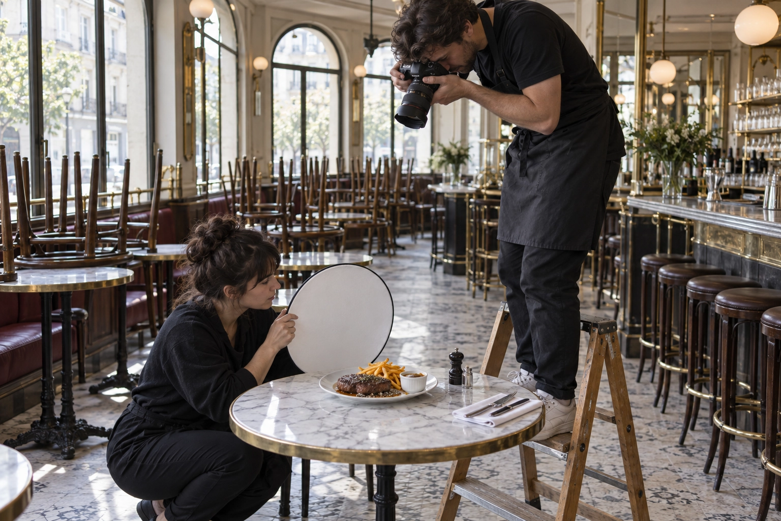 Photographer on a step ladder shooting steak au poivre overhead in an empty brasserie for a restaurant menu photo set
9. Din Tai Fung (US): 8/10
Din Tai Fung shows a bold logo with Reserve and online ordering buttons below. Every dish on its HTML menu has a consistent product shot and its own page. Fix: a logo-only first screen wastes the best food photos on the site.
10. Alinea (Chicago): 7/10
Alinea opens on an abstract plate close-up with two reserve buttons explaining its switch from Tock to OpenTable in November. Fix: no menu. See Chicago food photography.
11. St. JOHN (London): 7/10
St. JOHN shows its white dining room, a "Reservations" link up top and a booking form built into the homepage. Fix: no menu link from the homepage. See London food photography.
12. Dishoom (UK): 7/10
Dishoom leads with a quote about Bombay and "Book" in the header. Its HTML menus list prices and carry 20+ large photos, all with empty alt text. Fix: describe each image; real-user LCP is 3.1 seconds.
13. Noma (Copenhagen): 6/10
Noma sells the experience before the food: a moody food image, "Copenhagen 2026" and "Book a table" on the first screen. Fix: a cookie banner covers the lower third and the page weighed about 19 MB in the lab.
14. BAO London: 6/10
BAO posted the best lab score here (88) and keeps "Book here" in a top bar. Fix: a cookie modal covers the hero, and the menus show location shots, not buns.
15. Zahav (Philadelphia): 5/10
Zahav shows a warm dining room, then a notice modal about Monday hours with "Book Here" inside it. Bar and dessert menus are PDF only. Fix: a slim banner and HTML menus. See Philadelphia food photography.
16. Padella (London): 5/10
Padella has a lovely pasta photo and an HTML menu dated for the day, a unique touch that makes the experience feel live. Fix: a group-bookings modal blocks the first screen.
17. Joe's Stone Crab (Miami Beach): 4/10
Joe's Stone Crab showed a seasonal closure notice when we tested (back 16 October). The HTML menu lists jumbo claws at $129.95, plus a PDF. Fix: 3.4-second LCP and one dish photo. See Miami food photography.
 Motion-blurred servers lifting sharp, still plates from a busy kitchen pass, the speed diners expect from restaurant websites
18. Gramercy Tavern (New York): 4/10
Gramercy Tavern has an HTML menu with prices (Seafood Platter $54) and a photo gallery. Fix: a book-promo pop-up hides everything, and it posted the lowest lab score (24).
19. Zuni Café (San Francisco): 4/10
Zuni Café has a beautiful dusk shot of its building and windows. Fix: "Sample" PDF menus, no booking button for visitors up top, 3.0-second LCP. See San Francisco food photography.
20. Via Carota (New York): 4/10
Via Carota wraps the first screen in illustrated logo design and keeps a dish gallery that suits the brand. Fix: the menu is an image with no prices.
21. Katz's Delicatessen (New York): 4/10
Katz's runs a full online shop with category photos of pastrami, soups and bagels. Fix: an email pop-up covers the first screen, and the menu makes the customer sort pastrami from hoodies and gift cards.
22. Hawksmoor (UK): 4/10
Hawksmoor writes clean, clear HTML menus with prices (fillet £46/£59). Fix: a location picker and cookie banner stack over the hero, hiding "Book a table".
23. Sketch (London): 4/10
Sketch pairs reservations and menus in one header button, a smart and unique idea. Fix: a cookie modal covers the first screen and the lab recorded 29.4 seconds of blocked main thread.
24. Roberta's (New York): 3/10
Roberta's links OpenTable, online ordering for delivery, and catering. Fix: our test's final frame still showed the red splash screen, and no menu is linked.
25. Momofuku: 2/10
Momofuku gives most of its restaurants an OpenTable link. Fix: newsletter and cookie pop-ups cover the first screen, and no menu is linked. For a group of restaurants, one Menus hub in the navigation would fix most of this.
Why weak restaurant sites fail on photography
Most restaurant websites fail on photography because a modern template expects a hero and a set of dish photos the restaurant never shot. Even among the best restaurant websites, 13 of 25 showed no dish photo with the menu, and the sites that passed either paid for a professional shoot or ran a chain-scale photo program.
Empty image slots make any modern website design look unfinished, however good the fonts, and that is where most independent restaurants stall. Our restaurant branding guide explains how one photo style carries a brand across your site, social and delivery apps, and our photo menu guide covers why visual menus help guests choose.
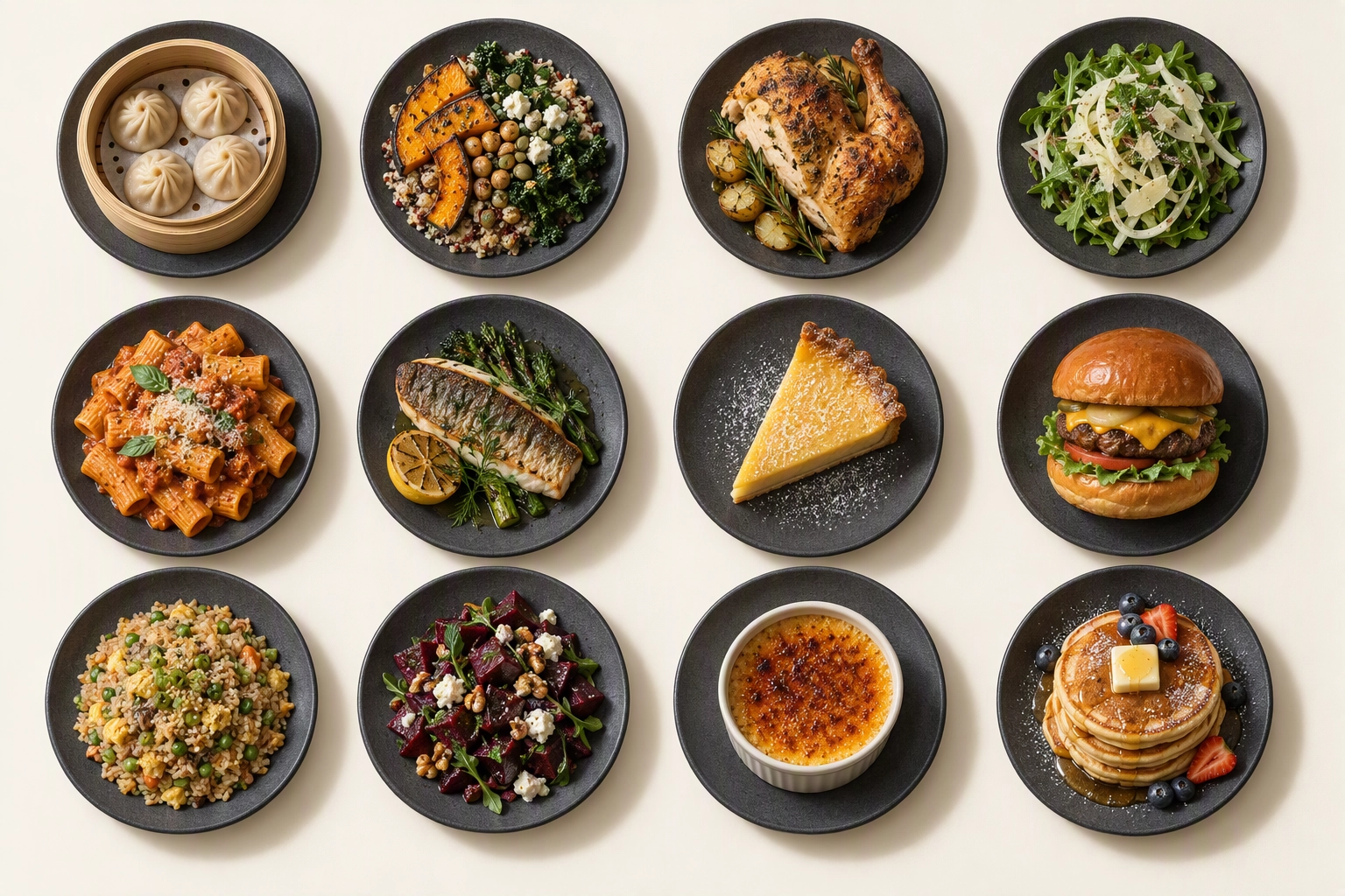 Twelve dishes on matching grey stoneware in an identical overhead grid, a consistent food photo set for a restaurant website
The photo set a template needs:
| Slot | How many | Shape | What it shows |
|---|---|---|---|
| Hero | 1-2 | 16:9, subject centred for phone crops | Signature dish or the room at service |
| Dishes | 8-12 best-sellers | 1:1, same angle and surface | One photo per item |
| Room and exterior | 2-3 | Landscape | Dining room, bar, front door |
| Google and social | Reuse | 1:1 or 4:5 | Same dishes for your Google Business Profile, cropped to the profile photo specs |
Start with the dishes that earn the most; menu engineering tells you which those are. There are three ways to fill the set. A professional shoot gives the most control; our food photography cost breakdown shows the price range, and our restaurant photoshoot ideas help you plan the day. A phone shoot works if you follow our phone food photo steps and lighting guide. The third route is AI food photography: FoodShot turns a phone photo of each dish into a studio-style 2K image (2048 px) in about 2 minutes. Run every dish through one of 200+ styles so the set matches, or use My Styles to match the brand photos you already have. It also runs as a food photo editing app on iOS and Android, and plans start at $15 a month for 25 photos. Our restaurant food photography guide compares all three routes in depth.
To be clear: FoodShot supplies the images, not the website. You place the files in Squarespace, BentoBox, Webflow or WordPress like any photo. Our page on restaurant website food photos shows the workflow, and the same set feeds delivery apps and every online listing, as covered in how to increase restaurant delivery sales.
Two details the audit exposed. Write alt text for every dish photo, as Sweetgreen does and Dishoom doesn't. And export images at the size the slot displays, because the largest element on a phone's first screen is usually an image, which makes it your LCP.
Audit your own restaurant website in 10 minutes
You can score your restaurant website against the rubric we used on the best restaurant websites in about ten minutes with free tools. Run one PageSpeed test, look at the first phone screen, open your menu, and count your dish photos. Anything that scores zero is your next fix, and most are easy wins that need no redesign.
 Restaurant owner ticking a printed website audit checklist at the bar after closing, chairs upturned behind her
- Run PageSpeed Insights on mobile now. Note the field LCP; aim for 2.5 seconds or less.
- Look at the first screen. Is there a photo of food or the room, and a Book or Order button you can tap without scrolling?
- Count the boxes you close. Moving any pop-up to a slim banner is an easy change.
- Open your menu. If it's a PDF or an image, rebuild it as HTML with prices, allergen information and your hours nearby.
- Count dish photos. Fewer than eight best-sellers? Plan a session with our menu photography guide.
- Check alt text. Describe the dish ("crispy pork belly bao with peanut powder"), not "IMG_4471".
For more ways to turn visitors into covers, see our restaurant marketing ideas and the restaurant marketing tools we compared.
Frequently Asked Questions
What makes the best restaurant websites different?
The best restaurant websites in our test shared three traits: a real photo on the first screen, one visible Book or Order button, and no pop-up blocking either. Design style varied widely, from Chez Panisse's illustrations to Russ & Daughters' giant buttons, so the experience matters more than the look.
Should a restaurant website use a PDF menu?
Avoid it if you can. A PDF is hard to read on a phone and gives search engines less information to work with. Among the best restaurant websites we tested, only Zuni Café relied on PDFs alone. Keep a PDF as an optional download, as Joe's Stone Crab and Din Tai Fung do, not the only version.
How fast should a restaurant website load on mobile?
Google treats an LCP of 2.5 seconds or less for real users at the 75th percentile as good. Of the 25 best restaurant websites we checked, 19 met that line, even though lab scores were lower (median 56) because the lab emulates a slow phone.
How many food photos does a restaurant website need?
Plan for one or two hero images, 8-12 photos of best-selling dishes and 2-3 room or exterior shots. Among the best restaurant websites in our audit, only Din Tai Fung and Sweetgreen photographed every dish, which makes a full set a real way to stand out.
Do pop-ups hurt a restaurant website?
They cost the first impression. Fourteen of the 25 best restaurant websites we tested covered part of the first phone screen. If you need a notice right now, a thin banner says the same thing without blocking dinner.